
Standard and Quirks Mode for CSS
It’s an old story on the Web, caused by the fact that Web browsers and computers don’t all display Web pages in the same way. As a result, a page that looks great in one browser can be completely illegible in another.
It’s one of the most frustrating experiences a Web designer can face: you spend hours (or weeks or months) creating a beautifully-designed Web site that looks fabulous on your own computer. Then you go to show it off to friends and family, and the entire design falls apart.
These problems go back to the beginning of the commercial Web in the 1990s. Even in the early days, browser companies didn’t agree on how HTML should be displayed. And with the advent of CSS, display differences got worse in many ways.

What happened is that in the “old days” (the last couple/few years) browser makers were slow to support CSS (and even contradicted each other in their display of styles). So, the best and brightest in the Web design community were forced to create elaborate workarounds — sometimes called “hacks” — that were designed to “trick” the different Web browsers into displaying pages more consistently.
The irony is that as designers got better at dealing with browsers that didn’t follow standards, the browser makers got better at following standards in ways that threatened to “break” these carefully-designed pages.
So in the latest rounds of Web browser updates, browser makers came up with a compromise — creating browsers that support two different CSS display modes: Strict Standards mode (for pages that follow standards) and Quirks mode (for pages that were designed before anyone agreed on any standards). Some browsers, such as Firefox, also use an "almost” mode, which is designed to display some of the older quirks, while conforming to most CSS standards.
The basic idea is this – if the doctype (the code at the very top of a Web page) indicates the page was created following modern standards, then the page will be displayed in Standards mode. But, if the page has no doctype, or if it has an older doctype, then the page is displayed in Quirks mode, which is designed to emulate older browser versions.
Thus, how your Web pages are displayed today depends, in part, on the doctype at the top of your page. If you’re not even sure what a doctype is, view the source of a page by choosing Code or Split View in Dreamweaver (or View>Source in most Web browsers) and take a look at the first line of code at the top of the Web page.
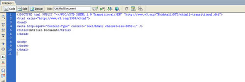
If you create a new page in Dreamweaver using the default settings, the doctype should look like this:
<!DOCTYPE html PUBLIC "-//W3C//DTD XHTML 1.0 Transitional//EN" "http://www.w3.org/TR/xhtml1/DTD/xhtml1-transitional.dtd">
The latest browsers will read this doctype and display the page in Standards mode. If you delete the doctype, or your page has an older doctype, many of the latest browsers will display the page in Quirks mode.
If you create a new Web page in Dreamweaver CS3, the doctype that is automatically added to the top of the page will trigger the latest browsers to display your pages in Standards mode, which is ideal for the Dreamweaver standard-based design features.
You can change the doctype by editing Dreamweaver’s preferences, but here’s my best advice — follow the rules, keep it simple, and let Dreamweaver help you through this time of transition. If you use the new CSS layouts included in Dreamweaver CS3, your pages will be designed for optimal display in the widest variety of browsers, complete with a variety of workarounds designed for those quirky, older browsers.
If you’re working with legacy Web pages that don’t have the latest doctype at the top of the page, consider updating the pages by copying the doctype from the top of a new Dreamweaver page into the old page, and then updating the design features in the older page to follow more modern standards. And here’s another tip: In many cases, your best bet is to start over; replacing old pages that were likely designed with Tables with new pages designed with CSS and div tags.
If you’re overwhelmed by all of these evolving standards, consider this — your Web pages don’t have to look exactly the same in every browser on the Internet. Your goal should be to create pages that look good in as many browsers as possible. Many designers agree that it’s not worth trying to design for really old browsers, like Netscape 4 (although I did have a client recently tell me her Web site looked terrible when she viewed it on her old laptop, which still had Netscape 3 on it!).
The good news is most of those old laptops have died by now, and the vast majority of Internet users are upgrading to newer browsers. The bad news is that it’s nearly impossible today to create completely standards-based designs that look exactly the same on all Web browsers unless they are super simplistic (read: boring).
If you’re still a bit confused by all this, hang in there. The best news is that an increasing number of people on both sides of the Web agree that it’s time to start following standards, because if we don’t, the Web will forever be a mess of inconsistencies that make it impossible for well-designed pages to look good to everyone on the Internet. If this noble effort succeeds, things won’t have to be so (please forgive me) quirky in the future.