
Distressing Text with Live Trace in Adobe Illustrator CS2
Traditionally, if you wanted distressed-looking text in your designs, you either had to have a typeface that was designed to look that way or you had to apply filters to the text in Adobe Photoshop. With Adobe Illustrator CS2, you can use the Live Trace feature to achieve a similar effect. For this tutorial, we’re going to create a poster for a fictitious concert taking place in Seattle, Washington. To give the typography a distinctive look, we’re going to trace a photograph and apply a portion of the result to the text.
STEP 1 Select an Appropriate Image
Find a suitable image that will produce a good amount of texture when traced in Illustrator. You can easily find an image of a brick wall or rusty metal to convert to vector with a quick Web search, but I prefer to use my own photos to generate unique textures. When looking at potential photos, try to find images that contain a lot of small details and also have good contrast between light and dark values. For this tutorial, we’ll use an image of sunlight reflected on water.

CREDIT: MICHAEL HAMM
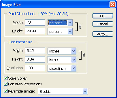
STEP 2 Resize Your Image; Save as JPEG
Once you find an image to work with, you may want to resize it in Photoshop (Image>Image Size). Don’t make the image too small though. The larger your image, the more detail Live Trace will produce in the result. If your system doesn’t have much memory or has an older processor, a large image being converted to vector may bring it to its knees. Our image begins with dimensions of 3072×2304 pixels. That’s a little large, so we’ll reduce the size by 30%. When you’re done editing your image, save it as a high-quality JPEG file.
STEP 3 Open in Illustrator; Begin the Live Trace
In Illustrator, open your image by choosing File>Open. Although we modified the image’s dimensions, it’s still larger than the document’s artboard. Not to worry: We’ll delete much of the tracing a few steps from now.
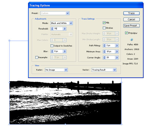
Select the image with the Selection tool (V) and choose Object>Live Trace>Tracing Options. This allows you to modify any settings and preview the image before conversion. In the dialog that appears, enable the Preview option. Leave the Preset as Default. The trace will output in black and white, as two colors are easier to work with for this technique.

STEP 4 Adjust Threshold to Show Detail
Typically, the only setting we change in the Tracing Options is the Threshold value, which controls how much black or white appears in the image. For our image, we found the default value of 128 didn’t show as much detail as we wanted. With a bit of adjustment, we settled on a value of 70. This produced a good amount of small details to use on the text.
When you’re done making adjustments in this dialog, click the Trace button to trace the image.
STEP 5 Convert the Tracing to Paths
Before we can work with the tracing, we need to convert it to paths. Select the tracing and choose Object>Expand. In the dialog that appears, click OK. We want to work only with the black objects. Choose the Magic Wand tool (Y), select the white, and then press the Delete (PC: Backspace) key. You could just as easily work with the white objects by deleting the black with the Magic Wand tool; however, you’ll need to apply a different color fill to the white objects so they’re visible on the document’s white background.

STEP 6 Enter Your Type; Choose a Font
You won’t use all of the tracing to distress the text. As such, you’ll delete a good portion of it. First, you need to figure out which parts you want to use by seeing how the texture will appear with the text. Choose the Type tool (T) and type on your artboard outside the tracing. Use a relatively large point size for your text and leave the Fill color as black. For the featured band’s name, we chose a bold version of the American Typewriter font set to around 70 points.

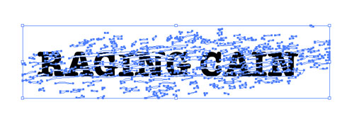
STEP 7 Position the Text
When you’re done typing, move the text in front of the tracing. Position the text so that it’s barely readable. If you can clearly see the outlines of the letters, then the clipping mask in the following step will render the text unreadable. For our text, we’re looking for a lot of small details in the texture to put behind the letters. Too much white or too much black and the text may not be very legible when the mask is applied. In the example above, we’ve highlighted the text so you can see it more clearly over the tracing.

STEP 8 Make a Clipping Mask
To view the texture with the text, we’ll create a clipping mask that uses the letters as the mask. Press Command-A (PC: Control-A) to select everything and choose Object>Clipping Mask>Make. If you’re not satisfied with the overall appearance, undo the clipping mask and reposition the text over another area of the texture. Repeat as necessary to get just the right look. If you have a lot of texture to work with, invest a little time in moving it around. You can also resize the texture up or down as well as rotate it for different appearances.

STEP 9 Create a New Layer
Rather than keep all of the texture we’re not using in the clipping mask, we can quickly delete it with a simple Pathfinder command. Before we do this, we’ll need to undo the clipping mask, so choose Edit>Undo Make Clipping Mask.
Open the Layers palette and expand the layer by clicking the arrow next to the layer’s thumbnail. Click on the texture group layer to highlight it in the Layers palette. Option-click (PC: Alt-click) the Create New Layer icon, name this layer Square in the Layer Options dialog, and click OK. This will position the layer between the text and texture.

STEP 10 Delete Excess Background
Select the Rectangle tool (M) and draw a rectangle on the Square layer over the text and the texture you want to keep. Press Command-A (PC: Control-A) to select everything. Open the Pathfinder palette (Window>Pathfinder) and click the Crop icon. This command is on the bottom row, fourth from left. It deletes anything outside of the rectangle. This reduces your file size and helps speed up Illustrator’s performance. A Live Paint Group, indicated by a double gray rectangle around the artwork, may appear after you apply the Crop. With the Selection tool, double-click an empty area of the artboard to disable it.

STEP 11 Reapply the Clipping Mask
At this point we’ll reapply the clipping mask, albeit with a less-complex texture. Press Command-A (PC: Control-A) to select the text and texture. Choose Object>Clipping Mask>Make.
STEP 12 Convert Text to Outlines
I prefer to convert the text to outlines in the event I need to send this to a printer who doesn’t have the American Typewriter font installed on their systems. With everything still selected, choose Type>Create Outlines. (Note: If you wish to maintain editability of your text, save a copy of the file before applying the Create Outlines command.)
With the text converted to outlines, we can remove additional unused texture around the text and further reduce our file size. With everything still selected, click the Pathfinder’s Crop icon.

STEP 13 Convert Live Trace to RGB
After Live Trace is applied to an image using the Default preset, the trace is in Grayscale color. To allow for colors outside of Grayscale mode, deselect the object and open the Color palette (Window>Color). Double-click the palette’s tab to fully expand it, if necessary. You should see only one color bar with a K next to it on the palette. This indicates Grayscale color mode for the object. Open the palette’s flyout menu by clicking the small arrow in the upper-right. Select RGB from the menu and apply any color you want to the text.

STEP 14 Paste Text into Document
Let’s modify the size and position of the word “CAIN” by selecting all the letters with the Direct Selection tool, holding Shift-Command (PC: Shift-Control), and dragging out one of the corner points. Then, use the Rotate tool and the Selection tool to rotate it and move it. Once done, copy and paste the text into the poster document. For the other distressed words in the poster, I scanned in some corrugated cardboard for the texture.
The possibilities with this technique are limitless. With the right texture, you can give practically anything you draw in Illustrator more personality and visual interest.

