
Design Makeover: Retail Redo
A Retail Package Gets Updated for More Shelf Appeal
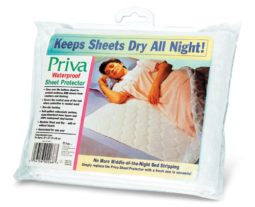
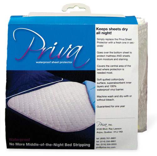
BEFORE
CLIENT: Priva Inc. www.priva-inc.com
“…the current fonts, color choices, and photos are starting to look tired and could use some freshening.”
Priva Inc. manufactures specialty textile products that meet real human needs, not just the whims of fashion. Among their product line are adult bibs for those whose dexterity isn’t what it used to be; smokers’ aprons to protect against burns from dropped ashes; children’s art smocks to keep paint and other substances off kids’ regular clothing; and anti-allergen bedding. They also make a line of products for children and adults struggling with incontinence, including the Waterproof Sheet Protector that’s the subject of this issue’s “Makeover.”
The Waterproof Sheet Protector is intended for anyone who suffers from incontinence during sleep. The product is sold worldwide in large drugstores and, according to company representative Natasha Pietramala, is one of the only reusable sheet protectors available. “Our only competitor would be a disposable sheet protector that slips out of place on the bed and can be very costly for someone on a fixed budget,” she says.
The current package design dates from 1994. Pietramala praises its clean and uncluttered layout and the way it clearly communicates the product benefits. “How to use the product is clear and easy to understand, and it shows that the pad covers the central bed area from shoulder to knee.” Nevertheless, Pietramala says the current fonts, color choices, and photos are starting to look tired and could use some freshening.
The way the product is displayed in a store puts some restrictions on a redesign. Depending on the store, the product might be placed on a shelf or hung on a peg, so the package needs to be able to accommodate both options. (One problem with the current package is that it doesn’t stand up on its own very well.) The other restriction is that it can’t be wider than 10″, because that’s how much shelf space most stores are willing to give the product. With these guidelines in mind, our designers set out to give the Waterproof Sheet Protector a package that will stand out (and up) on the shelf.
AFTER
DESIGNER: Phillip Alig www.flickr.com/photos/67347266@N00
“I wanted the copy to outline the benefits of the product in an easy-to-read hierarchy.”
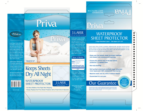
I started the redesign process by researching similar products at local stores. They seemed to blend in with one another, all using similar colors and packaging choices. So I proceeded to brainstorm ideas for a kind of package that would be distinctive but still maintain the current size and address the issue of standing versus hanging. I came up with the idea of a light cardboard box with a projecting tab that could be used to hang on a peg.
Once I decided on the kind of package, I got to work on the design and layout and decided to focus on the idea of “secure comfort.” I put the Priva logo and a confident woman pictured with the product on the front panel, along with an entrapped close-up of the quilted texture of the product. The background texture of water droplets and ripples reflects Priva’s 25 years in the manufacturing of waterproof textile products.
I wanted the copy to outline the benefits of the product in an easy-to-read hierarchy. The front panel lists the primary two features of the sheet protector, and the back panel gives plenty more room for a bulleted list of further benefits and Priva’s unconditional guarantee, showing the company’s confidence in the quality of their product. I felt the original package’s very bold sans serif font seemed almost harsh, so I set the headers in Baker Signet BT to soften the overall appearance. I used Helvetica for the body copy for contrast and because it’s easy to read for short items like bullet points.
ABOUT THE DESIGNER: PHILLIP ALIG
 Phillip graduated with honors from the Art Institute of Pittsburgh in 2002. He currently has an Associate’s Degree in Graphic Design and is weeks away from receiving a Bachelor of Science Degree in Graphic Design. Phillip works as a freelance graphic designer as well as a full-time designer in a firm out of Pennsylvania.
Phillip strives to grow as a designer and to become a successful name in the design industry. He takes his inspiration from various sources, including postmodern artwork, pinup and vintage art, amateur and professional designers, and old punk rock music. But most of all, when he’s not designing, he enjoys spending time with his beautiful wife and son, and aspires to be a successful father and husband.
APPLICATIONS USED: Macromedia Freehand, Adobe Photoshop 7
AFTER
DESIGNER: Carole Maugé-Lewis
www.kennesaw.edu/visual_arts/Personnel/Mauge-LewisC/index.shtml
“The product is portrayed as being comfortable and worry-free, as the customer enjoys a dreamy sleep.”
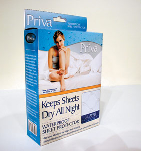
The original package looked dated to me—today’s women and men in their thirties, forties, or fifties lead different lifestyles than they did 20 years ago. To update it, I started by keeping some hint of the original color but making it bolder and surrounding it with blue for a touch of tenderness. The product is portrayed as being comfortable and worry-free, as the customer enjoys a dreamy sleep. Clouds are incorporated to give that “cloud nine” feeling. The product becomes part of the overall sleep experience, so that too fades into the clouds. The unique selling points of the product are immediately seen and placed in an inviting context. The back shows the entire product and lists its added benefits.
I also thought Priva’s logo needed to be modernized to make it look more “today”—fresh, lively, and somewhat carefree. I set it in the flowing Scriptina script font and placed it on both the back and front. (I moved the barcode to the bottom of the package so as not to interfere with the design.)
I didn’t want to enclose the package totally, so I used a sideless box around the clear plastic sleeve that wraps the product. That way the customer can still see and feel the product. The folded cardboard sheet provides a sturdy base that enables the package to sit on a shelf, while a die cut at the top allows it to also hang from a peg.
ABOUT THE DESIGNER: CAROLE MAUGÉ-LEWIS

Carole took her MFA from Howard University and has been an Associate Professor of Art at Kennesaw State University in Kennesaw, Georgia, since 1995. She has also taught at the Art Institute and at the American Intercontinental University, both in Atlanta, Georgia. In 2006 she received the Distinguished Teaching Award at the College of the Arts at KSU and the Educator of the Year Award at AIU.
Carole says, “I’m very passionate about teaching and design. I constantly try to remind my students of their importance as image-makers, and the responsibility they have as visual communicators to deliver meaningful messages that work. I see my classroom as an exploratory lab where students are encouraged to push the envelope at every opportunity.”
APPLICATIONS USED: Adobe Photoshop CS2 and Adobe Illustrator CS2
AFTER
DESIGNER: Eric P. Mullen www.epmullen.com
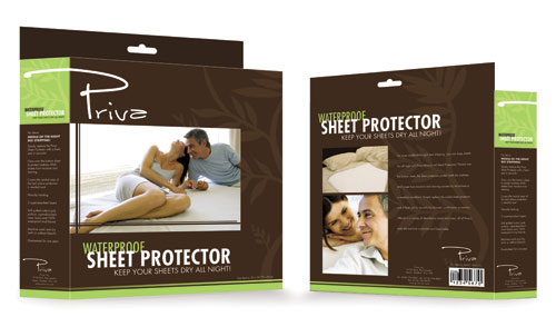

“I decided to focus on creating an appealing and comforting look to help lessen the embarrassment from having to purchase incontinence products.”
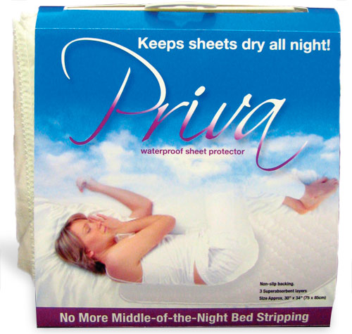
When I looked at the original packaging for the Priva product, my first impression (other than it was completely outdated) was how unwelcoming it felt. I decided to focus on creating an appealing and comforting look to help lessen the embarrassment from having to purchase incontinence products.
I chose natural earthtones for the color palette and opted to use the Futura font family to provide a sleek, elegant, and legible typeface. The existing logo treatment for the Priva name was too sterile and corporate-feeling, so I tweaked Jennifer Dickert’s script font Luna Bar to tie together the whole organic, earthtone feel.
The original’s photo selection aimed the product at a very specific demographic. Part of setting a new mood and direction was selecting a lighthearted and timeless lifestyle shot. The series of the happy couple reinforces the comforting reward that the product promises to deliver, while avoiding any gender- or age-specific suggestion.
The main challenge here was trying to solve the problem of the existing package’s lack of stability on store selves. I decided a fully enclosed box would be most beneficial. It provides both a durable footing for shelf placement and a secure hook for hanging. In addition, by concealing the product inside, the package provides a more intimate and less vulnerable purchasing experience.
ABOUT THE DESIGNER: ERIC P. MULLEN
 A graduate of Temple University in Film and Media Arts, Eric brings a trained and contemporary look to the design department at V2 Creative, an advertising agency in Las Vegas, Nevada. He has led the concept and design of numerous websites, ranging from political to corporate to restaurants. His experience also includes the concept and design of national, regional, and local ad campaigns; corporate branding; and directing and editing television spots and corporate media projects. In his off hours, he has written and produced two short films, with two more currently in preproduction.
APPLICATIONS USED: Adobe Photoshop CS2, Adobe Illustrator CS2, and Adobe InDesign CS2

