
Design Makeover: Renewable Energy
Nanergy started in the renewable energy business about four years ago, specializing in photovoltaics (converting solar energy to electricity). In the U.S., they market their products to consumers through catalogs such as Hammacher Schlemmer, in-flight magazines, and televised home shopping networks. Outside the U.S., their markets are primarily in third-world countries, which they reach through organizations such as the United Nations or UNICEF.
The corporate image Nanergy would like to project is informal and friendly, but at the same time polished and high tech. “More Apple than IBM.
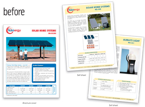
The company also sends representatives to trade shows and overseas trade missions where they distribute sell sheets describing their products. Typically, several sell sheets will be inserted in a folder with a cover letter. Eva Csige, Nanergy’s Vice President of Marketing, asked if Layers could come up with a more effective design for the sheets.
Csige likes several things about the current sell sheets: the layout is neat and clean, and the angled rules makes them look modern. But they’re inconsistent and not terribly eye-catching. One problem is the color scheme. Because the current logo is red and blue, she says, they had a hard time coming up with a background color to work with it. They decided against green because it’s such a cliché in the renewable energy field; the yellow they settled on is meant to suggest sunlight, the source of the power for their products.
The corporate image Csige would like to project is informal and friendly, but at the same time polished and high tech. “More Apple than IBM,” she says. We gave three designers a pair of spec sheets and the cover of a four-page brochure and asked them to generate a new look that could represent Nanergy’s efforts across the entire product line.
After
DESIGNER: Gregory Wostrel www.gwcreative.com
Graphic design is about organized communication. In the case of commercial design, it’s vital that information is clear and accessible. The challenge is to distill simplicity out of complexity and reduce detail to the essentials.
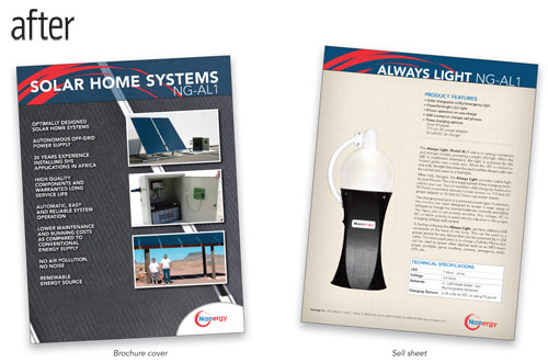
I started with the Solar Home Systems brochure cover. It needs to entice viewers to investigate further—to make them interested in the product and to draw them in. I decided to take a magazine-cover approach, using large images and treating the product features as bold “story subjects.” As for the design details, I tried to pull together elements that subtly suggested the product and the brand: the translucent blue of photovoltaic panels, with bits of the logo swirl in the top bar echoing the logo at the bottom. I set the type in Avenir Black, Medium, and Light for its modern feel and clean, easy-to-read characters.
My approach to the Always Light data sheet was to repeat elements from the brochure for consistency, to soften the stark feel of the original, and to organize the information and highlight the important details. Placing all the information into one vertical space, starting with a list of product features and ending with the tech specs, makes it easy for someone who is scanning to find the most important points quickly. The background has a subtle grid pattern over a gradient tone that softens the look while adding a “technology” feel. This was my attempt to address the slight conflict in the client’s request for a warm, casual image and a modern, high-tech look.
Nanergy makes some interesting and relevant products. I wish them good fortune with their business.
About the Designer: Gregory Wostrel gwcreative
 Greg started as a photographer in 1990. He worked for agencies and design studios shooting images for ads, annual reports, lifestyle marketing pieces, and catalogs. The years of crafting images honed his eye for the important details. He found himself drawn to the entire design process, and a combination of self-instruction, trial by fire, and a Design and Advertising Certificate program at Rhode Island School of Design enabled him to expand his skills and services.
Going into business as gwcreative in 2000, Greg began to design and produce appealing, user-friendly, and effective websites, print projects, and photography. He now stays busy with freelance work, wedding and event photography, and a day job as the lead Senior Graphic Designer for GTECH Corporation’s Sales and Product Marketing Department in Providence, Rhode Island.
He lives in Pawcatuck, Connecticut, with his wife and two teenage children, who are his favorite people in the world.
APPLICATIONS USED: Adobe Photoshop CS3, Adobe Illustrator CS3, and Adobe InDesign CS3
After
DESIGNER: Cristy Vallee www.valleedesign.com
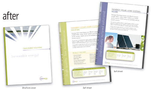
Nanergy’s current look is not only inconsistent among their marketing materials, but also in communicating a clear brand message (which starts with a suitable and successful logo). The original logo’s brush stroke effect makes it look either artistic or handmade, and the colors are harsh and misleading. I set out to create a mark that illustrates the main characteristics they use to describe themselves: high-technology, environmental, polished, and people-focused.
My revised logo uses crisp lines that suggest energy being dispersed as rays of light. The combination of bright green (representing both the environment and the vibrancy of the sun’s energy) and blue (symbolizing the sky and solar panels) evokes a feeling of freshness. I set the company name in lowercase Futura to complement the icon and provide a friendly but sophisticated tone. The rays-of-light theme is carried through on the brochure cover where the use of ample negative space communicates an overall feeling of expansiveness and clean energy.
Besides inconsistency, I thought the sell sheets suffered from lack of hierarchy, poor interaction of elements, and weak use of photography. Nanergy’s mission combines compassion for humanity with environmental awareness, and this became the force behind my concepts.
I decided to use typography and negative space in a very pure and simple manner to communicate an overall feeling of expansiveness and clean energy. I wanted the product sheets to organize the information, but have some dimension and hierarchy. I did this by establishing a grid, assigning levels of importance to type through size treatment, and bringing out specific features in bold sidebars. The type in the sidebar sits between parentheses and remains lowercase, maintaining the techie-yet-friendly nuance. Different colors selected from the same overall palette distinguish one product from another. I added images that evoke feelings of well-being and attention to the environment and the betterment of humanity.
About the Designer Cristy Vallee vallee:design
 Fueled by her passion for designing the art of meaningful communication, Cristy Vallee established her own design studio, vallee:design, in 2003.
Cristy received her Masters of Fine Arts in Graphic Design from Boston University and worked as a designer for a number of design studios, an advertising agency, an exhibit design firm, and as a freelancer. Her experience covers a wide range of media, including branding, print and marketing collateral, and large-scale experiential design projects. Cristy also enjoys teaching graphic design at Bridgewater State College, where she’s continuously reminded of the importance of meaningful and fresh design.
“What I enjoy most about design is the creativity and collaboration, but even more the point at which successful design does
more than simply attract a viewer, but reaches out to inform and inspire. It’s at this point that I believe design shows its true strength and power to ignite change and growth.”
APPLICATIONS USED: Adobe Photoshop CS3, Adobe Illustrator CS3, and Adobe InDesign CS3
After
DESIGNER: Andrea Jensen and Michael Olson www.dykeman.net
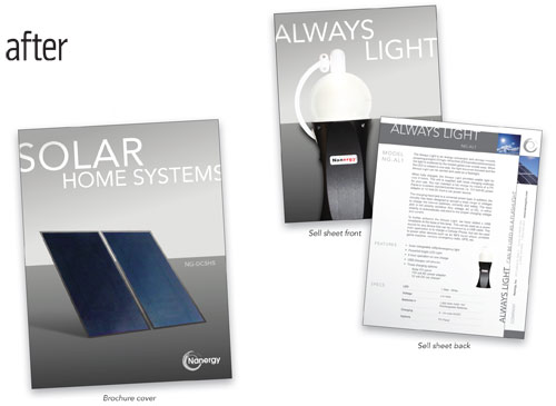
hile reviewing the existing Nanergy marketing collateral, several issues became very clear, most notably that the company wasn’t capitalizing on aesthetic communications for green energy, the product capabilities, or the refinement of solar technology. When you leave any piece of material with a potential customer it should always be eye-catching and clever. The new design needed to be modern, sleek, and refined, communicating to a market of sophisticated customers with the interest and funds to invest in clean, green energy for their homes and lifestyles. To accomplish this, we took a minimalist approach, drawing on Swiss Modernism, and reduced the color scheme to shades of gray and sky blues. The resulting design is modern and elegant.
The Always Light sell sheet was challenging if only for placing so much information in too small of a space. Our team decided to transform the page into a two-sided one sheet; the front displays the simplicity of the product and the back details the product specifications. We capitalized on the fact that the product emits light to make the top half of the front of the sheet (starting where the light is) a pale gray, while the bottom part of the sheet is dark to create contrast and ground the design.
The previous Solar Home Systems brochure cover also contained too much text. Continuing the clean and simple presentation established with the Always Light sheet, we removed all the product information from the front of the brochure and simply showcased the product. The information inside the brochure is presented in a similar format as the back of the Always Light one sheet. The design should remain consistent in this way between all collateral items, creating a standard design for the brand.
About the Designers Andrea Jensen and Michael Olson DYKEMAN: Graphic Design Services
 DYKEMAN’s Graphic Design Services, located in Everett, Washington, provides clients with print, Web, and environmental design services. Notable clients include Safeway, ICON, Krispy Kreme, Top Foods, and Housing Hope.
Andrea Jensen has worked in the design industry for the last four years as a copywriter, marketing manager, and graphic designer. Her myriad skills assist DYKEMAN Graphics in design, as well as business development and marketing ventures. Andrea has worked with the Washington State Ferries, PEMCO Insurance, and the Urban Mobility Group.
Michael Olson has worked in the design industry for the last eight years as a graphic and Web designer. As a graphics director at DYKEMAN Graphics, Michael contributes his award-winning talent and entrepreneurial experience. Michael has worked with PEMCO Insurance, Ignite Analytics, and the Diocese of Olympia.
APPLICATIONS USED: Adobe Photoshop and Adobe InDesign

