Design Makeover: More Than Just a Business
Client:Apostle Construction —www.apostleconstruction.com
BEFORE
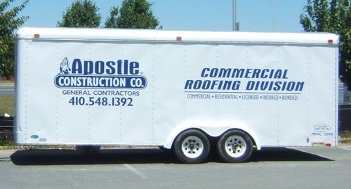
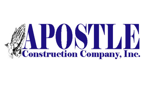
The voice mail at Apostle Construction Company greets callers with a cheery, “Could your project use a miracle?” That question encapsulates both the Christian underpinnings and the can-do attitude that Apostle would like its logo to project.
Apostle Construction was founded as a roofing company in 1996 by Robert Brooks, a minister who wanted to create more than just a business. According to Brooks’s wife, Monica, he wanted Apostle to be a business that operates with integrity and honesty and that gives back to the community. Now licensed in six states, the Maryland firm takes on such jobs as doing all the roofing and siding for a school or a hotel; the company also handles complete construction jobs, such as houses.
Apostle’s current logo was put together by the sign company that made the signs for the company trucks. Brooks specifically requested they use the familiar praying hands picture and his favorite color is blue, so the design of the logo pretty much took care of itself. Monica Brooks says the logo works in that it catches people’s eyes and starts a conversation, and it gives the business a chance to convey their belief system along with their competence.
There are issues with the current logo, however. For one, its appearance and presentation is inconsistent, as a comparison of a business card to one of the company vehicles will show. For another, the praying hands image is so familiar that, by itself, it doesn’t uniquely identify Apostle Construction. So we asked three designers to perform a minor miracle and create a logo that would maintain a religious connotation while still communicating the other qualities that distinguish the company. According to Monica Brooks, it’s not too big to give personal service, but not too small to take on a big job; the attitude that “the job’s not done until the customer is satisfied;” and a commitment to do what they say they’re going to do.
AFTER
DESIGNER: Jeff Cook
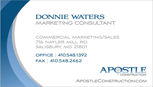
My primary goal in reworking the Apostle logo was to not only update the concept but also give it a sleeker, less bulky appearance. My issue with the original logo was that all the words had the same weight—nothing pulled for attention. When I designed my updated version, I made sure that the word “Apostle” was a primary graphic, while the word “Construction” played a secondary role.
I also swapped religious graphics, as I felt that the praying hands image was the most outdated element of the logo. I updated that graphic with what seems to me to be the most recognizable imagery when it comes to religious items: a cross. I placed the cross graphic inside the “o” of Apostle, where it’s contained within the overall structure of the logo—unlike the praying hands, which were floating loose on the side. This new element gives the logo a polished and finished appearance, without looking dated.
The original logo used the same font for all text, but mixing serif and sans-serif fonts in logos with multiple words is a treatment that’s always more appealing to the eye. The word “Apostle” obviously has a religious connotation; therefore, I decided to use a serif typeface (Aviano from Insigne) to convey a professional, yet historical look. The word “Construction” should have a masculine quality, so I set it in the sans-serif version of Aviano. The sans-serif version lends a strong appeal, while remaining sleek and refined.
For reasons of personal preference, the main color choice for the original logo was blue, so I stayed on the same path for my redesign. Instead of the flat royal blue of the original, I opted to use a more slate-like blue and applied a gradient effect. Taken together, the approach helps modernize this new logotype.
I placed the cross graphic inside the “o” of Apostle, where it’s contained within the overall structure of the logo…
ABOUT THE DESIGNER
Jeff Cook — Jeff was born in the northwestern suburbs of Chicago in 1981. As a young child, he loved to color and constantly won community coloring contests. As he grew older, he recognized that he was fascinated by logos, so he started studying layout and composition. A 2003 graduate of the Illinois Institute of Art, Jeff holds a degree in Visual Communications. Shortly thereafter, he gained four years of graphic design experience at Brian Keith Advertising, the midwest’s largest and most respected real estate agency.
He currently resides in Arlington Heights, Illinois, and works as a graphic designer for the in-house creative department of Camping World, a nationwide chain of camping and outdoor stores. He also strives for greatness with his at-home, freelance company, JC Design. Jeff also loves spending time with his niece and nephew, who love to color just as much as he does. He can be reached at Jeffcook88@yahoo.com.
APPLICATION USED: Adobe Illustrator CS2
AFTER
DESIGNERS: Don and Amy New —www.newslandingdesign.com
NewsLanding’s brand redesign methodology always starts with a client survey of the existing mark. We want to know what the client likes about the current logo and why they’re motivated to change at that point. Graphically speaking, the client expressed only one requirement—that the final treatment clearly portray the owner’s faith—and one preference: the owner’s favorite color is blue. It’s a wise design principle that if the guy writing the checks prefers the color blue, at least one iteration in your presentation should use blue.
Our next step in the re-branding process is usually to write a creative brief with the client. For this makeover, we just used the notes provided us from a conversation with the owner’s wife.
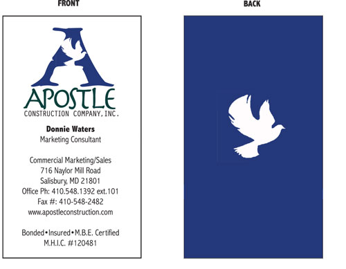
After all that, we go someplace quiet and simply write out words. With Apostle, we created categories and under each, listed as many words within those categories as we could come up with before hitting the old Google button or going to our favorite online thesaurus. In our “religious icons” category, we ended up with such terms as cross, Star of David, crucifix, olive branch, fish, dove, robes, candles, halo, praying hands, steeples, and so on.
Armed with the list of words, we selected several candidates that could be treated graphically. Next, we began combining appropriate typestyles with sketched icons—the dove was a combination of several dove shapes I had in my scrap files. Everything at this point was being done in black and white. Once all the assets are in digital format, we can work very fast with combinations, overlays, transparency, typography, and color.
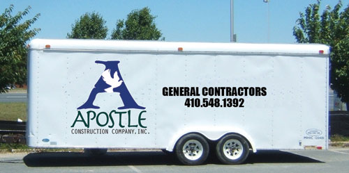
With Apostle Construction, we ultimately rendered the dove in Adobe Illustrator and selected a font that reinforced the fine craftsmanship so important to the client. We set “Apostle” in Linotype’s Herculaneum and used Adobe’s Orator Std for “Construction Company” and other text. The result was a ligature/icon that would show as well on the side of a construction trailer as on a golf ball.
Armed with the list of words, we selected several candidates that could be treated graphically.
ABOUT THE DESIGNER
Don and Amy New NewsLanding Design 
As a graduate of the University of Oregon’s School of Architecture and Allied Arts, Don founded his first firm, Graphic Media, in 1980. This company grew to a fulltime staff of 65, held the top position for marketing communications firms in Portland for 10 years, and during that time, Don was the runner-up for Inc.’s Entrepreneur of the Year for the Pacific Northwest region.
Don sold Graphic Media to his partners in 1995 and in 1997, joined Portland’s Creative Media Development (CMD) as Corporate Creative Director. He was named Chief Creative Officer the following year. In 2001, CMD garnered more than 30 regional and national creative awards.
In 2004, Don and his wife Amy formed NewsLanding in Lake Oswego, Oregon. Their current clients, who consider NewsLanding to be an extension of their marketing staff, range from real estate firms to a biofuels refinery. NewsLanding is also committed to pro bono work for several nonprofits and a great little Christian-based orphanage in El Salvador.
APPLICATIONS USED: Adobe Photoshop and Adobe Illustrator
AFTER
DESIGNER: John Webb —www.jweb3d.com
In re-creating the Apostle Construction corporate identity, I wanted to maintain the religious aspect of the logo but give it a more professional look. The sketched praying hands have been overused, so I didn’t feel that image offered the individual identity a company would benefit from. They also had two different variations of the logo, so I wanted to give them a consistent brand mark that can be used on all of their collateral. I felt the font was very plain and that the black and blue color choices weren’t aesthetically pleasing.
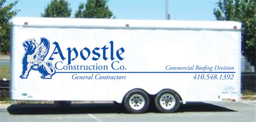
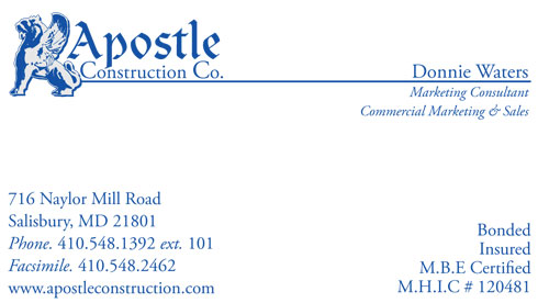
The first thing I wanted to do was find a Christian symbol that was powerful, could relate to the company, and wasn’t seen on every Christian building and book. That ruled out a fish, cross, sacred heart, etc. Through my research, I came across the winged lion, which is a symbol for Saint Mark, representing faith and a connection to God. The wings represent a messenger of God, which I felt was symbolic of a company that does charity work, such as offering aid to Hurricane Katrina victims (as I read on their website). I also thought the winged lion would be a strong, trustworthy mascot (for lack of a better word) to represent a Christian construction company. I found a photo of a winged lion statue online, traced over it in Adobe Illustrator, printed out the sketch, drew over it by hand to add detail and modify some of the shapes, scanned my drawing back in, and manipulated it until I was satisfied with the result. The final image looks something like a gargoyle, which suggests the roofing aspect of the company’s services.
For the word “Apostle,” I chose Clairvaux LT STD Roman from Linotype, which has a biblical look. And for “Construction Company” and any text that would accompany business material, I chose Adobe Garamond Pro because it’s easy to read, fits well with Clairvaux LT STD Roman, and is a professional-looking font.
To top it off, I felt a cool gray and an eye-catching blue gave it a nice modern color scheme.
I also thought the winged lion would be a strong, trustworthy mascot (for lack of a better word) to represent a Christian construction company.
ABOUT THE DESIGNER
John Webb John is a multifaceted artist based in Philadelphia, Pennsylvania, offering a wide range of services—from graphic design to fine art and airbrushing. Born in 1980, John has been drawing since childhood, using mostly pencils, pastels, Pantone markers, and ink. To this day, much of his work is inspired by graffiti and by the comic books he enjoyed as a child. During his high school years, he excelled in art classes, which led him to pursue a career in this field.
In 2001, John began airbrushing and creating T-shirts and tattoo designs for his friends. Then he started creating and selling custom T-shirts in a store he partially owned in West Philly. The following year, he began to try his hand at fine art, with a focus on acrylics. His work in computer arts, primarily graphic design, began in 2003. At present, John is refining his knowledge of the Adobe Dreamweaver, After Effects, and Flash programs. He attained his Associate’s degree in Graphic Design in June of 2008.
APPLICATIONS USED: Adobe Photoshop CS3 and Adobe Illustrator CS3


