
Design Makeover: Modern Media Makeover
A Modern Media Company Gets an Updated, Snazzy New Logo
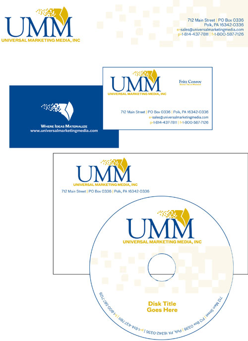
BEFORE
CLIENT: Universal Marketing Media www.universalmarketingmedia.com
“We’d like a new logo to project a feeling of professionalism.”
It’s not easy to give a quick answer to the question, “What does Universal Marketing Media do?” Director of Sales, Fritz Conroy, makes a valiant effort: “I guess one way to describe our company would be to say that UMM is a multichannel, multimedia company with its roots primarily in the publishing and marketing of electronic and printed materials.” Basically, UMM—launched by self-publishers—works with business owners and authors to help develop media products and market them. For instance, a book author could rely on UMM for everything from rewrites and editing to Web, radio, and TV marketing. The company also offers order fulfillment, bulk-mailing services, and an answering service.
Even with all that, the company is determined to move forward and expand. But they feel that their current logo—obtained from a logo design website—no longer represents them. Conroy likes the color choices well enough but doesn’t think the colors are well used, contributing to a logo that’s bland and not eye-catching enough. “We’d like a new logo that projects a feeling of professionalism,” he says. Since the company’s planning to expand their service offerings, they don’t want the new logo to tie them to a specific medium—they wouldn’t want the plain image of a book, for example. And ideally, it could represent the parent company of a group of divisions. “Perhaps it could be something that looks like it would be on the side of a large warehouse,” suggests Conroy, optimistically.
We asked three designers to give this media company a new message that could be used on letterhead, business cards, CDs, book covers, and the Web.
AFTER
DESIGNER: Jaci Raia
“My ultimate goal with the logo makeover was to come up with something fresh and lively.”
Upon first viewing the UMM logo, my immediate thought was that it looked dated. The colors and the font seemed stiff and too “science-y” for a marketing and media company. My ultimate goal with the logo makeover was to come up with something fresh and lively.
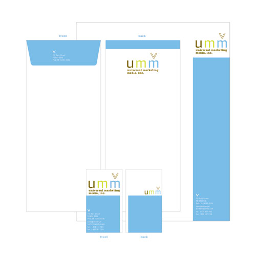
I selected a more current color palette—bold colors, but at the same time, sophisticated. I also chose a diverse font family with many different weights and options, which would lend itself well to the identity system as it would afford variety but still remain cohesive. Cholla from Emigre suited my needs perfectly. It’s crisp and modern but slightly quirky, so it has personality.
I updated the mark to something that still felt universal but was more specific to the company. UMM publishes books, so the V mark represents an opening book but can also represent the rabbit ears on an old-fashioned TV to suggest other media.
The components of the new logo aren’t permanently glued together: They’re designed to be broken up, so that the mark can stand on its own, or the acronym and mark can be separated from the full company title. This will allow for more creative options in the future. For the format of the stationery, I chose vertical for both the envelope and the business card: It makes designs more memorable.
ABOUT THE DESIGNER: JACI RAIA
 Jaci Raia was born in New Jersey and has resided there for all of her 23 years, except for a five-year stint at the State University of New York at New Paltz. Jaci excelled there and graduated in May 2006 with a BFA in Graphic Design. She was immediately scooped up by a company in Manhattan offering an excellent career opportunity. When not busy commuting, Jaci is practicing Ashtanga yoga, hanging out with friends, or listening to death metal. She aspires one day to be a household name in graphic design.
APPLICATION USED: Adobe Illustrator
AFTER
DESIGNER: Ben Muldrow www.arnettmuldrow.com
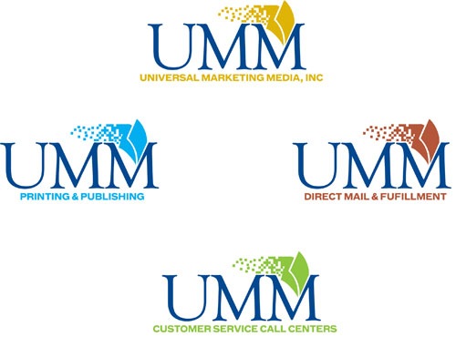
“The addition of a standalone icon allows UMM to begin to use different accent colors to represent the different divisions of the company.”
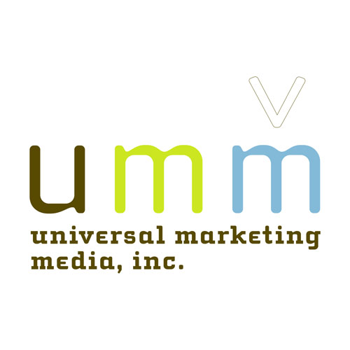
The current logo for Universal Media Marketing falls short of creating an umbrella brand that allows for future expansion and specialization of the company as it grows. The first major decision I had to make was whether or not to continue using the acronym “UMM” or shift the logo’s focus to the name “Universal Marketing Media, Incorporated.” I decided to continue using the acronym because of the design simplicity that it allows. Also, the company expresses plans for diversification in the future, and I believe the iconic nature of the acronym allows for future expansion.
I selected a serif/sans-serif combination of Goudy Old Style and Bau Bold, and changed the “UMM” from sans-serif to a serif font because the client requested that the logo reflect more professionalism. The traditional and formal qualities that Goudy Old Style express project that of a parent company. I chose to maintain the current color scheme for two reasons: one, the client already likes the colors; and two, keeping the color palette already in use allows for easier migration to the new logo. The addition of a standalone icon—the digitized page—broadens the system and allows UMM to begin to use different accent colors that represent the different divisions of the company and elevate the overall brand to the parent of the system.
ABOUT THE DESIGNER: BEN MULDROW
 Ben Muldrow currently serves as the Community Imaging Director for Arnett Muldrow & Associates. He’s responsible for all community marketing and branding functions of the Greenville, South Carolina-based urban planning firm. Ben helps communities develop their brand identity through an open process including public design sessions and collaborative small groups. He has designed new branding and marketing elements for revitalization projects in more than 75 communities.
A Greenville native and a graduate of the University of South Carolina, Muldrow was Strategic Branding Manager for NewSouth Communications and Owner of Mudduck Design, an advertising and graphic design company specializing in design for residential home builders, developers, real estate, and support businesses in the industry.
APPLICATIONS USED: Adobe Illustrator, Adobe Photoshop
AFTER
DESIGNER: Michelle Gustavson www.shellgraphix.com
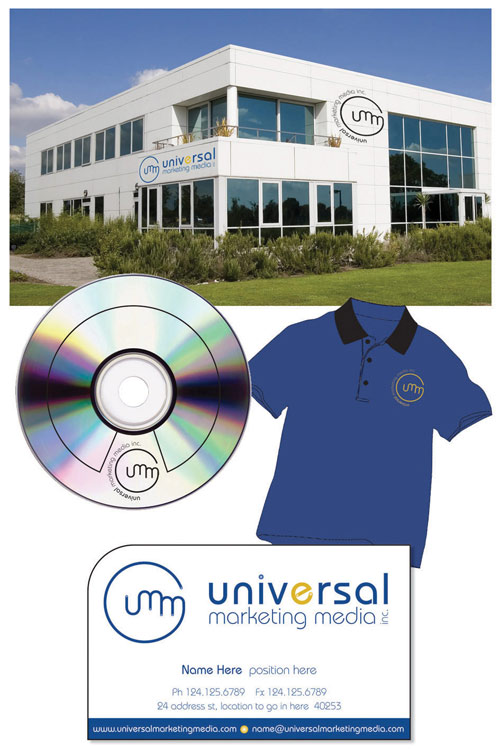
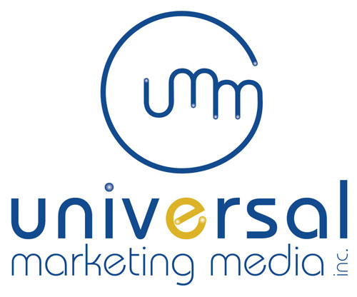
“The new logo also remains very powerful and easily recognized when presented in black and white.”
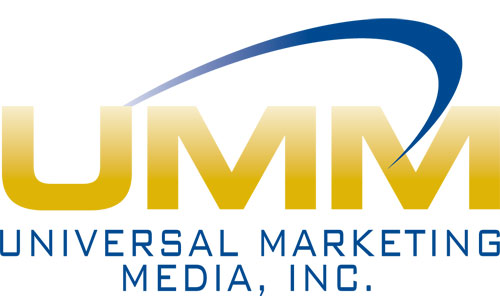
After considerable thought and research into the company background, I concluded that the UMM logo was in need of customization more than anything else.
I quickly decided a smooth, rounded theme would work well, because the U and M could blend together and then become united in a circle that would represent the “universal” element of the name. I selected Bauhaus as the font for its rolling letters and the ability to access both medium and light weight styles.
Since the company liked their existing colors, I kept the navy blue as the prominent color in both solid blocks and gradient spots, and then I used limited golden tones for highlights. The new logo also remains very powerful and easily recognized when presented in black and white.
In order to make the logo as adaptable as possible, I morphed it into three formations, including a classic portrait style, a horizontal treatment, and a round button layout. These three options make life easier when it comes to adapting the logo to vastly different locations from stationery, embroidery, and Web use to buildings and vehicles.
ABOUT THE DESIGNER: MICHELLE GUSTAVSON
 A personal approach is priceless when it comes to securing new clients and maintaining existing business relationships. Making clients feel that someone cares for their business as much as they do is reassuring and gives them the confidence to try something new when fresh ideas are suggested. Michelle Gustavson lives by this theory, which has led to great success over the past six years of operating Shell Graphix, located in Ormeau Hills, Australia. With a diploma in Graphic Design and Advertising plus eight years of industry experience, Michelle continues to learn new skills in order to keep her design work fresh, exciting, and unique.
APPLICATION USED: Adobe Illustrator CS2

