
Design Makeover: Artist Online Showcase
Three Designers Give a California Artist an Online Showcase Worthy of His Work
BEFORE
CLIENT: Larry Morace www.moraceart.com
“So many galleries’ and artists’ websites show work against a white backdrop. I know they’re going for the look of museum matting or gallery walls, but it’s just too stark.”
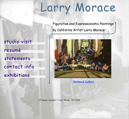
Larry Morace is a well-established San Francisco artist whose expressionistic and figurative paintings include colorful San Francisco cityscapes, moody landscapes of coastal California, and still lifes that depict ordinary domestic objects. Working mainly in oils, Morace uses broad brushstrokes and bold colors to give dramatic intensity to his canvases and plays with contrasts of shadow and light. His website is where connoisseurs who’ve seen or heard about his art can view a range of his work. The site also links to galleries that represent Morace.
Updating the website has been on the artist’s mind for a while. “There are things I used to like about the site that I don’t care for anymore,” he explains. “For one thing, it shows older work that I’d like to replace with more recent paintings. But I’m also ready for a less-dated overall look,” he says.
One of the first things he thinks should change is the background. “Right now it shows black-and-white images of my studio,” he says. “I like the concept of showing the environment where I paint, but the reality is that it makes the pages look way too busy.” He’s open to a colored background, as long as it’s not white. “So many galleries’ and artists’ websites show work against a white backdrop. I know they’re going for the look of museum matting or gallery walls, but it’s just too stark,” he says.
Morace sees the value of having a large central image on his homepage, but he’d like it to be even bigger. He’d also like to display a series of paintings that scroll or fade into one another to quickly show the breadth of his work to even a casual visitor. He plans to do his own updates, such as changing a price or replacing an older painting with a newer work, so he’s looking for a design that’s not too complicated.
AFTER
DESIGNER: Bob Bittner
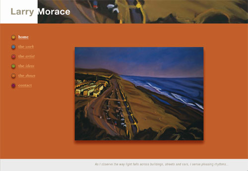
“On the homepage, the base color with a sandstone background texture and the graduated darker color over it give an ‘on wall’ feeling, and subtle drop shadows complement and bring out the central art piece.”
My first thoughts were that I had to keep this website simple, inviting, and tasteful, and avoid elaborate pages that might take the focus away from the artist’s work. With that in mind, I carefully selected an earth tone background color that wouldn’t clash with or distract from the art. I added a secondary color—also in a warm tone—for the text and highlights. On the homepage, the base color with a sandstone background texture and the graduated darker color over it give an “on wall” feeling, and subtle drop shadows complement and bring out the central art piece.
I highlighted the large central picture frame with a fine black line to frame it, and a fine white border to give a slight separation from the background color. I placed the text and secondary pictures so as to lead the viewer’s eye back to the central piece of art, which would change as the viewer moused over the smaller pictures. That way each painting could get a turn in the bigger frame.
The fonts I chose were Myriad Pro for all info except the main titles on a page. For those I used Minion Pro with a Bevel and Emboss layer style applied, and in some cases I added a drop shadow. For consistency, I also used Minion Pro for the Home button on the Studio Visit page.
ABOUT THE DESIGNER: Bob Bittner
 Bob Bittner has worked as a graphic designer, illustrator, and photographer for more than 30 years in television, the sign industry, advertising, and newspapers. For the past 15 years, he has run his own design studio in Edmonton, Alberta. His clientele has included the Edmonton Oilers Hockey Club (cover illustrations and magazine action photos) and Above and Beyond magazine (where he was art director for 12 years). When he graduated from Edmonton’s Grant MacEwan College in Design Arts, digital design was in its infancy, starting with the old typesetting machines. About five years after graduation, he started with Aldus Freehand version 2.2 and later with Photoshop on a Mac Classic. “I once heard a speaker refer to my generation as ‘digital immigrants’ as opposed to ‘digital natives’ like my children,” he says. “I guess I am an immigrant…but I love my new country!”
APPLICATION USED: Adobe Photoshop CS2
AFTER
DESIGNER: Susan LeGrande –www.susanlegrande.com
“I fell in love with Morace’s paintings right away—the color and the vibrant brush strokes that seemed to have a life all their own. I wanted the website to reflect this vibrancy and allow the art to be the hero.”
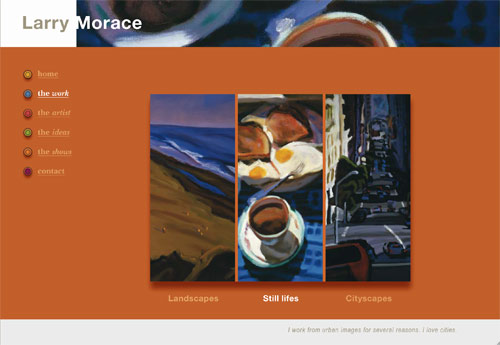
I fell in love with Morace’s paintings right away—the color and vibrant brush strokes seemed to have a life all their own. I wanted the website to reflect this vibrancy and allow the art to be the hero.
I started with a wide strip across the middle of the page, bordered by white on the top and bottom to frame Morace’s work. The painting in this area would change as you scroll over it. I may have taken a risk with the background color, but after trying a lot of colors, I found myself drawn to shades of orange. I felt this color complemented the work without overpowering it.
I also wanted to zoom in on the wonderful textures in the brushwork and make their abstract beauty a part of the page. It was fun to highlight small sections of the paintings and pull them out into the top border. Reversing the artist’s last name out and breaking the box with the negative space created a more organic transition between words and the art.
Helvetica Neue 75 bold was chosen for the artist’s name for a clean, modern face that didn’t compete with the art. For the subheads, I wanted something more traditional and friendly, so I settled on New Baskerville bold and bold italic. I incorporated Morace’s colorful palette in the navigation buttons, adding layers to create depth. I planned to put a quote from a famous artist on each page, but instead I chose Morace’s own words—they connect the viewer to the art in a more meaningful way.
ABOUT THE DESIGNER: Susan LeGrande
 Susan LeGrande got her first job in an ad agency before she graduated from college almost 30 years ago, back when agency creative departments were pretty much boys’ clubs. “I was usually the only woman,” she says, “but I was young and brash and took to the cursing and drinking right away.” After cutting her teeth at the largest agency in Arizona, she headed for San Francisco, where she became a Senior Art Director at Grey Advertising. She’s done just about everything from brochures about septic tanks (not a high point in her career) to big-budget TV shoots. Most recently, she spent six years at Publicis & Hal Riney working on the Sprint account. Susan now freelances from her home office in San Anselmo and loves it. The time she used to spend commuting she now spends hanging out with her son.
APPLICATION USED: Adobe InDesign 2.0
AFTER
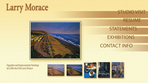
DESIGNER: Paul Dellostritto www.dellostritto.com
“The large, central image on the homepage is designed as a Flash area, where several pieces of Morace’s work would transition, keeping the site fresh.”
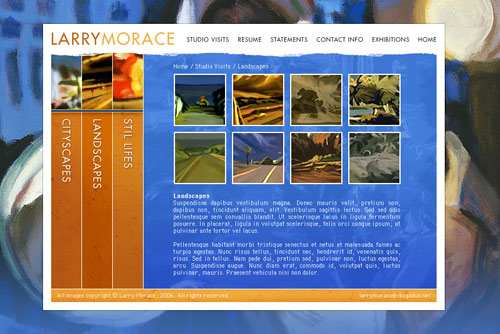
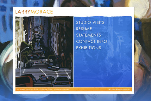
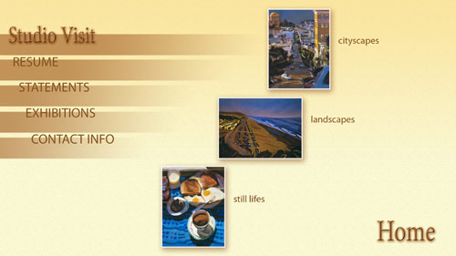
My approach for this project was to stick with hard lines and sharp corners and keep the navigation simple. Morace was very specific about not wanting a white background. So a close crop of one of his paintings seemed like the perfect choice for the homepage as well as the rest of the site. This would allow him the flexibility of having a pool of images (say four or so) that display alternately when someone visits the page. The large, central image on the homepage is intended as a Flash area, where several pieces of Morace’s work would transition, keeping the site fresh.
For the logo/wordmark, I chose a traditional Futura at medium weight for legibility, removing the word space and using a color shift to keep it a bit whimsical. I also used Futura for the navigation. For the Studio Visits page, the logo remains in the anchoring position. Subnavigation tabs to the left allow visitors to choose which genre of Morace’s work they want to view. Clicking on a thumbnail brings up a larger version with a description.
The nice thing about designing an artist’s site compared to a corporate site is that you have a bit more room for creativity and to push the limits of a normal header/content/footer page design. Because text is limited on Morace’s site, it was possible to make the artwork the main focal point, rather than text or the page design. My goal was to enhance the artwork, not hinder it. I hope I’ve achieved that.
ABOUT THE DESIGNER: Paul Dellostritto
 Graphic designer Paul Dellostritto says the dual influences of rural Ohio (he grew up in Youngstown, an old steel mill town) and the urban vibe of Pittsburgh, Pennsylvania, where he graduated from The Art Institute of Pittsburgh, have both left a deep imprint on his work. Four years ago, the 26-year-old designer moved to Little Rock, Arkansas, where he works for Aristotle, a 60-person website and interactive multimedia design firm. Paul’s personal and freelance digital work includes textile designs, as well as poster, logo, and CD/DVD designs. He also enjoys photography and recently did a series of color pictures of vintage toys (http://flickr.com/photos/pdellostritto). Paul shares a home in the quaint Little Rock neighborhood of Park Hill with his artist girlfriend Lauren and her 8-year-old daughter, Audrey, who he says proudly are both equally creative and talented.
APPLICATION USED: Adobe Photoshop CS2

