Design Makeover
Plaster Surgery
BEFORE
Client: Timeless Finishes — www.timelessfinishes.com


Stanley Rachwal started his Venetian plastering business about three years ago, after doing the work on a part-time basis for two years before that. “I started my plastering business at the tender age of fifty,” he says, “because I wanted to do something different.”
Rachwal describes Venetian plastering as “the latest faux-finish craze,” one that’s been popular in the United States for about seven years. But the technique itself has been around for thousands of years—long before Venice was an important city. Evidence of the method has been found in ancient sites in Iran, Turkey, Egypt, and, of course, Italy.
Venetian plaster starts with mined limestone that’s heated, dried, and crushed. The rock powder is then mixed with water, and after some time it becomes a sort of putty. Different substances (sand, ash, ground marble) can be added to the mixture to change the appearance of the putty. When a plasterer such as Rachwal applies the putty to a wall, it dries into a hard, marble-like surface.
Any plasterer can use the material, says Rachwal, but the trick is in learning to apply it to achieve the desired effect. Some of the finishes require him to apply up to three different kinds of putty in just the right way.
After three years, Rachwal has confidence that his business will survive and he’d like to replace his original logo, which he just slapped together quickly to have something to put on a business card. He likes how the current logo, based on a photo of a Roman column he found on the Web, suggests the antiquity of the process. But he doesn’t feel that it really portrays what he does. He would like a new, hipper logo that communicates the idea that Venetian plastering is an actual work of art, not just a faux finish. We asked three designers to come up with a logo and business card that say “hip” and “today,” as well as “timeless” and “Old World.”
AFTER
Designer: Russel Hempel — www.DaringEscape.com
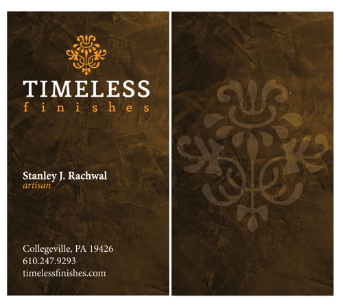
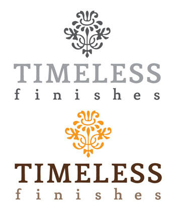
When I design a logo, I always begin by doing a black-and-white version and then add color later. My feeling is that a logo needs to look great in grayscale as well as color, since a logo gets used in so many places, not all of which use color (such as invoices, newspaper ads, etc.). Working this way also helps to keep the design simple.
I decided to combine a slab-serif or “Egyptian” font (Mido) with an intricate ornamental flourish to convey the skill and Old World artistry used in the work. The organic tones of the colors I selected, a rich chocolate brown and a deep orange, suggest the natural materials used in the process. I decided to dispense with the tagline “yesterday’s wall finishes…today” to further simplify the logo.
I elected to create a vertical business card to keep the layout clean and modern. With the exception of the logo, I kept all the type (set in Adobe Minion) left-justified for a more professional look and took the liberty of adding the title of “artisan” underneath the name. I think adding this title helps communicate the immense skill and training that it takes to master the Venetian plaster technique. I incorporated a textured background from a stock photo house, similar to the effects achieved with the plastering technique, to add depth and interest. An oversized, screened-back version of the flourish from the logo rounds out the design on the back of the card.
ABOUT THE DESIGNER:
 After serving as the senior designer for an in-house design department, Russel Hempel left to start Daring Escape Designs, a small studio committed to helping small businesses succeed. Russel has done work for a variety of clients, ranging from a website for a punk rock band to a catalog and marketing material for a high-end barbecue grill manufacturer. When he’s not cranking out fantastic design work, Russel can be found spending time with his wife, Dena, and their two sons, Noah and Hayden, in the beautiful southern California sun; playing guitar; or working on his 1921 Craftsman home.
APPLICATIONS USED: Adobe Photoshop CS3 and Adobe Illustrator CS3
AFTER
Designer: Reynaldo Gonzalez
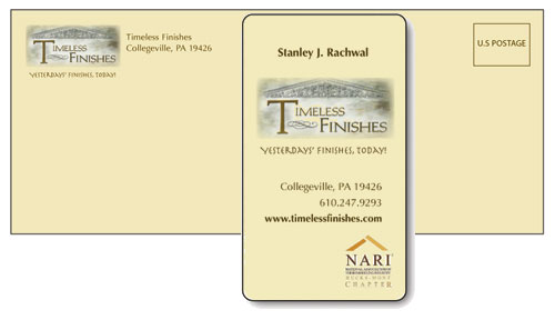
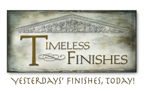
The old logo looks more like a slogan than a proper logo, and it’s not as upscale as the client’s work product. Furthermore, there’s no balance or consistency between the version on the business card and the version on the website—the latter is almost playful, which I don’t think represents the client’s artisanal techniques.
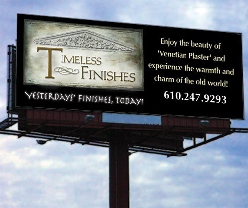
I wanted to create a logo that would reflect the look of materials used in a “timeless finish.” For the background, I scanned a piece of paper and applied different filters in Photoshop until I got a mottled effect reminiscent of the walls commonly seen in Rome and throughout the Mediterranean. I added a classical architectural image taken from the west pediment of the Temple of Zeus at Olympia, built around 470 B.C.E., depicting the Battle of Lapiths and Centaurs.
The font for the company name is Michelangelo BQ, a Venetian-style font designed by Hermann Zapf to be a titling font for Palatino. It goes well with the architectural image. For the tagline, I chose Herculaneum, which made me think of Rome and Roman orthography. For the rest of the business card I used Optima Regular and Bold. Optima is clean, fresh, and easy to read, which is very important when you want to send a message to clients. It also doesn’t call attention to itself and away from the type in the logo.
ABOUT THE DESIGNER:
 Born and raised in Mexico City, Reynaldo Gonzalez came to the U.S. when he was 21. In 1994, he met an illustrator who introduced him to the field of design. Inspired, he began his quest to become a graphic designer: in 1998, he received an Associate’s degree in graphic design, specializing in print design, from Platt College in Cerritos, CA, and he has continued his studies in the field at Santa Monica College.
As a freelancer, Gonzalez has worked for many sizes and types of companies and ad agencies, including Deutsch and Guess. He credits his cross-cultural experience with his versatility and ability to view tasks from varied angles. He loves his work and is still inspired by the creative process.
APPLICATIONS USED: Adobe Photoshop CS2 and Adobe Illustrator CS2
AFTER
Designer: feliciA chamberlain — www.felicia.us
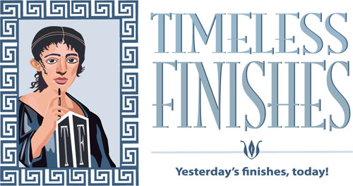

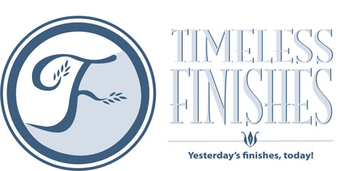
The current logo design for Timeless Finishes could be improved, in my opinion, for a variety of reasons. The graphic treatment of the column on the website feels more anthropomorphic than architectural, causing a disconnect between the intended purpose of the image and the message it’s trying to convey to prospective clients. The tagline, extending into the photo, disrupts the balance of the graphic treatment, and the wide tracking of the company name (also on the business card) doesn’t seem to have a clear purpose.
I wanted to make the business card and website work together to make a branding statement with at least one consistent element, especially since this is a relatively new business. I also wanted to evoke the modern with the historical, the new with the traditional.
The ancient Italians used to plaster their walls and paint them in distinctive styles. Most of the paintings are lost to antiquity, but some remain, like those preserved at Pompeii under the ashes of Mount Vesuvius. Using the Pen tool in Illustrator, I drew a female figure in the style of some of those preserved paintings. Hopefully, the woman will provide a talking point for Timeless Finishes’ owner and customers.
I thought a more Italian- or Roman-inspired font would be suitable, so I set the company name in ITC Mona Lisa Solid. The rest of the type is in Myriad Pro for a modern contrast.
The new cards contain personality and history, and in turn will create a lasting memory that should put Timeless Finishes at the forefront of a prospective client’s mind. Reaching for the card will be easy because it’s distinctive and the information is clearly outlined.
ABOUT THE DESIGNER:
 feliciA started her career at an early age, winning numerous art and writing contests. They afforded her the opportunity to study illustration and design with Alan E. Cober and Anita Kunz while earning her BFA with honors at State University of New York at Buffalo. She later went on to earn her MFA, magna cum laude, at the Academy of Art University in San Francisco in Computer Arts: New Media.
feliciA describes herself as a visual communicator and technologist because she combines her skills as an illustrator, designer, interactive designer, and programmer to create complete packages for a variety of clients. She actively engages in sketching, illustrating, and visual journalism. She continues to draw on the computer using Adobe’s Creative Suite and one of her Wacom Tablets as if it were her artbox.
APPLICATIONS USED:Adobe Illustrator CS2


