
Design a Coffee Brand Label in Adobe Illustrator
Follow this step by step tutorial to create a label design for a premium coffee brand. We’ll combine the styles of old and new with a mix of vintage patterns and contemporary typefaces to create a modern and sophisticated design. The final design will then be laid out on a printable template and mocked up on a Photoshop document. Click here to download the template.

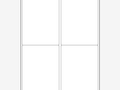
We’ll use the handy PDF template from World Label as a base for our coffee label. The WL-475 Multi Purpose label is a perfect fit with its portrait orientation and nicely rounded corners. Download and open up the PDF template file in Adobe Illustrator.

In order to select each individual template panel we’ll need to ungroup and release any Compound Paths. Right click and select the Release Compound Path option until you can select each individual segment.

Fill then background of the first section with a dark brown, then paste in a vintage pattern. This particular file is courtesy of Designious.

We’ll need to crop down the patten file to fit. First make a copy of the background fill using the shortcuts CMD+C and CMD+F. Bring this file to the top of the stack with the shortcut CMD+Shift+], then select both the pattern and the newly created rectangle and hit the Crop button in the Pathfinder window.

Draw a brown filled rectangle over the lower third of the label template, then paste in another copy of the background rectangle and use it as a tool to clip away the excess using the Intersect option from the Pathfinder palette.

Add a gradient to the rectangle fading from the dark brown to a slightly lighter shade. Adjust the Gradient settings to Radial then alter the flow to emit from the upper left.

Align a thin rectangle to the width of the label and the top of the brown fill to add a border effect. Fill this border shape with a brown-tan gradient.

Adjust the Opacity of both the brown panel and the border to around 80% to allow the underlying pattern to subtly show through.

Elsewhere on the document begin preparing the logo of the coffee brand. This particular company is completely fictional so we’ll need to quickly mock up a logo using a couple of cool typefaces. Obviously a live project would include the company’s branding files and guidelines.

Contain the logo in an oval, then go to Object > Path > Offset Path to create a border. Enter 1mm in the options window.

Ungroup the two elements to select the outer shape individually, then give it the brown-tan gradient fill.

Group all the elements that make up the logo file then position them centrally in the upper portion of the label file.

Choose a clean and contemporary sans-serif font to describe the coffee. Position the text centrally between the logo and lower panel.

Use a heavier weight version of the same typeface to describe the actual product. Some product information is more important then others, so use size and weight to give prominence to certain elements.

The overall label design is just about complete. It includes all the information we need for our coffee product. Group all the elements together.

Hold the option key along while dragging the group to make a duplicate. Carefully align the copies to the template file.

Before sending the labels off to print we can mock them up in a Photoshop file to preview how the label will look when applied to the packaging. Open up a stock photo file in Photoshop then paste in a copy of the label design. Press CMD+T to transform, then right click and select Distort. Drag the four corners into position to match the perspective of the product shot.

Use the Warp feature from the transform options to carefully alter the outline of the label to match the angles and shape of the product packaging to give a more realistic application.

Our final mockup really helps us see how the design and branding will be continued to the packaging once the label graphics are printed and applied.
