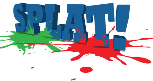
Create Perspective Using Simple 2D Art with Illustrator CS4
Like most things in design, you can make quite an impact by modifying how people perceive things. In this tutorial, we’re going to create a 3D effect using simple 2D art, demonstrating how effective a little perspective can be.
1 [CREATE NEW RGB DOCUMENT]
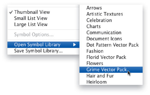
Choose File>New, select Basic RGB from the New Document Profile pop-up menu, and click OK. Open the Symbols panel (Window>Symbols), then click the flyout menu and choose Open Symbol Library>Grime Vector Pack.
2 [DRAG SYMBOL ONTO ARTBOARD]
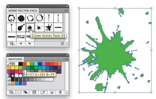
Next, click-and-drag Grime Vector Pack 09 from the Grime Vector Pack panel onto the artboard. Go up to the Control panel and click the Break Link button. This will turn the art into a regular shape rather than a symbol instance. Open the Swatches panel (Window>Swatches) and choose a bright green color for the shape.
3 [DRAG SECOND SYMBOL ONTO ARTBOARD]
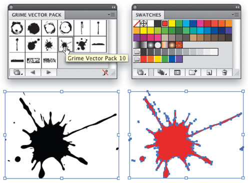
Go back to the Grime Vector Pack panel and click-and-drag Grime Vector Pack 10 onto the artboard. Once again, click the Break Link button to turn it into a regular shape. Then choose a red color for this shape in the Swatches panel.
4 [TURN SHAPES BACK INTO SYMBOLS]
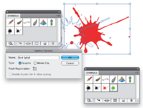
At this point we have two splat shapes: a red one and a green one. With the Selection tool (V), take these shapes and turn them back into symbols by dragging them into the Symbols panel. In the Symbol Options dialog that appears, choose Graphic and give each symbol a name. This will also turn these existing shapes on the artboard into symbol instances.
5 [CHANGE PERSPECTIVE OF SYMBOL]
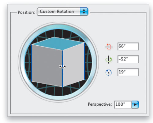
Select one of the shapes and choose Effect>3D>Rotate. This will allow you to rotate the object in 3D while still being 2D. In the 3D Rotate Options dialog that appears, you can grab the cube and rotate the object freely, or you can input the numbers manually for exact positioning (click the Preview checkbox to see your changes). To rotate the object on a specific axis, place your cursor where any two sides of the cube meet in the dialog. The colored lines correspond to a specific axis, as indicated on the right. As a final touch, set the Perspective to 100° to give it an exaggerated perspective that adds more interest.
6 [APPLY SAME ROTATION TO SECOND SYMBOL]
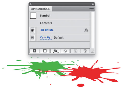
Repeat Step 5 for the other symbol to apply the same 3D rotation, then position them so they overlap each other, as shown here. If the perspective seems off, you can always modify the 3D settings of either symbol. To do this, select a symbol, open the Appearance panel (Window>Appearance), and click the 3D Rotate effect.
7 [ADD TEXT; CONVERT TO OUTLINES]
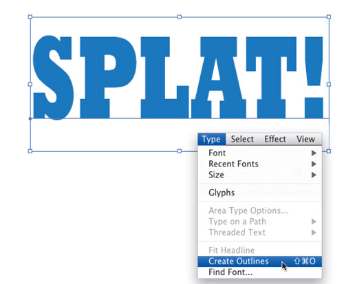
Select the Type tool (T) in the Toolbox. While you may use any word you like, we’ve chosen to be obvious and use the word SPLAT! We’re using a very bold font called Rockwell Extra Bold. Switch to the Selection tool, then go into the Swatches panel and choose a color that will go along with the red and green; we’re using blue. Now convert the text to outlines by choosing Type>Create Outlines.
8 [POSITION TEXT]
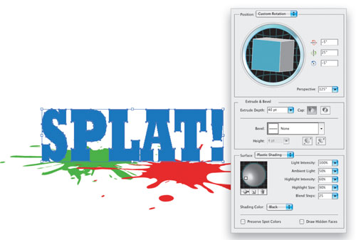
With the Selection tool, position this text over the 3D splats and resize to taste. Then, choose Effect>3D>Extrude & Bevel. What we need to do here is use the current 3D splats as a guide for the perspective. You can grab the cube and position the text in 3D. Notice we set the Perspective to 125° for a more exaggerated look. Also, set the Extrude Depth to 40 pt. Next, click the More Options button to reveal the lighting controls. Grab the light handle on the sphere and position it so it’s front and left of the sphere in relation to the text itself. Click OK.
9 [ROTATE LETTERS]
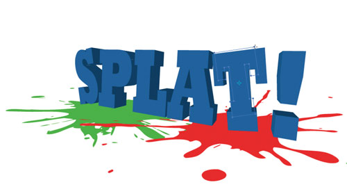
We have the text in 3D, but it needs something extra because it looks like it just slammed down on the floor. Because the 3D effect is a live effect, we can modify the original shapes of the text and it will be updated as we change them. Grab the Direct Selection tool (A) in the Toolbox and select any one of the letters. Then grab the Rotate tool (R) and give the letter a slight turn. The 3D effect will redraw based on the new position. Do this to a couple other letters, slightly varying the rotation.
10 [ADD SHADOWS]
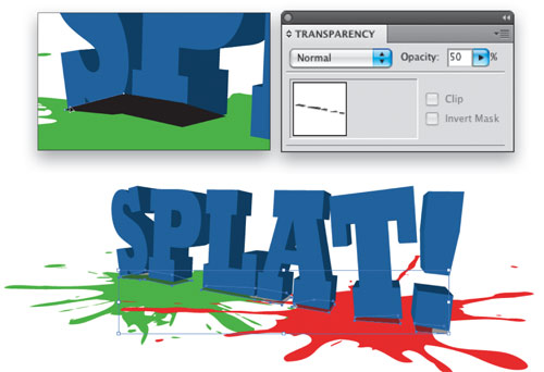
Select the Pen tool (P) in the Toolbox and set the Fill color to black up in the Control panel. Draw some shapes at the bottom of the letters that conform to the contour somewhat, as these will be shadows. Once all the shapes are done, choose the Selection tool and Shift-click each shadow area to select them. Open the Transparency panel (Window>Transparency) and lower the Opacity to 50%. Now we need to put these shadow shapes behind the letters. Click on a letter with the Selection tool and choose Object>Arrange>Bring to Front.
11 [MAP ART]
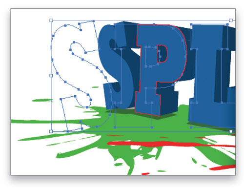
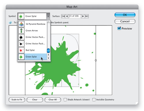
Let’s go back to those colored splats we created earlier. We’re going to make it appear as if some of the color splashed up onto the letters. With the text still selected, open the Appearance panel and click on 3D Extrude & Bevel. In the 3D Extrude & Bevel Options dialog, click on the Map Art button to open the Map Art dialog. The current surface is indicated by a red outline on the art itself. To get to the front face of the letter P, toggle through the numbered surfaces at the top of the Map Art dialog until the red outline selects it.
12 [ADD SPLAT COLORS TO LETTERS]
With the P selected (the outline, not the solid), click the Symbol menu and find the splat symbols. Select the green one and it will apply to the letter. If the graphic comes in really big, click the Scale to Fit button at the bottom, then drag it toward the bottom of the letter. Make sure the Preview button is checked so you can see the result. Use the control handles on the bounding box to resize and rotate the symbol as necessary. Continue to add these splats to other letters and this will result in a cool splash effect on the text.
Final Image
