
Artistic Expression: Logo Design from Start to Finish
Logo design in today’s world is totally underrated. People don’t understand how important a good logo is and how valuable it is to their business. Let me guide you through the basics of what makes a good logo, while also walking you through the process of creating the identity and logo design for one of my recent clients, Vero, a limited liability company based in Miami, Florida. Hopefully, this will give you an understanding of what actually goes on behind the scenes while creating a professionally designed logo.
What is a logo?
To understand what a logo is meant to do, we should first know just what a logo is: It’s one aspect of a company’s commercial brand or economic entity, and a logo’s shapes, colors, fonts, and images usually are different from others in a similar market. Logos are also used to identify organizations and other noncommercial entities. A logo’s design should make us immediately recognize the company—it should inspire trust, admiration, loyalty, and an implied superiority.
What makes a good logo?
A good logo is distinctive, appropriate, practical, graphic, simple in form, and should convey one message. An effective logo usually has a concept, or meaning behind the logo, that allows it to communicate the intended message. It should be printable at any size and be effective without color.
With these things in mind, it would be safe to say that a great logo usually comes down two things: a great concept and great execution.
The design process
When creating a logo, follow a logo design process that ensures the final design suits the client’s needs (not their wants). Here’s a list of what’s essential to the logo design process:
• Design brief: Start with a questionnaire or interview with the client to get the design brief.
• Research: Conduct research focusing on the industry, its history, and its competitors.
• Reference: Look at logo designs that have been successful and current styles/trends that may be related to the design brief; however, don’t follow trends just for the sake of it. Longevity in logo design is key.
• Sketching and conceptualizing: Develop the logo design concept(s) around the above-referenced brief and research.
• Reflection: Take breaks throughout the design process to allow your ideas to mature. This also helps to renew your enthusiasm and get feedback.
• Positioning: Position yourself as a contractor or build a long-lasting relationship with the client; for example, the client tells you what to do or you guide the client to the best solution. The latter is usually best.
• Presentation: Present only your best logo designs to your client. PDF format usually works best. You may also wish to show the logo in context to help the client visualize the identity.
• Celebration: Drink beer, eat chocolate, sleep, then start on your next project.
Getting the job
Now that you have an insight into the logo process, let’s go through it in more depth, using a recent job as an example. When the CEO of Vero contacted me late last year (he found me through my blog), the company was looking for a complete branding package for a new business they were launching. Not only did they want a logo and identity design, they also required the design of the actual product.
After going through the Vero business plan, numerous emails, and having them fill out a questionnaire (it’s available on my website), I had a good idea of what the whole project entailed. So, I did the math, sent them a proposal and agreement (never call it a contract!), and received a 50% deposit.
The brief
Before walking through the design process, here’s some background information on the project along with the design brief.
Sparked by environmental concerns, many hotels and restaurants have recently stopped selling bottled water and, instead, they’re serving either plain or filtered tap water. Vero offers restaurants, cafes, and hotels an eco-friendly bottled water alternative. The company uses the latest in microprocessor-controlled, water-purification technology to purify, chill, and carbonate (if needed) tap water at the point of use.
Without going into too much detail, the brief was to design a “South Beach chic” glass bottle that made people “feel cool drinking it.” The bottle should scream “practicality,” “environmentally conscious,” and should be something that “a celebrity would be pictured drinking.” The target market would be high-end hotels and restaurants—places where people would expect to pay $7 for a bottle of imported water.
In its purest form, the brief was to create a logo that could be placed on a glass water bottle and portray all of these things.
Research and reference
After the brief was clarified, the deposit received, and the agreement signed, the research began. This included researching Vero’s competitors, the industry, target market, location, other logos, and so on. Only after you’ve carried out a thorough research should you move on to the design development.
Sketching, reflecting, and developing
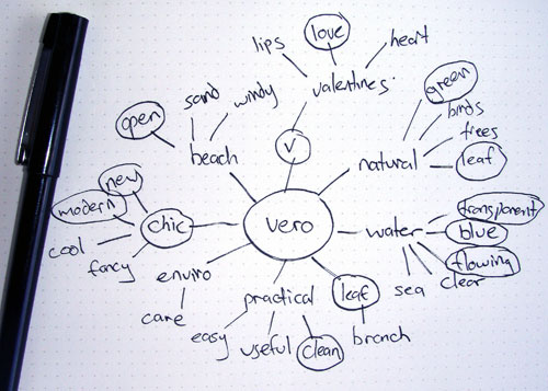
After the client signed off on the bottle shape and tag line (“Earth’s Purest Drinking Water”), the project’s next phase was to develop the logo. And this is where creativity comes into play. Based on the design brief and research conducted, this is where I let my ideas run wild.
I started by brainstorming and sketching my ideas and then experimented with them on the computer. A crucial part of this process is that I took breaks between these sessions to reflect on the designs and get a fresh perspective on the job at hand. The challenge that I had when creating the Vero logo was trying to incorporate “chic,” “practicality,” and “environmentally conscious” into one logo, while also making the logo look like it was for a high-end market.

Brainstorming ideas on paper
Here’s a page of my original sketches. I know I’m no Picasso but it’s the end result that counts. Remember: There are no bad ideas, just bad decisions.
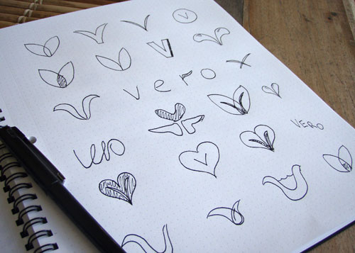
Original sketches
Computer generation: As you can see, I had the idea of creating a “V” from two “leaves” of water. With a general idea in mind, I experimented with the concept in Adobe Illustrator, creating some rough, vectorized logos.
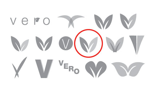
Experimentation results in Illustrator
Tip: This is a good time to advise that you should always design a logo in vector format to ensure that it can be scaled to any size. And you’ll note that I haven’t yet added any color. That’s because it’s best to focus on the shape and concept of the logo at the start of the process and then add color toward the end.
The concept for my final logo was based around two leaves forming the letter V, not just once, but twice. The middle V in the negative space suggests the shape of a leaf in a creative and clever manner, making it a memorable and identifiable mark. I left the bottom of the letter V open to suggest that the source was renewable—as if the leaves were coming out of the earth.
Typeface: After experimenting with a variety of logos, I then tried out typefaces. Keeping in mind the considerations stated in the design brief, I chose Bauhaus Light for its geometric, clean lines—these type characteristics will give Vero the look of a modern, fresh, and sustainable company. Bauhaus Light is also a very pretty typeface, which makes it great for display purposes and it looks great in both horizontal and vertical formats. The added spacing between each letter gives it a touch of class and luxury.
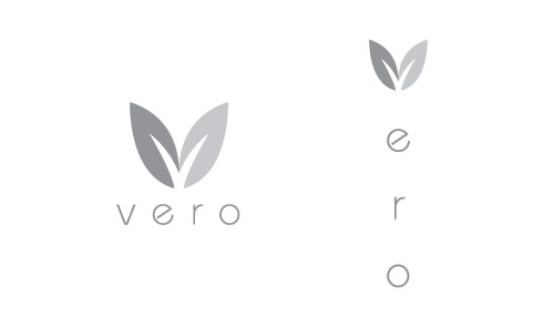
Bauhaus Light works very well for both vertical and horizontal versions of the logo
Presentation and color
Now that the typeface and logo concept were finalized (though this is never set in stone), I sent through one concept to the client. Why only one? It’s important to show only your best logo design concepts, not a large array of options. You’re the designer and should know best. You’re not there to say, “Here are 20 concepts, pick one.” This may just confuse the client.
The logo was approved straight away and we moved onto color choices. I experimented with a large variety of colors, keeping in mind how the logo would look on the bottle design and what each color would portray (your knowledge of color theory is vital here).
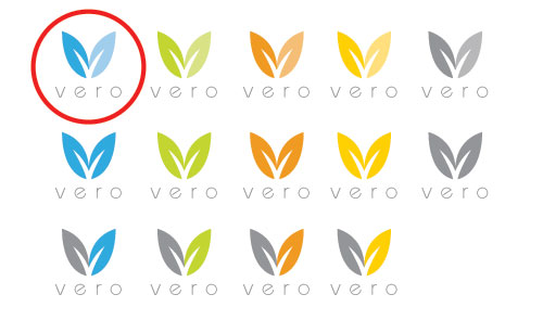
Experimenting with colors
After coming down to a few select colors that reflected the values stated in the design brief, I sent through these options and we agreed that the blue/light-blue variation was the best color for Vero.

The final approved logo
Time to celebrate
The client agreed to the final colors, logo, and tagline and sent the final 50% payment. I then completed a mock-up of the bottle design in MAXON CINEMA 4D. The horizontal version of the logo is featured on the back of the bottle. (As this article is being published, the bottle is being manufactured in China and a website will follow soon thereafter.)
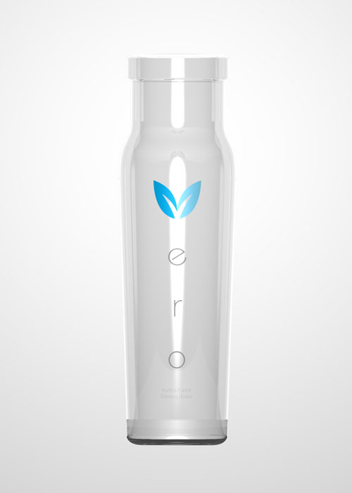
Mock-up of bottle

