
The Art of the Second Page
It’s so ordinary that it seems almost insignificant, but one of a designer’s most challenging assignments is to follow a beautiful front page with a beautiful inside page. What makes it hard is that no matter how good your front page is, inside is a different space with different words and a different purpose. Inside must reinforce the outside while flowing naturally from it, yet communicate its own unique message. How do you do this? It’s fair to say that more designers stumble here than in any other routine task.
What we’ll do in this article is design four CD jewel cases and accompanying CDs. The jewel case conveys the first impression; the CDs themselves provide the follow-up. Each must stand alone, yet both must work together.
In every case, the key to a successful second page is simplicity; the second page should be a lesser and simpler version of the first. By repeating typefaces and colors you create continuity.
You’ll face this task everywhere, not only on CDs but in books, brochures, webpages, PowerPoint presentations—everywhere that one page follows another.
Let’s have a look at four good techniques.
Repeat the Center of Interest
A beautiful jewel-box cover has been carefully cropped from a larger image. Key in this case is placement; note (below right) that the seashell’s position defines the margins containing the type. A repeated image brings built-in continuity of shape, color, and texture, and makes a fresh, bold statement. The inside is clearly a subset of the outside, yet has its own distinctive presence. Hierarchy: With a strong, central image, the rest of the layout should work in support. The easiest way to do this is to center the design, which moves the eye down the page in a straight line (right). Similarly, you want the type to recede: Set it small (smaller than you’d think), and color it gray (far right) or a light tint of the image itself, which yields a handsome, minimalist look. |  When your cover has a strong focal point like this one, mask its background and bring it inside. Alone on a white canvas, it will stand out in striking relief. |
 |
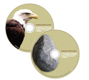
Find something in the scene
| If the outside is big, make the inside small. Bring something from the forest inside–a pine cone, an eagle, a rock– and you’ll create a beautiful contrast of far and near.A forest is vast, panoramic, and distant. A small object brings it close, puts it at human scale, makes it touchable.
|  |
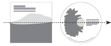 Simple alignment helps bring the outside in. |
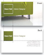
Make your own object
| Draw a shape–simpler is better–atop your image, then repeat it inside. This beautifully modern look is especially handy if your cover image has no available follow-up.Cool and low-key, note in each of the designs that similarities–shapes, sizes, colors–and opposites–dark, light–work easily together. Note especially the very small type; it takes real restraint to to set your own name in 14-pt type, but the results couldn’t be classier.
| 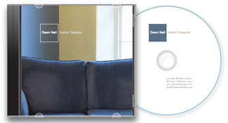 |
  Note the positive-negative use of color.Position the shape in the same place on both sides, then align the type blocks neatly to it. Be consistent and simple; note the clean, straight lines of sight. |
Lift out one title
| Tell the rest of a story. Here, a buildit-yourself cover grid of doors prepares the viewer for the “key” inside–a single tile lifted out and enlarged.At first glance, what you see is a collage of doors. The fun is that you can hide your message on the cover, and then reveal it inside. It’s the only image with a key, appropriately tying it to the message “Unlock your imagination.”
Tint the type color to blend with the image. |  |
 |

Simplify with similar colors
| A grid of dissimilar images is naturally complex and must be simplified. An easy organizational technique is to create one row of similar colors. | ||
 | ||
![]() John McWade is a designer, teacher, and author who has been at the forefront of the graphic design and desktop publishing worlds for two decades. He is founder, publisher, and primary voice of Before & After magazine (www.bamagazine.com; email: layers@bamagazine.com).
John McWade is a designer, teacher, and author who has been at the forefront of the graphic design and desktop publishing worlds for two decades. He is founder, publisher, and primary voice of Before & After magazine (www.bamagazine.com; email: layers@bamagazine.com).

