
Design Makeover: Content Maven
The Business is All about Content—Three Designers Give It Some Style
BEFORE
CLIENT: Meryl Evans www.meryl.net

“Meryl prides herself on meeting deadlines and making the client happy, so the logo should communicate her competence and professionalism.”
Meryl Evans has a writing business with a wide variety of clients, ranging from high-tech publications to newspapers to her own blog. Unfortunately, her business has also had a variety of logos, and the current one “isn’t getting good feedback,” she says. Moreover, it’s based on a business name that started out as something of a placeholder itself. On her site, she describes how she registered the name on the assumption she’d think of a better one later. But she never did. And the “.net” part, which was distinctive in 1995 when she came up with it, is no longer the differentiator it once was.
What she does like is her tagline, “content maven,” because it perfectly describes what she does. Although she has that domain name registered, she doesn’t think it makes a good business name because it sounds more like a role than the name of a company.
What she wants is a logo that projects the image of being worth the price. Meryl prides herself on meeting deadlines and making the client happy, so the logo should communicate her competence and professionalism. It should also work on paper as well as online, and should lend itself to resizing as needed.
We noticed that the meryl.net website seldom talks about meryl.net the business—most of the references are to Meryl Evans the person. So before we turned three designers loose on her logo, we asked her if they could work with her name or tagline instead of the admittedly unexciting business name, and she replied, “Yes. I’m very open-minded about this.”
AFTER
DESIGNER: Daniel Writer www.danielwriter.com


“I decided to approach the job with a style meant to mimic old-fashioned newspaper print.”
The first thing I did was visit Meryl’s current website (www.meryl.net) in order to familiarize myself with the idiosyncrasies of her style. I began playing around in Adobe Illustrator with a number of different fonts, but for some reason everything I created looked too reminiscent of the existing logo. At that point I ceased working on it, but I didn’t stop thinking about it and looking for inspiration.
The following day I was working on an entirely different project and experienced an epiphany. I decided to approach the job with a style meant to mimic old-fashioned newspaper print, which I thought would communicate a sense of professionalism that was lacking from the previous logo, in addition to suggesting the craft of writing. I chose the Adobe font Minion Pro because it has a polished, classical look that again lends an air of professionalism.
Initially, I tried to work with the website name, but it’s not really effective in describing who Meryl is and what she does. Using her name plus title takes care of that—it says exactly who she is and what her specialty is. Besides, considered just in terms of design, her full name is much easier to work with than “meryl.net.” Placing the Web address under the logo still directs people to her website.
ABOUT THE DESIGNER: DANIEL WRITER
 At 22 years old and with only three years of experience, Daniel Writer is admittedly young. His pieces, however, possess a polish that matches designers with many more years of experience. Writer has an innovative design style all his own that one could label as distressed avant-garde with a little science fiction thrown in for good measure. Writer’s adroitness has not gone unnoticed: despite his short tenure in the industry, he has an international client base.
Writer currently works for 3rd Studio (www.3rdstudio.com), a graphic design, Web design, Web development, and Web hosting firm in Yakima, WA. Keep your eyes peeled for more from this up-and-coming design star.
APPLICATION USED: Adobe Illustrator CS
AFTER
DESIGNER: Karen Johnson www.kj-creative.com


“The two meanings of the bracket symbol connect traditional writing of the past with the technology writing of today.”
My goal was to design Meryl a logo that expressed that she’s an experienced, dependable writer with a strong work ethic. I decided to base the logo on her name because she works directly with her clients on projects. I kept “content maven” as part of the logo since it sums up her profession, and the nickname helps her stand out from competitors in the field.
I began the project by writing down a series of words and sketching out images associated with the writing profession. I wanted to find something more abstract than the typical imagery (pens and pencils) that relates to her industry. I started experimenting with and researching different symbols and learned that curly brackets or braces ({}) are used in writing computer programs. I thought that would be an interesting tie-in to the mostly technology-related content Meryl writes. I turned the bracket on its side and realized how similar it was to the shape of an open book. The two meanings of the bracket symbol connect traditional writing of the past with the technology writing of today. The main elements of the logo—the M and the bracket—can also be pulled out into a secondary icon for use on different sections of her website or, as I did, applied to the back of a business card.
I selected the font CM Tiempo, designed by Charly Masci, with its unusual serifs, to create a polished yet distinctive impression for her name. The simple, clear Trade Gothic makes a good complement. I applied contemporary colors to the logo to convey an up-to-date and professional image for Meryl.
ABOUT THE DESIGNER: KJ CREATIVE
 Karen Johnson is a graduate of Hussian School of Art in Philadelphia. Since graduating in 1999, she has gained experience working as a full-time designer in both ad agency and corporate environments. Karen has created design solutions for various projects including corporate identity, outdoor advertising, display materials, and direct mail. “I’m excited to contribute to an industry where design is constantly evolving and technology is so rapidly advancing,” she says.
In addition to working full-time, she runs a freelance design firm, KJ Creative, where she has a growing list of clients and projects. A brochure design she developed for an international pharmaceutical company was selected for publication in the 2005 Graphic Design USA Awards Annual. Karen would like to acknowledge Louise Adams of Studio West design firm, who has been a trusted mentor and friend throughout her career.
APPLICATION USED: Adobe Illustrator CS
AFTER
DESIGNER:Randy Nicholson www.practicaldesign.biz
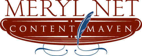
“I chose old style serif fonts to give a sophisticated feel to the design.”
The overall intent for my design is to exemplify the long experience Meryl has with writing. Keeping in mind the up-to-date website design of meryl.net, I wanted to design a logo that would easily unite the two.
I chose old style serif fonts, Trajan and AT Sackers Light Classic, to give a sophisticated feel to the design. They also matched up well with the thickness of the lines within the logo. The wispy curves creating the ornaments below the logo recall the appearance of handwriting created by a feather, used by traditional artisans of writing. The colors were chosen to complement the style and design.
The letterhead demonstrates the use of the logo. Keeping the design clean and elegant, I used simple lines and curves to frame the masterpiece created by the “content maven.” I wanted the business card to contrast with the letterhead but still give the same feel and use the same shapes. Once again, I framed the logo on the front of the business card and kept the contact information on the back.
To create the logo, I used Illustrator CS2. For the letterhead and business cards, I used both Illustrator and InDesign CS2. I took advantage of the capabilities the Creative Suite offers with using native files and copying-and-pasting vector art into InDesign.
ABOUT THE DESIGNER: PRACTICAL DESIGN
 Randy Nicholson resides in the music capital of the world, Austin, Texas. Currently finishing his studies at Austin Community College, he works for a printer in the graphic and prepress department. This has brought tremendous experience for the print side of design.
Randy launched a company a couple years ago and has since acquired several big clients. “I love being creative, and molding my company into what I want most for a design firm is another creative talent.” He has always loved being creative and pursues numerous hobbies that use his creative talent; for example, collecting model trains. “My younger years, I spent numerous days just drawing on the floor with my mom asking me not to waste paper. Little did she know where that would lead me.”
APPLICATIONS USED: Adobe Illustrator CS2 and Adobe InDesign CS2

