
Get Your InDesign CS2 Tips While They’re Red Hot!
As we wind down our tutorials on Adobe InDesign CS2 and ramp up for InDesign CS3, I thought I would leave you with my favorite killer tips for InDesign CS2. Using these tips will save you time and make working with InDesign just that much easier.
TIP 1 Fit Text Frames to Content
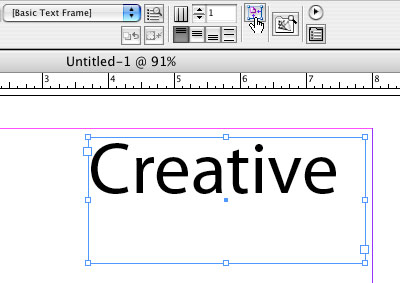
This tip falls under the category of Good Document Hygiene. Unless you’re perfect (and who is?), when you draw a text frame by hand with the Type tool (T), you usually end up with a frame that’s larger than you need. No problem. Go ahead and key in your text. Then, switch to the Selection tool (V) and click the Fit Frame to Content icon right on the Control palette. Your frame will be sized down instantly to the size of the text.
TIP 2 Use the Eyedropper to Copy a Frame’s Attributes
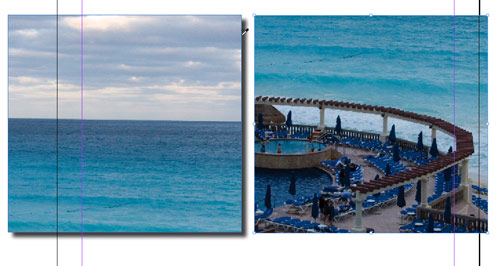
With object styles, you can save a frame’s attributes and then apply that style to other objects. However, if you just want to copy the attributes from one frame to another, you can do it with the Eyedropper tool (I)—if you know the secret. Since you’re copying the frame’s attributes, use the tip of the Eyedropper on the edge of the frame, not inside the frame. Select the object that you want to copy the attributes to, and then with the Eyedropper, click just to the right of the frame containing the attributes that you want to copy.
 Terry White
TIP 3 Apply Text Attributes to Multiple Text Frames
Most of the time you probably highlight text with the Type tool (T) to change its attributes. However, if you want to change the attributes of text that’s located in several unlinked frames, it can be a pain highlighting the text frame by frame. So instead, grab your Selection tool (V), hold down the Shift key, and select all the frames that you want to change. Switch back to the Type tool so all your text options are available in the Control palette. As you make your changes, all of the selected text frames will update.

TIP 4 Display Your Menus Items in Alphabetical Order
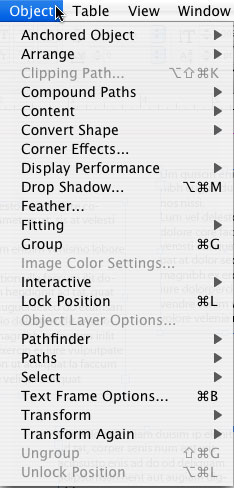
This is a hidden one, but a cool one. You can display the options under any InDesign CS2 menu in alphabetical order. Just hold down Command-Option-Shift (PC: Ctrl-Alt-Shift) before you click on the menu.
TIP 5 Drag-and-Drop Multiple Images to Your Page
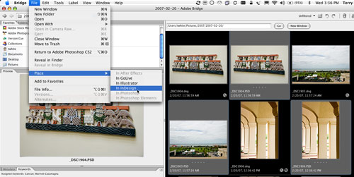
I do this one so often that I take it for granted. When you want to lay out multiple images, rather than bringing them in one by one, select them all in Adobe Bridge and either drag-and-drop them onto the page or use the Place>In InDesign command under the File menu in Bridge.
 Terry White
TIP 6 How Much Text is Left?
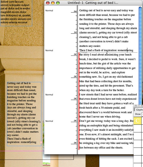
When you place text into InDesign, say from a Word document, and the text doesn’t all fit into the frame, you get a red plus sign indicating that there’s more copy. At one point or another, you’re going to ask, “How much text is left?” You can easily find out by bringing up the Story Editor (Command-Y [PC: Ctrl-Y]). A red line will indicate the part of the text that’s not fitting in the frame. You can either edit down the text or adjust your layout.
TIP 7 Fill Frame Proportionally
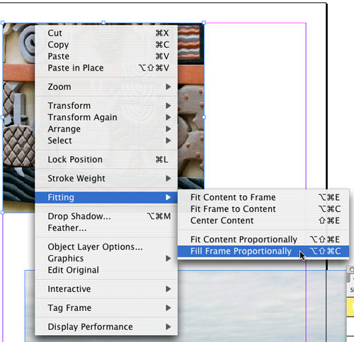
My favorite InDesign CS2 fitting command is Fill Frame Proportionally. When I’m placing photos into a layout, most of the time I want my image to fill the frame even if it means some of the image will be cropped. Create a frame and place an image into it. Either click the Fill Frame Proportionally button in the Control palette or choose the option from the Fitting submenu under the Object menu. Your image will be scaled to fill the entire frame.
TIP 8 Enable Dynamic Spelling
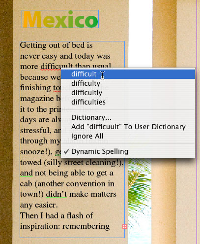
One of the only reasons I used to use Word to input text was because of the ability to check spelling as I typed. Now that InDesign can do this, I enter my text in the app that I’m going to be laying out my content in. To enable Dynamic Spelling, choose it from the Spelling submenu under the Edit menu. When you type a word that’s not in the dictionary, you can either correct it manually or Control-click (PC: Right-click) on it to bring up a contextual menu of probable words to choose from.
TIP 9 Apply Gradients to Text
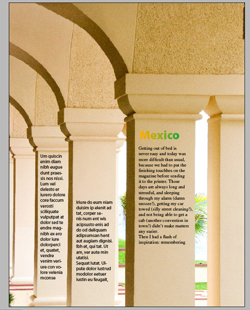
Not only can you apply a color to your text in InDesign, you can also apply a gradient. First, create a gradient swatch using the colors you want. To create a gradient swatch, highlight your text, open the Swatches palette, click the right-facing triangle to access the flyout menu, and choose New Gradient Swatch. In the New Gradient Swatch dialog, click the color stops to edit the gradient (keep an eye on the Stop Color pop-up menu to make sure you’re in the correct color space). When you’re done, click OK and InDesign applies the gradient to your text.

TIP 10 Work in Preview Mode
While it’s great that InDesign has a variety of onscreen guides and other elements to help you lay out your pages, sometimes you just want to see what the document would look like on the printed page. You can quickly switch to Preview screen mode by pressing the letter W on your keyboard (as long as you’re not currently entering text). However, rather than pressing W again to switch back to Normal screen mode, go ahead and work in Preview as much as you can until you need to see your guides, grids, bleeds, etc. again.
 Terry White
TIP 11 Add Curves to Your Text Frame
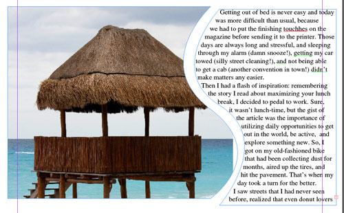
Whenever I show this feature to a room full of people, the crowd always oohs and aahs. Although standard text frames are rectangular, they don’t have to stay that way. Create a text frame and enter text into it. Now, switch to the Pen tool (P) and click-and-drag right on the edge of the frame to create a curve point. Your text will reflow to follow your new curve.
 Terry White
TIP 12 Patient User Mode
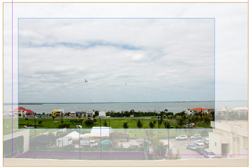
InDesign will show you more info—if you’re patient. When you place an image in a frame and the image is larger than the frame you created, you can pan the image around in the frame using the Direct Selection tool (A). However, if you click-and-hold on the image for two seconds, you’ll see a ghosted preview of the areas that are cropped out before you drag the image around.
 Terry White
TIP 13 Use Pathfinder to Create Odd-Shaped Frames
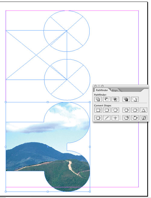
While it’s possible to create irregular-shaped frames with the Pen tool (P) or the Pencil tool (N), it does require a little drawing skill. You can create irregular-shaped frames much easier by joining multiple shapes together using the Pathfinder palette. Create two or more frames and overlap them (they don’t have to overlap if you’re trying to create a windowpane effect). Bring up the Pathfinder palette from the Window>Object & Layout submenu. When the palette appears, select all of your frames and click on the Add button to convert your multiple frames into one.
 Terry White
TIP 14 Use Your OpenType Fonts
One of InDesign’s most powerful features is how it handles OpenType fonts. When you choose the Font submenu from the Type menu, your OpenType fonts will be preceded by an O. When you use OpenType fonts, there are potentially hundreds or thousands of alternative glyphs for each character. Type a word using an OpenType font, then highlight just the first letter. Now bring up the Glyphs palette from the Type menu. Choose Alternates for Selection under the Show pop-menu, and if there are any alternate characters for you selected character, you’ll be able to double-click them to choose them.


