
The Art of Type: Space Exploration
Ems, Thins, Spacebands—There’s More to Empty Spaces Than Meets the Eye
All typographic spaces derive from the em, the width of which equals the point size of the type you’re setting. For example, an em in 12-point type is 12 points wide and in 20-point type, it’s 20 points wide. (Its width has nothing to do with the letter “m,” which can have any width a type designer decides.)
The spaces between characters are expressed in fractions of an em, generally thousandths. If you specify the distance between two characters in points and then double their size, the characters will look too close together. But if you specify that distance in fractions of an em, their relative spacing will remain constant at any size. This is why kerning and tracking adjustments are made in fractions of an em.
A multitude of spaces
Spaces come from two sources: fonts and applications. The width of a word space (or spaceband) is defined in your fonts, and it’s usually about a quarter of an em. Word spaces of faces with wide characters are wider than those of condensed or compressed faces. A key characteristic of the word space is its unpredictability: Its width is subject to change when text is being composed.
Another space that’s built into every font is the nonbreaking space, which has the same width as a font’s word space, but it isn’t a legal place for a program to break a line. Two words linked by a nonbreaking space will always appear on the same line. If you were writing about the poet ee cummings, for example, you might want to link his initials and his last name with a nonbreaking space to prevent the curious morsel ee from ending up at the end of a line by itself.
A space that should be in all your fonts (but usually isn’t) is the figure space. Fortunately, InDesign offers one of these. It’s the same width as a face’s lining numerals (the set of numerals, whose widths are identical in order to line up in tables, as opposed to old-style—or lowercase—numerals, whose widths typically vary). Figure spaces are great for aligning material in numeric tables. In the table shown, the dollar signs align despite the varying number of digits in each entry. The trick: Go to Type>Insert White Space and use figure and punctuation spaces (see below) to fill in for commas and numerals in the shorter tab entries. All numeric values are simply set flush right.
 CREDIT: ©ISTOCKPHOTO/KATIV
An ally of the figure space is punctuation space in InDesign, which has the same width as a face’s punctuation marks and can be used as a placeholder for decimal points or commas.
Fixed vs. relative spaces
In “typographese,” all of these are referred to as relative spaces; that is, their width isn’t constant, and your program is free to flex them as needed to achieve various composition goals—most commonly justified margins. Equally important are fixed spaces, such as the em, which are generated by your programs.
Once a fixed space’s point size has been defined, it will maintain its width no matter what. You can force justify a line to stretch its spacing to extremes, but an em space in such a setting will always remain exactly one em wide.
Numerous fixed spaces derive from the em. The en space (again, no bond to the letter “n”) is half-an-em wide. In InDesign, the thin space is 1/8 em wide, and the hair space is 1/24 em wide, although these last two aren’t universal standard sizes.
Spacing tips
All spaces, except the word space, are available in InDesign from the Type>Insert White Space menu. Photoshop and Illustrator don’t offer fixed spaces, so if you need them, you’ll have to fake them: Set en and em dashes (Option-– [PC: Alt-0150] and Shift-Option-– [PC: Alt-0151]), respectively, and strip their color to make them invisible.
To create gaps in a line of type, never use multiple word spaces, because their widths are ambiguous and fluid; instead, use fixed spaces. To keep a series of spaces from being divided at the end of a line, select all of them and choose No Break from the Character panel’s flyout menu.
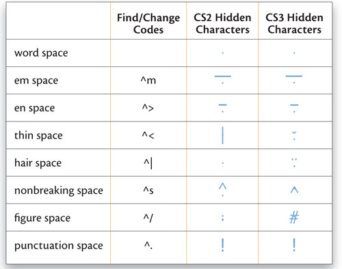
Turning on Show Hidden Characters under the Type menu (Command-Option-I [PC: Ctrl-Alt-I]) reveals the unseen formatting commands and lets you identify the different kinds of spaces in your text, using the shorthand codes shown in the chart below. The chart also shows the codes to use in the Find What field of the Edit>Find/Change dialog when searching for various types of spaces in your text:
To create a rule fill for a fill-in-the-blank effect, such as [Production Note: please create a rule fill in InDesign as described here in the copy and set it in this location], set a series of fixed spaces with a normal word space before and after (to provide potential line-breaking points). Select all the fixed spaces then select Underline from the Character panel’s flyout menu followed by No Break. Underline Options in the same menu let you control the position and weight of the rule.
And don’t forget that spaces have point sizes and leading specs just like any typeset character. If you want one to be a little larger or smaller, you can just adjust its point size.

