
The Art of Type: Dash Away All
After quotation marks, dashes are the most abused characters in the typographic stable. Dashes have visual, typographical roles as well as grammatical ones. These modest characters fall under the sway of both copy editors and typesetters, and using them correctly depends on knowing a bit of both disciplines. By the end of this article, you’ll be a bona fide dashmeister.
There are three kinds of dashes: hyphens, en dashes, and em dashes. The first two of these are often used incorrectly as stand-ins for minus signs, so we’ll draw that math operator into the discussion as well.
Dashes are nearly always set “closed up”; without any space before or after. A couple of exceptions are noted below, but in other cases you’re free to adjust kerning before and after dashes.
What does a hyphen do?
Hyphens play two roles: They link words in compound constructions and mark the division of single words at the end of a line. That’s all! The only time you see a hyphen followed by a space is in construction such as “pre- and post-manufacturing waste.” A hyphen should never appear at the beginning of a line, although you often see this on webpages because browsers have such poor type composition engines.
There are two kinds of hyphens: hard and soft. A hard hyphen is one you type from the keyboard and it’s a permanent part of the text stream. A soft, or discretionary, hyphen appears only when needed; for example, when your word processor or typesetting program is composing type, it inserts soft hyphens where words have to be divided at the end of a line. If the text re-rags, those hyphens disappear.
If you want to coax a line to break at a certain point—to create a better rag, for example, or to hyphenate a word your program doesn’t recognize—you can insert a soft hyphen yourself. In InDesign, the keyboard command for a soft hyphen is Command-Shift-– (PC: Ctrl-Shift-–). Note: You can also choose Type>Insert Special Character>Hyphens and Dashes to place a soft hyphen, but that’s too much work.
Don’t use a hard hyphen to force a word to divide because if the text reflows, that hyphen will reflow with it, appearing someplace you don’t want it. This is a very common mistake.
What’s an en dash?
The en dash is one en—that is, half an em—wide. Its job is always to connect. Use en dashes for a range of numbers, such as “pages 46–52” or “the years 1227–1308.” They’re also used like hyphens in compound constructions that would otherwise need multiple hyphens. For example, instead of “pre-Revolutionary-War years,” you’d use a single en dash to indicate the compound modifier: “pre–Revolutionary War years.”
To set an en dash, type Option-– (PC: Alt-0150 using the numeric keypad).
En dashes, like hyphens, are always set closed up. And while an en dash can end a line, it shouldn’t start one. Most text-processing software takes care of this automatically, but you can run afoul of the rule when breaking lines manually.
And the em dash?
Em dashes are a full em wide, and as such, many people find them too big. Nevertheless, they have a specific role to play—to separate—and this explains their size. They’re used in a manner similar to parentheses, to separate one thought from another or to insert an aside into the middle of a sentence, as in the previous sentence. Despite their grammatical role of separating, typographically speaking, they’re often referred to as “joining em rules.”
To set an em dash, type Shift-Option-– (PC: Alt-0151). Em dashes can end or start a line.
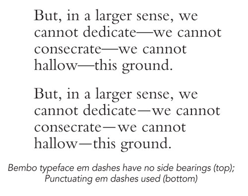
In most text typefaces, em dashes have no side bearings, which make them appear very close to the words they separate. If this bugs you, feel free to add some kerning space around them, but don’t add too much. (To judge if the em dash in a given typeface has side bearings, place the text cursor next to the dash and see if there’s a small gap between the cursor and the dash.) The maximum space I’d recommend in these cases is a hair space (Type>Insert White Space>Hair Space). Or you can just manually kern open a small gap before and after the dash.
Note: An en dash flanked by word spaces isn’t a good substitute for an em dash. It does create a break between words that’s an em wide (a word space being a quarter of an em wide) but the dash looks too wimpy floating in all that space.
There’s also a character called a “punctuating em dash” that’s slightly shorter than a normal em dash and with generous side bearings. Unfortunately, it’s rarer than hen’s teeth; it deserves to be more popular. True type maniacs can fake a punctuating em dash by adding two hair spaces before and two after an em dash and then using the Horizontal Scale tool in the Character panel to decrease the em dash’s width to 75%.
Here’s an example of a typeface where the em dashes have no side bearings, so they hew closely to the characters around them. For more generous spacing, you can use—or, more likely, create—a punctuating em dash. Make sure you select only the em dash to avoid resizing the hair spaces as well. Nice effect and a major hassle, this is only for the devout type lover.
Minus signs
The minus sign is a distinct character with its own width and weight. There’s no substitute for a proper minus sign. In our example, the top sample uses a hyphen—too short; the middle one uses an en dash—close, but badly spaced; and the bottom one—just right—is the hyphen character.
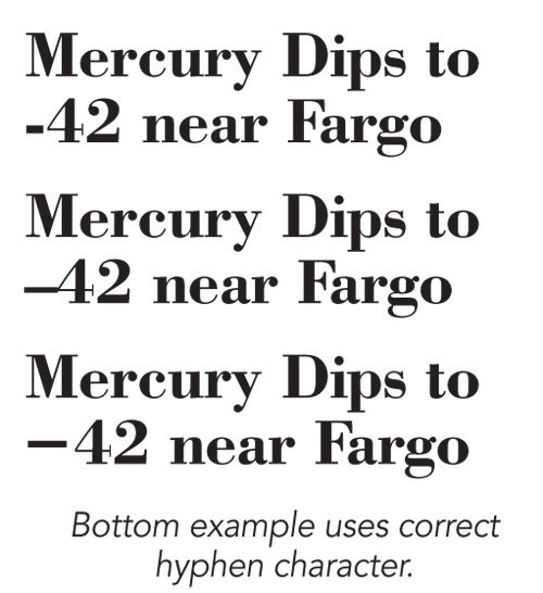
The hyphen exists in nearly all text fonts, including old PostScript Type 1, but Adobe applications make it hard to access. To find it, open the Glyphs panel (Type>Glyphs), and in the Show pop-up menu, select Math Symbols. You can’t miss it—it’s the only one that looks like a minus sign.
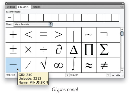
If you don’t see the hyphen there, it doesn’t exist in that font; but you can make sure it displays in the rank of Recently Used glyphs across the top of the panel from a font that does contain that glyph. Alternatively, you can add it to a custom Glyph Set that you can create from the Glyphs panel menu. Having a custom glyph set of similar, hard-to-find characters will save you lots of time later on.
Problems on the Web
Websites tend to use lowest–common denominator (note that en dash) HTML code for compatibility with all browsers and all computers. For this reason, webpages may display many so-called “special” characters incorrectly. Unfortunately, this includes en and em dashes as well as minus signs.
Most Web designers have come to avoid these troublesome characters, so it has become standard, sorry practice in text destined for the Web to substitute hyphens for en dashes and to use double hyphens (–) for em dashes. Minus signs are typically faked using hyphens. These are old typewriter conventions, dating to the days when the only characters you could type were those printed on the keyboard (plus lowercase letters a–z [another en dash!]).
Some day this will get squared away—when all computer systems are Unicode savvy—but that day hasn’t arrived yet.

