
Design Makeover
Our designers help a publisher cook up a more professional brochure
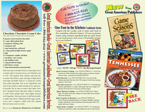
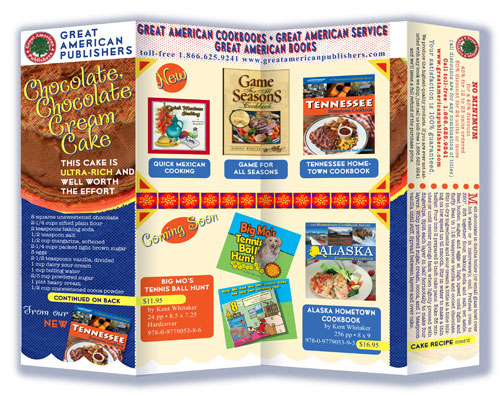
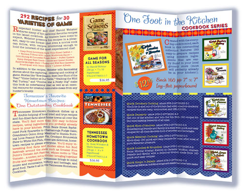
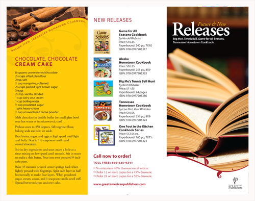
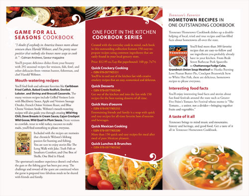
BEFORE
Client: Great American Publishers — www.greatamericanpublishers.com
Sheila Simmons worked for 20 years as an assistant publisher at another company before finally deciding to launch her own publishing operation. Great American Publishers (GAP) got underway in the summer of 2006, specializing in niche or regional cookbooks. Simmons is quick to note that GAP is a traditional publisher, not a vanity press or a print-on-demand service: Authors approach the company with a manuscript or a proposal. If it’s accepted, GAP takes on all the development tasks (and expenses), handling the editorial and design end themselves.
GAP’s books are sold in standard bookstores, but they do most of their business through gift shops catering to tourists. What better souvenir than a cookbook reflecting the cuisine of the place you’re visiting? Simmons sends out seasonal brochures to her retail customers highlighting the new line of books that are available. But she’d like to see a few improvements in the way her brochures look.
When asked what kind of look she wants, the first word she says is “professional,” followed quickly by “fun” and “interesting.” And when she says “professional,” she doesn’t mean slick or squared off. She wants to maintain the down-home feel that goes with the cookbooks themselves, but she thinks the brochure needs a more cohesive look—“to look as though it’s designed as one piece,” in her words.
The main thing she likes about the current brochure is the copy—it’s friendly and inviting. She especially points out the way it includes a recipe: “Recipes sell cookbooks,” she says. So we asked three designers to come up with a “down-home professional” brochure that would tighten up GAP’s image without buttoning it down.
AFTER
Designer: Richard Hanley — www.hanleydesign.com
“Down-home professional” made me think of country gravy, and that stuck in my mind throughout the entire design process. When I looked at the original, I wasn’t quite sure which page was the front and which was the back—what was on the inside and what was on the outside—and my eyes were going nuts trying to find somewhere to start. So I set one major rule for my redesign: break it into sections (with country gravy).
I started by creating a new logo, based on the brace symbol (}) turned on its side to look like an open book. The brace symbol became a motif for the entire design, dividing the two sections of the cover flap and setting off the contact information on the bottom of the back panel. Blown up very large, it also provided the curved shapes that define the areas on the inside of the brochure.
Besides organizing the content, I wanted to simplify the colors as well. While trying to pick a color that said “publishing,” my Eyedropper tool drifted down to the Dock and picked up the purple from the InDesign icon. Playing around with the Hue slider led me to the red and orange, which brought in the fun aspect. The third color is a variety of browns, and the final design uses tints and shades of those three.
Last, I wanted to find fonts that could be used in any design material the company needed. I chose ITC Goudy Sans for titles and headers and ITC Cheltenham Std for the body copy. With all the weights and styles in both of these font families, the company could use them for just about any material. They’re also both OpenType fonts—the possibilities are endless!
ABOUT THE DESIGNER: RICHARD HANLEY
 Born and raised in Baton Rouge, Louisiana, Richard has been pursuing design since he could pick up a crayon. He originally studied programming in college, little knowing what was ahead. He took a couple of classes in Web design and found his passion. With help from Lynda.com and several Kelby, White, and Kloskowski books, before he knew it he was an art director for a design firm, working on websites, logos, the whole nine yards.
Currently working as an interactive designer for Graham Group (www.graham-group.com) in Baton Rouge—a company he has always admired—he continues to expand his knowledge in animation with Flash and After Effects. He also does freelance work on the side, including publishing a magazine from start to finish. “I’m not intent on being the biggest thing out there, I simply strive to be the best,” he says.
APPLICATIONS USED: Adobe InDesign CS3, Adobe Photoshop CS3, and Adobe Illustrator CS3
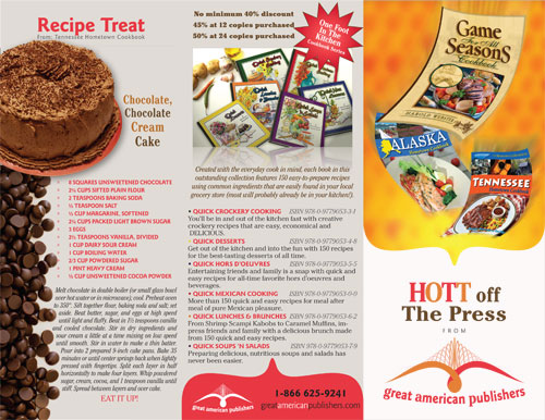
AFTER
Designer: Caryn Leschen — www.auntviolet.com
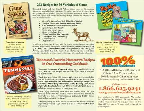
The first thing I noticed about the original brochure was that the folds didn’t match up, and the space was divided without any relationship to the folding pattern. The result was that the real estate was distributed unevenly: areas were either overused or underused. Overall, I thought the brochure needed to reflect the fun of cooking.
I started by playing with different folded pieces of paper in various sizes until I came up with something that felt right, inspired partly by the Mad fold-in. Then I blocked out the areas on the folded paper with colored pencils. I decided it should open with the cake recipe, so that’s the brochure’s entire front image (when folded).
When you open the brochure, the folds define the space, and the two edges of the cake image become dividers. As you proceed to unfold the brochure, new “pages” organize the large amount of copy into sections that can be easily digested. The scalloped border along the bottom also helps unify the space as well as lending a “kitchen curtain” effect.
The original’s colors are all over the spectrum, while the dominant cream color is tedious rather than unifying. I picked a color scheme based on old-fashioned cooking brochures and on good-old-American red, white, and blue. I used large dot screens and colored drop shadows to suggest off-register printing and further give the flavor of old-fashioned pamphlets (and by extension, traditional foods).
The script font is Confection—a font that, appropriately, looks like cake writing. The recipe and book descriptions are in American Typewriter Regular, which evokes old-fashioned recipe cards, while the catalog info is set in Times New Roman for its invisibility. Last, I used the Art Deco font Lionel Classic for the all-caps headings.
ABOUT THE DESIGNER: CARYN LESCHEN
 As a child, Caryn Leschen made paper dolls and her own private renderings of Seventeen magazine. She graduated from the California College of Art in Illustration, and blossomed into a famous cartoonist who changed the world with her bodice-ripping stories in Wimmin’s Comix and Twisted Sisters, and her nationally syndicated cartoon advice column, Ask Aunt Violet.
Around 1996, she was selected to write scripts and design characters for the Web, and began specializing in e-greetings and witty Web copy. As the dust settled on dotcomland, Caryn added print design to her repertoire as Aunt Violet Productions. Passionate about obliterating the line between “fine” and graphic art, she’s lectured widely on visual communications and taught at UC Berkeley and other colleges. Caryn looks forward to leading brainstorming sessions internationally with her new venture, CreativeJumpstart.com. She’s also working on her first graphic novel, Mandelbread.
APPLICATIONS USED: Adobe InDesign CS2, Adobe Photoshop CS2, and Adobe Illustrator CS2
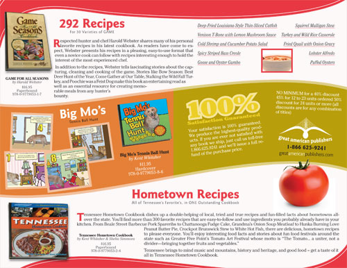
AFTER
Designer: Hannah Schrag — www.hannahschragdesign.com
The original brochure had an unclear hierarchy, which created confusion and a sense of disorganization; no apparent brand identity; and a lack of uniformity. My objective for the new brochure was to attract the reader’s attention, generate interest and desire, inform, and ultimately compel the reader to action. But first, the photos, illustrations, type, and white space needed to be arranged and designed in an effective and unified manner. This would set the tone of the brochure and create a favorable impression of the company and the products it offers.
I started by re-creating the company logo. The new logo uses a traditional typeface (Adobe Garamond Pro) to avoid trendy fonts that could become outdated. Adobe Garamond is also the primary text face, while Myriad Pro is used as a secondary typeface for titles and headlines. Only two font families are used throughout the entire brochure to keep a clean appearance.
A color palette of warm, happy, and inviting reds and yellows makes an ideal choice for this friendly design. The outer panels of the brochure use dark, light, and medium tones to visually differentiate them from each other. Each panel serves a different function. The cover panel incorporates close-cropped imagery of open books on a counter to catch the reader’s attention. The back panel provides a quick, at-a-glance summary of the company’s products, along with ordering information.
Floral embellishments and curves are incorporated into the brochure design to keep the layout from looking too “boxy” or rectangular and maintain a warm, inviting appearance. I also included some close-up photos of food to support the brochure text.
ABOUT THE DESIGNER: HANNAH SCHRAG
 Hannah currently resides in Tulsa, Oklahoma, where she’s a graphic designer at The Williams Companies, a Fortune 500 energy company. She specializes in interactive, identity, and print design. As a designer with more than six years’ experience in art direction and graphic design, she has worked with both formal and informal institutions. She enjoys thinking strategically to go beyond what’s expected to meet the clients’ needs.
As an advertising student, her future aspirations include helping clients in the execution and management of marketing and public relations campaigns. She finds photography and international travel to be instrumental in her personal outlook as well as her business perspective. Her interests outside of design include music, psychology, and a passion for any animal in need of rescue.
APPLICATIONS USED: Adobe InDesign, Adobe Photoshop, and Adobe Illustrator

