
Large-Format Printing
When it comes to file preparation of large-format imaging, there’s a different mode of thinking. The traditional rules of file dimension and resolution used in standard offset printing don’t necessarily apply. Where traditional print methods have you working in the 300-dpi (dots per inch) range, large format basically reverses that thinking altogether. This is where a number of traditional print designers and desktop publishers find themselves in unfamiliar territory. There’s a common misconception that bigger files need more resolution than normal print jobs—this is simply not true. All this does is give you a really huge file size.
The Eye Plays Its Part
When you’re getting started on a large-format project, the very first thing you must consider is how you got into this mess (just kidding)! No, you must first consider the viewing distance, which is perhaps the most critical aspect of how you go about preparing your file. When I was working in large format several years ago, this was always one of my first questions to the client. So let’s consider the aspect of “viewing distance” for a moment.
The human eye is a curious and fascinating piece of biology: perhaps one of our most sophisticated and, at the same time, one of our most flawed organs. That’s because the human eye is easily fooled, especially when it comes to viewing color and tones. Consider a rainbow, for example: When you see a rainbow in the sky, it really isn’t there. The mist in the air from a rainstorm is bending the light that’s passing through it (like a prism), which in turn makes the spectrum visible. But here’s the kicker: It’s only visible to a processing system like the human visual system, which can detect the sporadic wavelengths of light and generate the multicolored rainbow that we all know. The point is that our visual system is responsible for meeting us halfway by processing and rebuilding what we see. Everything we see in the world is merely reflected or transmitted light. The dimension and color of objects is the result of varying wavelengths of light that enter the eye.
Detail is lost, however, in an object seen at a great distance because, as your angle of vision to that object becomes narrower, the eye cannot distinguish details, and simply clumps them together. The science of a large-format imaging exploits this visual phenomenon to achieve its apparent clarity.
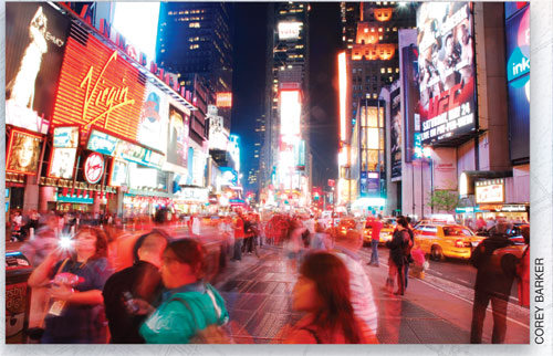
Say you’re driving down the interstate and see a really cool billboard with a seemingly sharp photo. You may be surprised to know that if you stood 3′ away from that billboard, you would see that the image is made up of very large scattered dots and the image itself is barely distinguishable. Yet from 50′ or more away, it appears sharp and colorful. Why is this? It’s because the clarity of this image relies on the functions of the human visual system. The farther we are from the image, the narrower our angle of vision becomes to that image and the dots appear to combine, resulting in a sharp image. Conversely, as we get closer to an image, we can see more details and the dots making up the image become visible. So the closer an image is to be viewed, the more resolution or dots per inch (dpi) are needed to make the image appear sharp and colorful.
Try it yourself: When you’re out in the world, get really close to a large print and examine the quality. It most likely doesn’t look that great. Then move away and look at it from a normal viewing distance. Simply put, the perceived resolution decreases the closer we are, and increases as we move farther away.
It helps the large-format designer, therefore, to be aware of the human visual system. When you find yourself in heavily populated areas (big cities), take a really good look at the billboards, bus wraps, and mural prints and think about where they’re located. The production artist has considered the location and set up the file accordingly. If a large mural print is at eye level, then it’s been output at a higher resolution than say, a billboard that’s 100′ in the air. Yet somehow they both have the same sharpness and detail. That’s our remarkable and flawed human eye at work.
File Preparation
So why does the preparation of files for large-format output seem to have traditional print designers scratching their heads in perplexity? Let’s consider how viewing distance factors into how we set up a Photoshop file for large-format output.
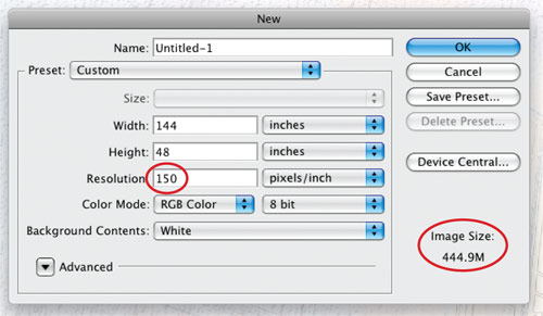
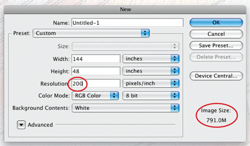
Let’s say that we have a client who wants a 4×12′ full-color banner with photos and text. The first thing to consider is: Where is the final image going to be located and how far is it going to be viewed from? Well if it’s going to be viewed from less than 3′ (like a wall mural), then we’re going to need some detail in there—around 150–200-ppi (pixels-per-inch) Resolution. So a Photoshop file at 48×144″ and 150–200-ppi will give us a file between 400 and 800 MB. That’s a lot of data because there are so many dots in a single square inch.
Now if the image is going to be viewed from a considerable distance—say 10′ or more—then we can certainly decrease the resolution to around 100 dpi. Now you’re looking at a 200-MB file. On some occasions, you can go even lower than that. This is where some designers start to get nervous, but they don’t need to worry. Just remember that the dot size is relative to the viewing distance. The closer your viewer will be to the image surface, the smaller the dots need to be; the farther away he is, the larger the dots. Relative to your eye, the dot is the same size.
Just to give you an idea, a friend of mine recently completed a banner print that was 6×84′ and he set the Photoshop file at 20 ppi (he could get away with this because the banner was going to be viewed from 25′ or more), which resulted in a file size of approximately 85 MB. Now that’s a much more manageable size of document. That same file at 300 ppi would create an 18-GB file!
You can also keep in mind that if you’re using Photoshop to build your large-format file, Photoshop will only handle a maximum pixel dimension of 300,000×300,000. And since Photoshop CS, there’s a large-document file format designated PSB, which will support your large files while maintaining layers, styles, etc.
What about Adobe Illustrator?
We know that Photoshop is a pixel-based application, which means that it’s resolution-dependent (you may have heard that term before).
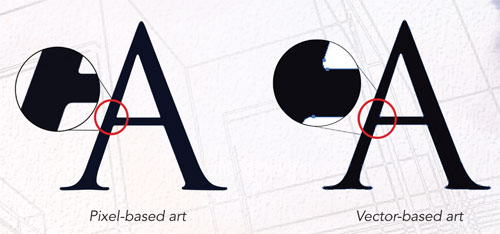
On the other hand, Illustrator is a vector-based application, which means that it’s resolution-independent. Vectors are geometric shapes based on mathematical equations, which means that they can be scaled to virtually any size without even the slightest loss of quality. So if you can get away with designing for large format with all-vector art, you’ll get very high-quality art and a very manageable file size. Here’s the caveat: This only applies to vector art. Yes it’s true: You can import raster- or pixel-based art into a working Illustrator file but this would be a resolution-dependent element that will print using the resolution settings from the original file. Also, embedding raster art in an Illustrator file will result in a ridiculously huge file size, which will take much more time to RIP (see “RIP What?” below). So you’ll want to use Illustrator for sharp, clean graphics and text and Photoshop for photos and continuous tone images.
What Do I Save the File As?
Well most typically, a TIFF or EPS file would be the preferred format to save to, but you’ll want to contact your printer to determine their file specs. And always save a copy. Don’t flatten your original file and then send it to print. Always keep an editable version somewhere. Believe me, you don’t want to have to rebuild a bus wrap design.
Of course, if you’re looking to outsource your project to a large-format printing company, they’ll always be happy to answer your questions. You should always find out what type of printer they’re using and how they want the files set up. The more they can sort out on the front end, the less difficult the job is on the back end, and then everyone can see the big picture.
There’s a wealth of information on large-format printing but we could only fit a few of the basics in this article. My hope is that this has provided a good primer for you to approach a large-format project with a little less confusion.

