Hollywood Type Tricks
When I was first approached about this article on Holly-wood type effects, my eyes lit up—as did my imagination. Being one of the biggest movie fans in the office, it made sense. I’m the one who is always going to midnight shows and still showing up for work the next day. It’s a passion that has played a major role in my creative process. I get so much more than two hours of entertainment; I also get a treasure trove of creative ideas.
Much of the peripheral visual media for a movie is also rich with inspiration. Has your attention ever been captured by a really well-designed movie poster, even if you weren’t interested in the movie? Before you know it you’re examining the logo, the overall image, the colors—and you suddenly find yourself a little inspired. This happens to me all the time and it motivates me to try and re-create the effect.
One of the most visually stunning aspects of these posters is the overwhelmingly creative use of type. For some movies, the logo becomes one of the stars of the movie, and it gets its own star treatment in a way. For instance, let’s consider Steven Spielberg’s film, Jurassic Park (www.jurassicpark.com). (I assume we’ve all seen it.) The posters for this movie were nothing more than the actual Jurassic Park logo on a black background. The logo had a certain theme park feel to it and that was all that was needed. It became an easily recognizable icon. Hence the name became one of the stars. You often see this with big-budget epic films—because these movies are promoted so heavily, they need eye-catching imagery.
Another Spielberg classic that has a recognizable typeface is Raiders of the Lost Ark (www.indianajones.com). This type style has been typecast (pardon the pun) as a standard look for conveying action and adventure, and it’s been mimicked many times. Then there are those films’ titles that are a bit understated, but the appearance of the text still plays a critical role. Take The Matrix (http://whatisthematrix.warnerbros.com), for example. The text treatment on this film used a standard typeface that was broken up and slightly offset in various places for a sort of convoluted effect. The result is a very simple graphic look, yet powerful enough to carry the theme of the movie. Other movies use simple customized fonts with mild type adjustments for a subtle effect. One example would be Spider-Man (http://spiderman.sonypictures.com). This text effect is a line of text in a specially designed typeface with some careful character spacing, which is very effective.
The font that’s chosen has a critical role, as it needs to invoke a feeling associated with the film. A common font used in movie titles is Trajan Pro. In fact, this font has been used so much that it has become sort of an inside joke with working professionals (check out http://typographica.org/001120.php). Why is it so popular? I’m sure different designers have different reasons, but I think it’s because it’s a classy looking and easily readable font. Still, it seems that it’s been overused. My point is this: It’s important that the typeface works with the title it’s portraying. You can see how certain types of movies, especially in specific genres, all have common type effects among them. Big effects movies tend to have really elaborate logos; sci-fi movies tend to have more angular, modern-looking text; while dramas will have more basic and straightforward text with subtle colors. Comedies and animated films tend to be colorful with bolder text, and often have some element of 3D.

For future reference
So with the ubiquity of so many examples on television, on the Web, and of course, in movie theaters, we seem to have an infinite database of images from which to gather ideas. If I see a logo or title that has a cool effect or captures my imagination in some way, I have to try and re-create it. When you’re studying an effect, look at the whole thing but also break it down and look at the parts. You might just see a part of the effect you like. When you do, then it’s time to reverse-engineer it—not to figure out how the original designer did it, but rather how you might do it and incorporate these techniques into your own work.
While it’s obvious that most of us aren’t creating type treatments for major feature films, by engaging our imagination we can use existing examples to help us explore how we might create a certain effect and perhaps come up with a new technique altogether. It’s been proven that you tend to be more creative when faced with a challenge, so start with something you’ve seen. No, don’t steal, but rather use it as a springboard from which to sort out your own technique and style.
Create your own title
Let’s put this into practice. Just recently, DreamWorks Animation released their newest feature Monsters vs. Aliens (www.monstersvs-aliens.com). The type treatment for this movie was designed to carry the theme of the movie, which portrayed the word “Monsters” with a more organic look and the word “Aliens” with a more angular, hi-tech look. Now, one thing was obvious when I first saw this: It was no doubt done in a 3D application. Does that mean we need a 3D app to create this look? Not necessarily. After a little experimenting, I discovered a way to get a similar result, all in Photoshop, with no 3D application at all. We’re going to create our own movie title in order to explore the technique, which would be the case anyway, because you want to use the technique on your own text.
STEP ONE: Start by creating a new file in Photoshop (the one shown here is 12×7″ at 150 ppi) and set your text. We’re going make a logo for a made-up movie called Human vs. Machine. Of course, the name isn’t super-important here; it’s the technique we’re playing with. We set the word “HUMAN” in Gill Sans Ultra Bold and “MACHINE” is conveniently set in a font called BN Machine (available from www.dafont.com). How nice! Adjust the tracking so the two words are the same width as shown here. (Note: To adjust tracking, double-click the type thumbnail in the Layers panel to both select the type and switch to the Type tool, hold the Option key [PC: Alt key], and use the Left and Right Arrow keys on your keyboard.)
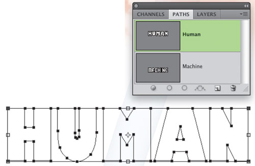
STEP TWO: Control-click (PC: Right-click) on the HUMAN text layer in the Layers panel and select Create Work Path from the menu. This will create a vector path for the text. In the Paths panel, double-click on the Work Path, change it’s name to “Human” in the Save Path dialog, and click OK. Repeat this step for the MACHINE text layer. You should have two path layers in the Paths panel.
Select the HUMAN path layer in the Paths panel, grab the Path Selection tool (A), and select all the paths that create the letters on the canvas. Click the Eye icon next to the HUMAN and MACHINE layers in the Layers panel to hide the original text.
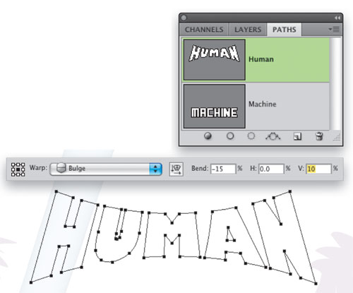
STEP THREE: Go under the Edit menu to Transform Path and choose Warp. In the Options Bar, choose Bulge from the Warp drop-down menu. Set the Bend to –15 and the Vertical Distortion setting to 10% (you may have to experiment with these settings depending on the size of your text and resolution of your document). Then press Enter twice to commit the transformation. Repeat this step for the other word in the title. You may need to do some additional scaling of the text after you apply the warp to both paths (just select the letters with the Path Selection tool and press Command-T [PC: Ctrl-T]).
STEP FOUR: In the Layers panel, click the Create a New Layer icon, and then
Command-click (PC: Ctrl-click) on the HUMAN path layer in the Paths panel to create a selection. Click the Foreground color swatch at the bottom of the Toolbox, pick a dark gray color in the Color Picker, and click OK, then press Option-Delete (PC: Alt-Backspace) to fill your selection with the Foreground color. Press Command-D (PC: Ctrl-D) to deselect.
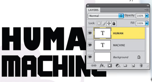
Repeat this step for the MACHINE path and press Command-D (PC: Ctrl-D) to deselect. When done, you should have a result similar to what you see here with each word on its own layer. (Use the Move tool [V] to reposition the layers if needed.)

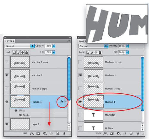
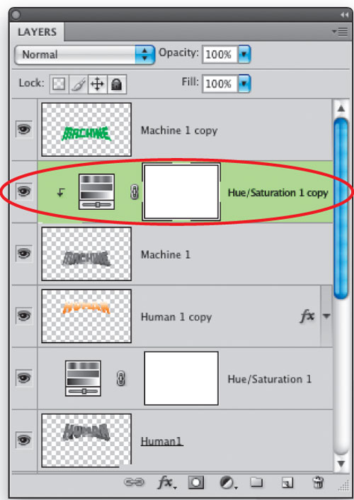
STEP FIVE: Double-click directly on the name of the first layer that you just created in Step 4 (Layer 1) and rename it “Human 1.” Similarly, rename Layer 2 “Machine 1.” Now Shift-click and drag these two layers to the Create a New Layer icon to duplicate them. Click the Eye icon for these new layers to hide them for now. We’ll come back to them later.
Activate the Rulers by pressing Command-R (PC: Ctrl-R), click the Human 1 layer in the Layers panel to make it the active layer, then drag a couple of vertical guides from the ruler and place them at each side of the text. They should snap right to the edge.
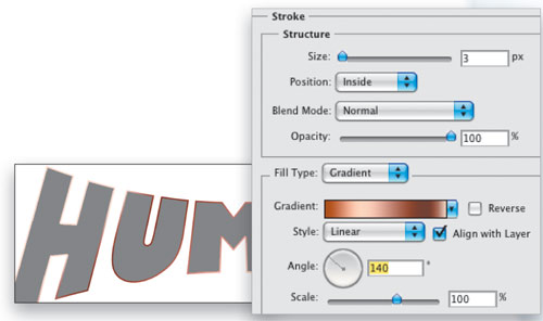
STEP SIX: With the Human 1 layer still active, click the Add a Layer Style icon (fx) at the bottom of the Layers panel and choose Stroke. Set the Size to 3 and the Position to Inside. Down in the Fill Type area, choose Gradient from the drop-down menu. Click on the gradient preview, choose the Copper preset gradient in the Gradient Editor dialog, and click OK. Back in the Layer Style dialog, set the angle to140˚. Click OK. This gradient will play an important roll when we make this look 3D.
STEP SEVEN: We need to rasterize this effect by merging it with an empty layer, so create a new layer and drag it under the Human 1 layer. Reselect the Human 1 layer and press Command-E (PC: Ctrl-E) to merge it down into the empty layer. This will render the layer style to the text (you’ll need to rename the merged layers to “Human 1” again). Then go under the Image menu to Adjustments and select Desaturate.
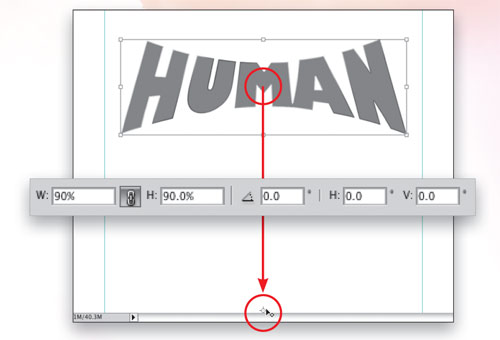
STEP EIGHT: Now press Command-T (PC: Ctrl-T) to invoke Free Transform once again. Grab the center target point, hold down the Shift key, and drag it straight down to the bottom of the canvas. This will be the vanishing point for the 3D effect. Go into the Options Bar and click the chain icon to lock the proportions, then enter 90% for the Width; the Height should change accordingly. The graphic will scale down toward the center target. Press Enter twice to commit the transformation.
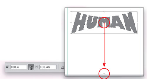
STEP NINE: Now load this layer as a selection by holding down the Command key (PC: Ctrl key) and clicking on the layer preview thumbnail for Human 1 in the Layers panel. Press Option-Command-T (PC: Alt-Ctrl-T) to start a step-and-repeat move (keeping it selected will ensure the repeated items stay on one layer). Drag the center target point to the bottom of the canvas again just like before. Go into the Options Bar and again click on the chain icon to lock the proportions, and set the Width to 100.4%; the Height will set automatically. (Yes, this is a small amount but it’s important for getting the 3D look in the next step.) Press Enter twice to commit the transformation.
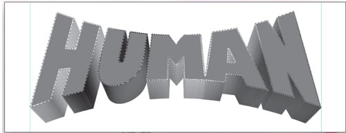
STEP TEN: Press Shift-Option-Command-T (PC: Shift-Alt-Ctrl-T) over and over until the edge of the graphic once again touches the guides. What you’ll get is a cool 3D effect that’s enhanced with the addition of the gradient stroke we applied in Step 6. Pretty cool, huh? Press Command-D (PC: Ctrl-D) to deselect and then repeat Steps 6 through 10 for the Machine 1 layer (you may need to reposition the guides to the left and right edge of the word first). Make sure to create a duplicate layer of any other layer to which you want to apply this effect.
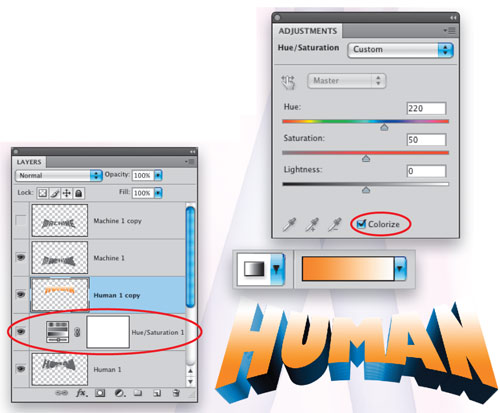
STEP ELEVEN: Okay, now that the 3D part is done, let’s finish off the face of the text. Remember those duplicate layers we created? Go ahead and activate the Human 1 copy layer and make it visible. Command-click (PC: Ctrl-click) the layer thumbnail to select that layer, set the Foreground color to R: 0, G: 174, B: 239, click OK, and press Option-Delete (PC: Alt-Backspace) to fill the layer with that color. Click on the Human 1 layer to make it active in the Layers panel and select Hue/Saturation in the Adjustments panel. Click on the Colorize checkbox and set the Hue to 210 and the Saturation to 50. This will apply a blue tint to the 3D edge.
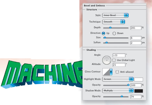
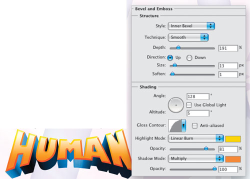
STEP TWELVE: Click back on the Human 1 copy layer to make it active, then double-click on the layer to open the Layer Style menu and choose Bevel and Emboss. Feel free to experiment with these settings to see how they look but the settings shown here work pretty good for what we’re after here. (Note the Gloss Contour has been changed to the Half Round preset and the Shadow Mode color has been changed to a dark purple.) Don’t click OK yet.
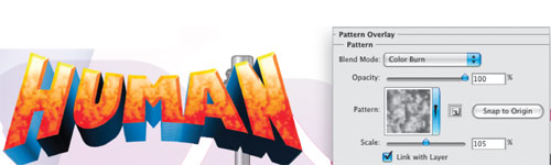
STEP THIRTEEN: Activate Pattern Overlay in the list of Styles on the left. Click the Pattern thumbnail preview to open the Pattern Picker and choose the Clouds pattern. (Note: If you don’t see the Clouds pattern, click the flyout menu in the Pattern Picker, choose Texture Fill at the very bottom of the menu, and click Append in the resulting dialog.) Then change the Blend Mode to Hard Light. Finally, activate Stroke. Set the Size to 5 and the Position to Inside. Change the Blend Mode to Overlay. Click OK and then deselect.
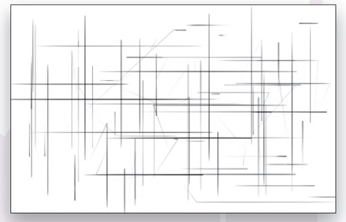
STEP FOURTEEN: Now we need to create a pattern to use for the MACHINE text. Press D to set your Foreground/Background colors to their default black/white. Then create a new layer, fill it with white, and drag it to the top of the layer stack in the Layers panel. Using a small, hard-edged brush (B), click a point on the canvas and then Shift-click a second point to draw a straight brush line. Brush up and down, left to right, and at various angles all over the canvas. Also change the brush size periodically to vary the width of the strokes. Once done, go under the Edit menu and choose Define Pattern. Name your pattern and click OK. You can either hide the pattern layer or throw it away.
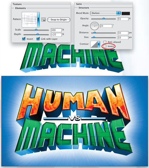
STEP FIFTEEN:Select the Machine 1 copy layer and make it visible. Command-click (PC: Ctrl-click) the layer thumbnail to select that layer. Set the Foreground color to green (R:57, G:181, B:74), click OK, press Option-Delete (PC: Alt-Backspace) to fill the layer with that color, and deselect.
Now drag the Hue/Saturation layer that you created in Step Eleven to the Create a New Layer icon at the bottom of the Layers panel to duplicate it. Drag this duplicate adjustment layer above the Machine 1 layer. Hold the Option key (PC: Alt key) and click between the two layers to clip the Hue/Saturation layer to the Machine 1 layer. This will add the blue shade to the 3D edge of the MACHINE text.
Activate the Texture option just under Bevel and Emboss in the list of Styles on the left. Click on the Pattern preview to open the Pattern Picker, locate the pattern you just defined (it should be the last one in the list) and set the Depth to about 25%. You can also reposition the pattern by moving the style window to the side and clicking inside the image and dragging; this allows you to move it around to where you like. When done, click OK.
Command-click (PC: Ctrl-click) the layer thumbnail for the Machine 1 copy layer, set your Foreground color to green, and then fill the MACHINE text with the green color.
Now drag the Hue/Saturation layer that you created in Step 11 to the Create a New Layer icon at the bottom of the Layers panel to duplicate it. Drag this duplicate adjustment layer above the Machine 1 layer. Hold the Option key (PC: Alt key) and click between the two layers to clip the Hue/Saturation layer to the Machine 1 layer. This will add the blue shade to the 3D edge of the MACHINE text.
STEP SIXTEEN: Now we need to create a pattern to use for the MACHINE text. Press D to set your Foreground/Background colors to their default black/white. Then create a new layer, fill it with white, and drag it to the top of the layer stack in the Layers panel. Using a small, hard-edged brush (B), click a point on the canvas and then Shift-click a second point to draw a straight brush line. Brush up and down, left to right, and at various angles all over the canvas. Also change the brush size periodically to vary the width of the strokes. Once done, go under the Edit menu and choose Define Pattern. Name your pattern and click OK. You can either hide the pattern layer or throw it away.
STEP SEVENTEEN: Double-click on the Machine 1 copy layer to open the Layer Style dialog and choose Bevel and Emboss. Again, feel free to experiment with these settings or use the settings shown here. (Note: Use Global Light was turned off.) Don’t click OK yet.
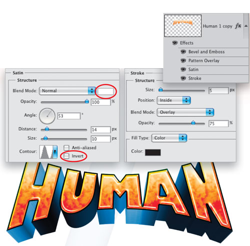
Activate the Texture option just under Bevel and Emboss in the list of Styles on the left. Click on the Pattern preview to open the Pattern Picker, locate the pattern you just defined (it should be the last one in the list), and set the Depth to about 25%. You can also reposition the pattern by moving the style window to the side and clicking inside the image and dragging; this allows you to move it around to where you like. The final layer style to activate is Satin. Set the Blend Mode to Darken, the Opacity to 51%, the Angle to 23˚, the Distance to 15 px, and the Size to 13 px. Change the Contour to Linear and uncheck the Invert box. When done, click OK.
As you can see, we’ve achieved something very close to the original, using some relatively simple techniques right here in Photoshop. The most exciting part is that I learned some really cool things that I might not have ever discovered if I hadn’t challenged myself to re-create an existing logo. What I’ve gained are some new techniques that I can use for whatever projects may come up in the future. So remember, when you’re at the movies, or just about anywhere, pay close attention to the world of ideas that surround you. They’re out there; you just have to pay attention.