
Design Makeover: Play it Again
BEFORE:
Client: Terry Shaw www.musicpotential.com
Musician and music teacher Terry Shaw has an independent streak. “I like to do things myself if I think I can do them better,” he says. “I’d rather play solo than with lesser musicians.”
That’s why he plays all the instruments on his latest CD, Instrument of Choice. On his website, he describes the CD like this: “It’s plastic, round, 4¾” in diameter, silver on one side with pictures of me on the other.” Obviously, Shaw has a sense of humor; however, he also describes the songs this way: “They’re original compositions covering many styles—bluegrass, swing, waltz, gypsy jazz, Celtic, Latin, contra, and jazz. And if that isn’t enough, I even include my cat singing on his own track.”
“I don’t have ADD, but I like all types of music,” he says, “Irish to Balkan to swing. But it still sounds similar because I wrote it.”
Shaw’s musical career started with playing the trumpet in his school band. He took up stringed instruments when a friend in the fifth grade introduced him to the guitar; he has since expanded his repertoire to include the mandolin, banjo, dobro, and fiddle, all of which appear on Instrument of Choice.
Shaw sells the CD through his website (www.musicpotential.com) and directly at the venues where he performs. When we approached him about a redesign, he said he likes the current cover, though he’s not fond of the lettering. “It’s too common,” he says. “I’d like a font that’s a little less pedestrian—maybe even one that looks like hand lettering.” He also says he’d like to project the same kind of image as Mark O’Connor: that of a virtuoso player who can play multiple instruments. But he doesn’t want to lose the personality and warmth that the current cover captures.
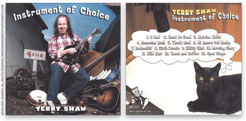
CREDIT: ©2008 DAVE KENNEDY. ALL RIGHTS RESERVED. www.davekennedyphotography.com
AFTER
DESIGNER: Stephen Woltz (designer), Ben Capozzi (teacher) www.svhed.org
Employing images ranging from mandolins set aflame as a nod to Jimi Hendrix to collaged bluegrass fantasies, 19 Halifax County High School students in the graphic arts class at the Southern Virginia Higher Education Center tackled the CD makeover with relish. We bought and listened to the CD, did a heckuva lot of individual and group ideation, and looked at Mark O’Connor’s branded material before beginning our designs. Unfortunately, the photographer’s request that we use the photo in its entirety removed from contention those designs that relied on isolating Shaw from the background (and frustrated those who had looked at Shaw’s website and seen his penchant for inventively placing his photo into improbable settings). Finally, just three choices remained. Two were by outstanding sophomores, but senior Stephen Woltz’s design is our final answer.
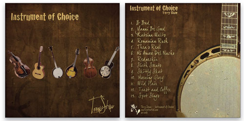
Noting that Shaw says his background is primarily in rock, Woltz wanted a “grunge” feel for his design, and to give it some personality without pretension. To achieve that look in Photoshop, Woltz built up layers of marbled paper as a background in warm earthtones and added coffee stains. An unrehearsed placement of instruments against the background gives the cover a handmade feel while suggesting Shaw’s virtuosic range and affinity for craft. The design walks that fine line between country and cornpone and still manages to capture the jazzy feel of Shaw’s music.
Woltz chose an edgy but strong font, Cracked from www.dafont.com, for the CD title. He picked another font from dafont, Joe Hand 2 for the signature and the song titles, and tweaked the paths to refine the handwritten feel.
Woltz simplified the weak layout of the original back cover and focused it on a boldly cropped close-up of a banjo. The final design is homemade without being homespun, a theme that seems to run throughout Shaw’s work and comments.
[ABOUT THE DESIGNER]
Stephen Woltz – Southern Virginia Higher Education Center
 Stephen Woltz and his classmates are students in dual-enrollment courses at the Southern Virginia Higher Education Center’s Business of Art & Design program, an innovative curriculum for Danville Community College students and Halifax County high schoolers.
In addition to developing his design talents, Woltz writes and directs his own films, competes for top honors in his graduating class, flings himself at opponents in the Allied Independent Wrestling Federation, and volunteers with the Ruritan Club.
Digital Art & Design curriculum coordinator Ben Capozzi has a degree in Studio Art from Virginia Tech in Blacksburg, Virginia, and worked in the school’s InnovationSpace multimedia center. He’s now pursuing an M.A. in Education & Instructional Technology and works with Woltz and other students five days a week to develop Virginia’s creative professionals of tomorrow in a sweet lab outfitted with Adobe CS4 and Mac Pro towers. His job, like each of his students, rocks.
APPLICATION USED: Adobe Photoshop
AFTER
DESIGNER: Davin Sanchez www.behance.net/DavinSanchez
When I saw the original CD cover, my first thought was, “Whoa!” It feels like a rush project, and the generic font doesn’t live harmoniously with the overall imagery presented on the cover. Certain aspects of the cover are fun—the cat thinking of the song titles—but the execution makes the overall effect seem silly and hokey, miles away from the fun and intriguing nature of the music. But I knew that with a little TLC, Instrument of Choice could be a true eye-grabber.
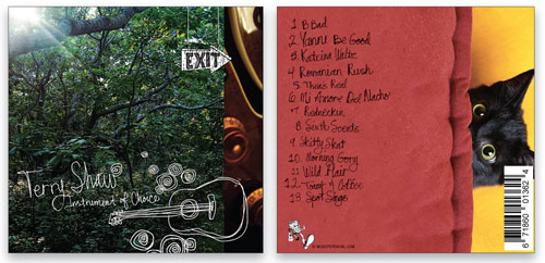
I didn’t want to use the existing cover image because it tells the viewer nothing about Shaw’s music. I wanted to convey the feeling, emotion, mystery, and storytelling that is Terry Shaw. When I listened to his music, read his blogs, and checked out his website in an effort to familiarize myself with the artist, I realized that this music was far more complex than the cover led his listeners to believe.
I removed Shaw from the cover and focused on a more reflective and intriguing image that matches the breadth and depth of his music. I chose the image of the woods because this image, much like the music, wasn’t easily defined—you could get lost in it, and yet it could be your own backyard. In an effort to convey Shaw’s lighthearted nature, I chose to preserve the image of the cat and the curiosity that cats so readily symbolize.
The cover also needed some organic, hand-wrought imagery to reflect the individuality of this artist and his music. I handwrote the text and drew some illustrations. I thought they would complement the sincerity and uniqueness of Shaw, and I thought they would be fun.
[ABOUT THE DESIGNER]
 Davin Sanchez www.behance.net/DavinSanchez
Davin has lived from coast to coast but now lays his head primarily in the City of Angels. He started designing in high school in Florida, laying out flyers for local bands, silk-screening T-shirts, and painting and drawing. Davin took his first major corporate job at a well-established company doing identity branding and Web and print design, as well as working on the side with local bands. The corporate print world became uninspiring after a few years, and he needed to move on.
Davin then came into contact with an Interactive Agency in L.A. He packed his life in his car and left for the Wild West a week later. Davin quickly became an Art Director, creating work for Scion, Budweiser, Bud Light, Pepsi, and Sony Pictures.
Davin has moved on and now does contract work in the Los Angeles area. His most recent work has been (on the Web) for Ford Models, Battle for Terra, and Bank of America; identity work for SanSu Solutions; and clothing for Maroon 5 and Sara Bareilles.
APPLICATIONS USED: Adobe Photoshop CS4, Adobe Illustrator CS4, and Adobe Photoshop Lightroom
AFTER
DESIGNER: Laurie Davidsohn-Bienstock www.davidsohngraphics.com
Terry Shaw is a multitalented instrumentalist and composer with a wide array of music styles. Shaw clearly has a sense of humor, which adds to his personality and spills over to his music. My vision for the redesign of Shaw’s cover was to create something upbeat, magical, fun, fluid, and full of high energy, with a hint of whimsy, all while maintaining a serious side. Wow, that’s not a lot to ask for, is it?
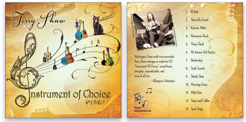
I started with classic music symbols: the treble clef and musical staff. The treble clef serves as an anchor for the cover, and the lines of the music staff also represent the strings of Shaw’s repertoire of instruments. I built upon these elements with fun, colorful, and random string instruments. I created multiple layers in Photoshop with various textures and silhouettes of more instruments and generously included swirls and wavy composition lines for fluidity.
Since Shaw lets his cat “sing” on one of the cuts and has a picture of him on the original cover, I thought it was something personally important to him. I wanted to keep it in my redesign, so I added the singing black cat among the instruments.
For Shaw’s name, I chose Adobe’s Voluta Script, and I used Sam Wang’s free Harrington font for the CD title. Since Shaw’s music style ranges from bluegrass to Celtic to jazz and then some, it seemed fitting that the fonts would be so different from each other but somehow still work well together.
I toned things down a bit for the back cover. While I do like the photo of Shaw with all of his instruments on the original cover, it seems to lack a bit of style. I cropped the photo and gave it a sepia tone to blend in with the overall design. Finally, I added an excerpt from a favorable review on a popular industry website.
[ABOUT THE DESIGNER]
Laurie Davidsohn-Bienstock Davidsohn Graphics
 Laurie Davidsohn-Bienstock continued her education in graphic design after receiving a Bachelor of Arts in Journalism in 1985. Over the following decade, Laurie refined her talents and professional qualities while working for some of the most prestigious design firms and advertising agencies on the West Coast. In 1998, Laurie launched her design firm, Davidsohn Graphics, and in March 2007, along with her husband Cion, purchased Town and Country Printing in Agoura Hills, California. Sometimes Laurie feels like a kid in a candy store, only she’s a graphic designer in a print and copy shop.
Laurie has an intense passion for graphic design, and since the purchase of the print shop, a love for different and unique paper and card stock. While she typically uses all three of the main programs in Adobe Creative Suite, her favorite is Photoshop, where she enjoys creating textures using multiple layers, filters, and masks. Laurie and Cion live in Granada Hills with their two daughters. Laurie also has five indoor cats and several outdoor strays.
APPLICATIONS USED: Adobe Photoshop and Adobe InDesign

