
Design Makeover: Landscape Lift
A Landscaping Company Turns Over a “New Leaf”
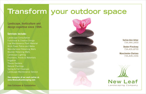
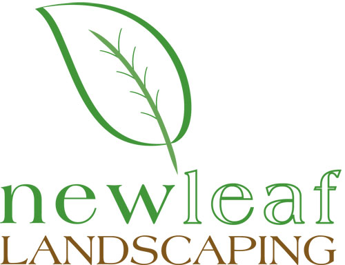
BEFORE
Client: New Leaf Landscaping Company www.newleaflandscaping.com

“Overall, he’s not satisfied with the balance between readability…and creativity.”
Founded in 1994, Michigan’s New Leaf Landscaping Company, with about 10 employees, is a full-fledged landscape construction company, not a yard maintenance service. Owner Peter Katke is educated in landscape, horticulture, and design, and he tries to use his knowledge to create a landscape that will work over the long term without requiring heavy maintenance, but one that will also be unique and interesting in every season. Katke prides himself on being able to create a landscape like no one’s ever seen or thought about before. (Of course, he admits, not every customer wants that.)
While the company does have a website, most of its marketing is done through print—magazine ads, newspaper ads, Yellow Pages, flyers, postcards, and so on. The original logo was a hand-drawn silhouette of a leaf printed in black on brown paper for a “natural” effect. But Katke says that version didn’t get a lot of attention, so he decided to add some color. “I respond to things that are colorful,” he says, and his customers look for color in what they ask him to do. He left the original leaf outline as the outer shape and added the interior shape with a graduated fill.
Katke still likes the way the logo gets people to notice it. He also likes the “hand-drawn but not cartoonish” look. But he’s not entirely happy with the way the colors work anymore and he’s tired of the “New Leaf” font (Papyrus, which Katke complains he now sees everywhere). Overall, he’s not satisfied with the balance between readability (for example, the use of Copperplate in the ad) and creativity.
We asked three designers to give New Leaf a new logo and use it to redesign the company’s half-page newspaper ad. Their challenge was to balance creative with professional and unique with classy.
AFTER
DESIGNER: Vicki Pene www.visualitydesigns.com
“I thought their logo should be more simplistic and modern, with fonts that have the same characteristics.”
My first step was to analyze where the company is now and where they want to go, in terms of their identity. New Leaf Landscaping wants to be known as classy and upscale, with a focus on their creativity and knowledge in the field of horticulture and design.
To achieve this, I thought their logo should be more simplistic and modern, with fonts that have the same characteristics. In Adobe Illustrator, I created an icon with intertwined, free-flowing lines that can be interpreted as blades of grass or simply as natural, organic shapes. This icon can be used as a design element across their various marketing efforts to establish a brand that’s both classic and modern. The fonts needed to be simple as well and easy to read, so I went with Trade Gothic LH Extended for both the name and company subtitle. I chose medium green and brown colors to portray the earth elements with which their company is identified.
For the ad, I wanted to carry through the clean, simple tone of the logo. I went with bright colors because this is something the company felt was important. And rather than show a photo of their work, I felt a conceptual object-oriented image would again convey a modern, upscale feel, plus leave plenty of white space.
ABOUT THE DESIGNER VISUALITY DESIGNS
 In 1997, after working in the hotel business for several years, Vicki Pene was looking for a new direction. A career counselor suggested she should be a graphic designer. “I was shocked!” she says, “as I didn’t think I was creative and didn’t know the first thing about art.” But on blind faith she quit her hotel job, went to art school, and hasn’t looked back since.
With a B.S. in Marketing from San Diego State University and a Graphic Design diploma from Platt College, Vicki has worked as a photo retoucher at Corbis and as senior designer at Blue Shield of California; she’s currently the senior designer at the wireless technology company Qualcomm. She also runs Visuality Designs, her one-person design studio. A southern California native, Vicki was recently married.
APPLICATIONS USED: Adobe Illustrator and Adobe InDesign
AFTER
DESIGNER: Margot Miller www.margotmiller.com


“Using textured paper instead of a flat color vector illustration gives the logo a more organic, natural quality…”
My first thoughts upon seeing the existing New Leaf Landscaping logo was that it lacked unity. I felt as if the leaf illustration was slapped on as an afterthought, instead of enhancing what was already there.
Keeping in mind that the company owner wanted the new logo to look more sophisticated, I gave it a more earthy color palette. I scanned a piece of paper with a textured floral print and brought it into Adobe Photoshop, where I changed the color and greatly increased the contrast. I then brought it into Illustrator and laid type over it, set in Birch STD, a clean-cut, timeless font rather than a trendy font. I converted the type to outlines and used them to create a clipping mask for the paper texture. This allows the letters to serve as a design element themselves, keeping the overall logo simple.
I used the same approach to create the leaf symbol. I placed it behind the text in Photoshop and reduced its opacity so it would not distract from the words. Using textured paper instead of a flat color vector illustration gives the logo a more organic, natural quality that should appeal to someone searching for a landscaper.
ABOUT THE DESIGNER: MARGOT MILLER
 A lover of coffee with soy milk, Margot Miller can often be found doodling in an Upper West Side coffee shop. She dreams of writing and illustrating a children’s book series, meeting Kathy Griffin, reading the top 100 novels of all time, and being a guest on Oprah.
As a designer for Global Design Concepts, a leading manufacturer of accessories, she works primarily with the Disney-licensed products.
Margot’s work has been published by Kendall/Hunt Publishing Company, Layers, The Outreach for Breast Health Foundation, The Post-Standard, and The Society of Illustrators Student Exhibition catalog. Her mixed-media work combines textured surfaces and found objects to create bold, colorful images.
Margot is a graduate of Syracuse University, with a degree in Illustration. She’s represented by Jane Feder (www.janefeder.com) and invites you to visit her website at www.margotmiller.com.
APPLICATIONS USED: Adobe Illustrator and Adobe Photoshop
AFTER
DESIGNER: Carolyn Crown
“I used a bright, vibrant green to represent everything above ground and a darker, neutral brown to represent everything below the grass line.”
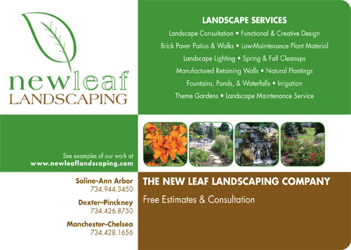
My approach to this project was to address the client’s concerns about the original logo: a font that was outdated and no longer unique, a color palette that wasn’t working, and an overall look that wasn’t as professional as the client wanted.
To me, a professional-looking logo is simple, clean, and graphic. Before creating any graphic elements, I looked at examples of the client’s work online. The photos all showed green and lively trees, plants, and shrubbery—no maple leaves. So I decided to draw a different kind of leaf—one that better represented the client’s work. The new leaf still looks hand-drawn rather than cartoonish.
I chose the font Americana for the logo because it’s retro-modern and stylish. I also wanted to use a serif font as in the original logo because, in my opinion, a serif font tends to look more professional and established than a sans serif one. For the text of the ad, I chose Futura and decreased the tracking and horizontal scale of the letters to differentiate it a little more from the logo font.
Green was an obvious color choice, and I decided to give the client an entirely new color palette—a natural one. I used a bright, vibrant green to represent everything above ground and a darker, neutral brown to represent everything below the grass line. I followed this color palette and pattern through to the ad. I wanted the “pop” colors in the ad to come from pictures of the client’s own work. (The photos come from the New Leaf website.)
ABOUT THE DESIGNER: CAROLYN CROWN
 Carolyn Crown is manager of design and production at CME Outfitters, a healthcare communications firm in Rockville, Maryland. Her professional projects for domestic and international audiences include brochures, advertisements, annual reports, books, postcards, and posters.
Although Carolyn specializes in print design, she’s also skilled in digital photo restoration. She learned her Photoshop essentials from her father, who owns and operates Split Image Photography in Smithtown, New York.
Originally from Long Island, New York, Carolyn moved to Pennsylvania with her family at the age of 10. She graduated from Loyola College in Maryland in 1999 with a degree in Communications.
In her spare time, she enjoys singing, cooking, and doing freelance print design (invitations, stationery, CD covers, photo restoration, etc.). Carolyn is also a newlywed and would like to use this opportunity to plug her new name: Carolyn Crown Tierney.
APPLICATIONS USED: Adobe Illustrator CS2 and Adobe InDesign CS2

