Design Makeover: Indie Music CD Art
Three designers give the cover of an indie musician’s CD a new look
BEFORE
CLIENT: Bone Cootes

“[Cootes would] like the cover to be whimsical, but not too silly or jokey. “‘Intriguing’ is probably the word that best describes what I’d like the designers to go for.”
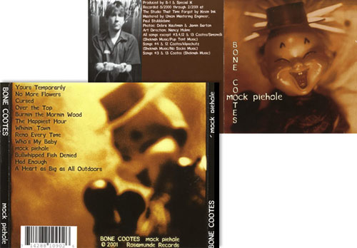
San Francisco singer/songwriter Bone Cootes performs his original compositions in small clubs around the Bay Area. In 2001 he self-produced mock piehole, a CD of songs co-written with fellow musicians. “Ry Cooder meets Tom Waits” is how one rock critic described Cootes, a musical raconteur whose gravelly voice delivers slice-of-life lyrics backed by reverberating guitar. But the indie musician prefers the high-concept description used by another reviewer: “Leonard Cohen meets the Cramps.”
One of the benefits of the indie music scene is creative control. Cootes not only co-writes all of his own lyrics and music and produces his own CDs, he’s also involved in creating the visual concepts for his albums. On the latest CD, he worked with a designer to realize an art treatment the singer already had in mind. “‘Mock piehole’ is one of those word mashups—a combination of mock pie (like mock apple pie from the Depression) and pie hole, which means the mouth,” he explains. “I came up with the idea of showing an Asian puppet with a false mouth.”
Although he’s happy with the cover, Cootes is curious to find out what the new designers will come up with based on their reaction to his ironic lyrics and musical references. He likes the idea of giving them free rein, aside from a couple of requests. He’d like the cover to be whimsical, but not too silly or jokey. “‘Intriguing’ is probably the word that best describes what I’d like the designers to go for,” he says. And though the current cover has a brownish tint, Cootes is adamant that the designers use what has become his signature color: “Green, green, green.”
We sent five songs from the client’s CD to three designers and gave them carte blanche to create a CD cover, front and back, that’s a little Cohen, a little Cooder, a little Waits, a little Cramps, and a lot Cootes.
AFTER
DESIGNER: Brook Berth www.gunthergraphics.com
 ©BROOK BERTH

“I made paths around different areas and played with making some parts color and others black-and-white. But ultimately I decided on a mostly black-and-white front cover…”
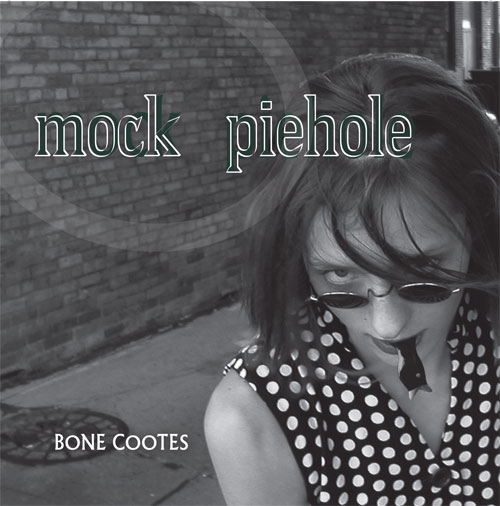
After listening to songs from Cootes’s CD, I decided to incorporate a blackbird into my design. My goal was to combine symbolism—blackbirds are bearers of messages—with a funky layout. The name of the album, mock piehole, gave me the idea of using a bird-shaped pie vent and putting it in someone’s mouth.
I set up a photography session in Milwaukee’s Third Ward in front of an old brick building. The model wore a polka-dot dress, which gives the cover an urban-retro look. In Photoshop, I made paths around different areas of the image and played with making some parts color and others black-and-white. But ultimately I decided on a mostly black-and-white front cover to draw the viewer into the imagery and evoke the raw feeling of Cootes’s music. The exception to the black-and-white treatment was the green layer in the lettering to tie it into the back cover, which has a green tint.
I used Albertus, a sharp, bold font with slight serifs, throughout this project. I even modified it in the white outline on the title to create a sense of vibration. I repeated the front cover image on the back, where I used it in a transparent layer above the green. I also used the pie vent, skewed at an angle, to create dynamic movement through the cover.
ABOUT THE DESIGNER: GUNTHER GRAPHICS
 In addition to working as a full-time graphic artist, Brook Berth runs her own home-based sign and design firm, Gunther Graphics, named after her Boston terrier. During her more than eight years in the field, she has created visual treatments for clients ranging from magazines and newspapers to individuals, small businesses, and corporations in just about every genre, from branding—creating logos and identity—to print, Web, signage, and monument design.
Berth describes her design style as eclectic and streamlined with an urban flair. She owes her early success to starting in the industry as a junior in high school, when she joined the Workforce 2010 Apprenticeship Program at Times Printing. That early exposure gave her a solid technical foundation and a head start in figuring out what she wanted to do professionally.
APPLICATIONS USED: Adobe Photoshop CS, Adobe Illustrator CS, and Adobe InDesign CS
AFTER
DESIGNER: Jay Kustka www.jaybirddesign.com


“My initial idea was to use pies with faces, but that evolved into simple circles with eyes and a different symbol for each mouth, or piehole.”
Before I began sketching, I listened to Cootes’s music, trying to get a feel for it. Since he likes the artwork he currently has (as do I), I wanted to provide a design alternative that would give the cover a different flavor but still capture the essence of his music.
My initial idea was to use pies with faces, but that evolved into simple circles with eyes and a different symbol for each mouth, or piehole. Working in Illustrator, I put together my first version (in green, of course), but the end result looked too stiff—not at all what I was going for. I then decided to try photographing the design to give me the effect I wanted. So I printed the Illustrator file on a color laser printer, laid it on a table, and took several pictures with a digital camera at different angles and distances. Using one of those images as a background, I overlaid text in Rosewood (filled), a font that’s a bit overused in circus and western themes but which works nicely here in the filled version.
Because I have a preference for completely transparent jewel cases, I designed the mock piehole cover to fit that kind of tray, which gives more room for the design.
ABOUT THE DESIGNER: JAY KUSTKA
 A Boston native recently transplanted to New York City, Jay Kustka is not only a designer but also a musician who has played guitar in bands in both cities for the past 20 years. Kustka branched out into print and Web design eight years ago. Since then, he has worked with Big Duck Studio and Newport Creative Communications, as well as on independent design projects. He’s also partnered on projects with his fiancée, a Web developer. Currently he’s the sole dedicated freelance designer for a large consulting firm in New York City, but he continues to devote as much time as possible to music. “Music inspires me on a core level. I always listen to music while designing and have found it to be an essential part of the creative process.”
APPLICATIONS USED: Adobe Illustrator CS2, Adobe Photoshop CS2, and Adobe InDesign CS2
AFTER
DESIGNER: Donovan Sears www.transfixdesign.com


“I immersed myself in the music and experimented with various combinations of images and textures in order to create the mood I got from his music.”
Knowing when to say when doesn’t just apply to beer. One of the most important things I’ve learned is to eliminate unnecessary elements. Before starting a project, I try to focus on the specific purpose the piece is intended for and figure out what mood I want to establish. Then I streamline. In the end, the customer has a piece that serves its purpose and does so in style—just not too much style.
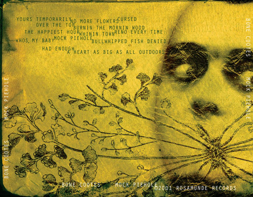
My idea for Cootes’s artwork was to work off of the word “mashup,” as his current design does. I immersed myself in the music and experimented with various combinations of images and textures in order to create the mood I got from his music. I was particularly drawn to the songs “The Happiest Hour” and “Mock Piehole.” I feel they are reflected most in my design.
I chose to run the image across the entire exterior of the booklet, in order to create a large, less-constricted image. I prefer the proportions of this “widescreen” visual format. The image also wraps around to the back of the tray card. Photography help came from the other half of Transfix—Kevin Shuck. He composed and photographed the face you see. For fonts, I chose the strange and grungy font Nasty, a nice contrast with the simplistic and condensed Orator. And of course it’s all dipped in Cootes’s signature hue: “green, green, green!” [Insert credit for photograph] ©KEVIN SHUCK
ABOUT THE DESIGNER: TRANSFIX DESIGN
 Donovan Sears started his business right out of college in 2001 with his partner in crime, Kevin Shuck. A lot of their work is with the indie rock bands and studios that make up the incredible music scene in Louisville, Kentucky. They provide that music scene with CD packaging, poster design, apparel logo design, and Web design. They’re particularly drawn to working with musicians because Donovan plays guitar for a band, and because he’s part of the indie scene, they’re able to make connections with local musicians. Aside from rock bands, they have also created promotional materials for country and bluegrass acts, and they’re working with local concert venues to help them better connect with concert goers.
APPLICATION USED: Adobe Photoshop CS


