
Design Makeover: High-flying Redesign
Client:
Good Bird Magazine! www.goodbirdinc.com
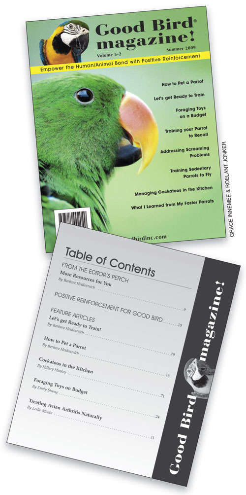
BEFORE
I don’t have a huge number of subscribers, but the ones I do have are really into their birds.
Good Bird Magazine! is just one part of Good Bird Inc., a source of information for owners of parrots and similar birds. The complete product line includes DVDs, books, and the magazine; there’s also a YouTube channel, MySpace and Facebook pages, a Yahoo! Group, and a Twitter stream.
The entire operation is the handiwork of Barbara Heidenreich. Heidenreich is an animal trainer with a history of presenting bird shows at zoos. She noticed that after the shows, people would line up to ask her about their parrots’ behavioral issues. That led her to write a book on the subject (Good Bird! A Guide to Solving Behavioral Problems in Companion Parrots), which led to a second book, which led to the launch of Good Bird Inc.
Heidenreich launched the magazine in 2005 “with no budget,” she says. “In fact, I sold subscriptions before the first issue was even printed in order to have the money to pay for printing.” Of the 2,000 copies printed per quarterly issue, more than half are sold to subscribers and through specialty pet stores and other independent retailers. The rest are sold at the speaking engagements she still pursues.
Twelve of the 92 pages per issue are printed in color, but the whole magazine is printed on inexpensive uncoated paper (except for the cover). Heidenreich’s goal is to turn the magazine into an all-digital product, and to that end she has begun sending subscribers PDFs as well as their printed versions, “to wean them off the hard copy.”
Most of the photographs in Good Bird are supplied by Heidenreich’s friends, who also happen to be good photographers. She likes the fact that the photos often show the personality of the bird. “I don’t have a huge number of subscribers,” she says, “but the ones I do have are really into their birds.” Her only regret is that most of the photos don’t have people in them, because her friends don’t usually put themselves in the shot. She wishes that the cover especially would demonstrate the connection people can have with animals (see the magazine’s tagline). She does pay her cover photographers a modest amount, so she could transfer that budget to stock photography, a course she hasn’t yet explored. We gave our designers that option and asked them to bring out the personality of Good Bird Magazine!
AFTER
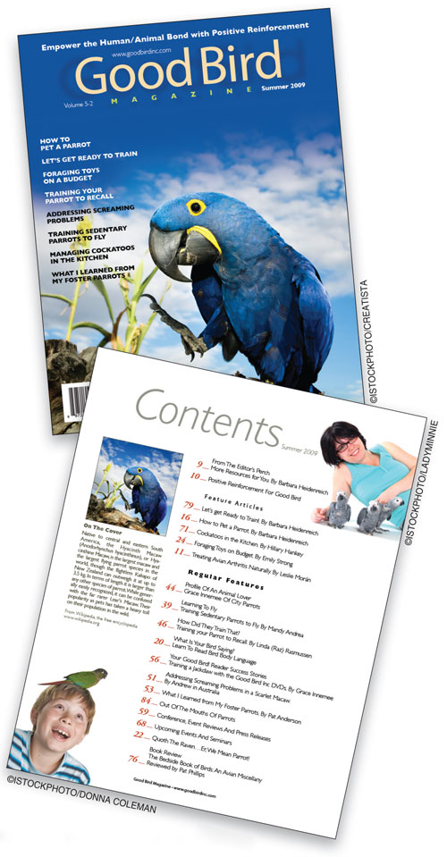
For the cover particularly, I was looking for a good quality photo with a lot of personality.
DESIGNER: Amane Kaneko www.amanekaneko.com
Parrots and cockatoos are such fun and fascinating birds in terms of looks, personality, and intelligence, and I wanted the design to reflect their playfulness. For the cover particularly, I was looking for a good quality photo with a lot of personality. I browsed a stock agency’s website and wound up selecting four images for the pages I redesigned, including the cover. The licensing fees would be $12 for each photo, still less than what the client is spending now for the cover photo alone.
Next, I started the process of choosing a typeface for the masthead. I felt that a round sans serif font along the lines of Futura, Gill Sans, or Century Gothic would work best for this publication. I finally selected Avant Garde as the magazine logotype.
In the original cover, all the type elements, including the masthead, were in black, which gave the layout a heavy and monotonous look. To add more fun and give the cover a lighter feel, I varied the type colors, from yellow for the logotype to white for the cover lines where the photo is dark to black on the white clouds.
The original table of contents spread across three pages with lots of large, widely spaced type. I replaced all that with a single page that can be scanned at a glance, and I added some fun stock photos of people interacting with their birds, which sets a tone for the whole magazine. I also added a small section that talks briefly about the cover photo.
The original’s “What Is Your Bird Saying?” section covered three pages—a right-hand opening, a second page with photos, and a third page that appears further back in the magazine with the answers. I felt the pages lacked consistency and that it wasn’t really necessary to force readers to turn to another part of the magazine, so I integrated all three pages into a single cohesive spread.
ABOUT THE DESIGNER
Amane Kaneko www.amanekaneko.com
 Amane Kaneko graduated from Parsons School of Design in New York City with a BFA in Communication Design. He now works full-time as a freelance artist on both design and illustration projects. Being both designer and illustrator enables him to enjoy working on a wide variety of projects from book covers to magazine illustrations, sometimes combining both disciplines.
Amane’s father was a Japanese Foreign Service officer, so he grew up in several different countries, including India, England, Japan, Sri Lanka, and Hong Kong. About his design sensibility, he says, “I think my style is a mixture of the many cultures that I have experienced in my life.”
His current client list includes Wiley-Blackwell, Elsevier, the State University of New York Press, the American Bar Association, and the Los Angeles County Bar Association. His illustration work has appeared in various publications in Canada, the U.K., Australia, and Japan, as well as here in the U.S., including The New York Times.
APPLICATION USED: Adobe Photoshop
AFTER
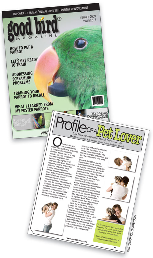
I tried to keep all the cover lines and beef them up while still maintaining enough space so the type doesn’t look all bunched together.
DESIGNER: Robert Todd www.roberttodddesigns.com
My first impression of the original cover was that it looked outdated. I tried to come up with a design that had more of a sense of fun to it yet maintained a simple and modern look. For the logo and the type along the bottom of the cover, I chose to go with the font American Typewriter. I think it has that feeling of fun yet it’s still easy to read. I used Myriad Pro for the tagline across the top of the cover and the cover lines, and Century Gothic for the word “Magazine” in the logo—I thought that both these sans serif fonts worked well with the slightly serif American Typewriter to give the effect I wanted.
The original cover featured a nice use of space around the cover lines, but the type was too small and lacked character. I tried to keep all the cover lines and beef them up while still maintaining enough space so the type doesn’t look all bunched together. I also added some pictures from a free stock photo site to the bottom of the page to give the cover more visual appeal.
For the standing “Profile of a Pet Lover” department, I stayed with a simple yet attractive look. I used a combination of four stock photos that would cost about $5 or $10 each from an online stock house. I kept the use of color to a minimum because these pages in the magazine are printed in black and white, although I wanted to add at least some color for visual interest because the client said the magazine would eventually be sent out in digital format. I used American Typewriter again for part of the department title and Arial and Times on the rest of the page.
ABOUT THE DESIGNER
Robert Todd www. roberttodddesigns.com
 Robert’s love for graphic design was born out of his passion for photography. When one of his favorite local bands asked him to take some promo pictures, he discovered that doing flyers and posters for their shows was a lot more fun than just doing the photography.
In the spring of 2007, he started work toward his Graphic Design certificate at a nearby technical college and bought himself a copy of Adobe Creative Suite 3. While going to school, he’s continuing to pick up freelance work. Robert is part of the creative team at Substance Church in Fridley, MN, and he continues to do photographic work for that same band that originally sparked his creative fire, as well as other bands in the Minneapolis area. He’ll be starting his hunt for a full-time graphic design job sometime this winter.
APPLICATIONS USED: Adobe InDesign and Adobe Photoshop
AFTER
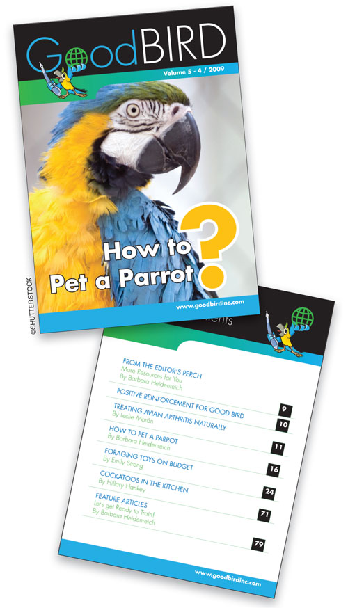
The parrot mascot will provide a unique brand for the magazine and can be used for any communication or promotional materials.
DESIGNER: Natesan Mohan http://natesanmohan.blogspot.com
My objective for this redesign was to create something that would stand out on the shelf while being attractive, colorful, and reader friendly. A good masthead is very important to a magazine, so that’s where I started. I set the magazine’s name in a simple and uncluttered font (Futura) and made it one word (and dropped the word “magazine”). That gives the name a unique identity—it’s now a name, not just two words—but I set each separate word in a different color to make the name clear and readable. The world graphic in the “o” of the word “Good” conveys the sense of “world’s best.”
I also created a parrot mascot, which will provide a unique brand for the magazine and can be used for any communication or promotional materials. For example, on one of Good Bird Inc.’s DVDs, the mascot and the spinning globe could make for an interesting animation. And at live events like the client’s speaking engagements, the parrot can be used on point-of-purchase displays that hold the magazine.
On the cover, I wanted to convey the idea of the main feature in a way that would entice the reader to open the magazine. That’s why I chose big bold letters (Futura Bold) with a question mark. I added a bottom band to the layout to hold the company’s URL and to give a tight, compact feel to the cover. The cover photo can change each issue, as can the color of the bands and the name, while the well-defined layout can be maintained throughout all issues.
The top and bottom bands are carried through to the departments and other standing elements inside the magazine, as on the Table of Contents page. The parrot mascot shows up again as your guide to the rest of the magazine.
ABOUT THE DESIGNER
Natesan Mohan http://natesanmohan.blogspot.com
 Natesan was born in Chennai, India, where he developed a lifelong interest in fine art and advertising. In 1997—after working for 12 years in India on brands such as Grundig TV, Lumber Jack Shoes, and BPL Home Appliances—he moved to Abu Dhabi in the United Arab Emirates. There he works as the creative director of the Adline Advertising agency. He has helped develop a new identity program for the UAE Exchange currency exchange house and create advertising concepts for international exhibitions such as IDEX (defense exhibition), ADIPEC (oil and gas exhibition) and Environmental Exhibition.
His advertising work has received an award from Gulf Air and the Best Public Service Campaign award from the Dubai Ministry of Health. He has also won an online competition for a Siemens Mobile ad concept from the Dubai-based Soura photography magazine. Besides his commercial work, Natesan has also worked on public service campaigns for breast cancer, diabetes, and HIV.
He lives with his wife Mythili and daughter Pragathi.
APPLICATIONS USED: Adobe Illustrator and Adobe Photoshop

