
Design Makeover: Handcrafted Website
Client:
Crone’s Custom Woodworking www.cronescustomwoodworking.com
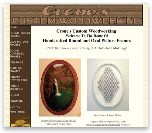
Before
Most craftsmen can make an awesome-looking product, but marketing’s where many run into problems.
Crone’s Custom Woodworking of Fair Grove, Missouri, didn’t start out as a frame shop. Tom Crone started the business in 1982 as a builder of wooden accessories for limousines—the wet bar in the back seat, for example. On the company’s website, Tom claims to have built more than 2,000 limousine consoles over the years.
Tom’s son, Mike, joined the business in 1999 and the two branched out into the home furniture market. In 2004, the two men started making round and oval picture frames as a spin-off of the furniture business. “We just kind of fell into it,” says Mike.
The two tried to market the new business locally, but it didn’t attract much interest. At one point, however, they uploaded some sample photos to eBay, “just to have something to show people,” Mike says. And the orders started to roll in.
Unfortunately, that source of business started to weaken as well, so the two decided to try direct marketing over the Web. They launched www.cronescustomwoodworking.com in 2007 and now attract customers from all over the U.S. and even from Canada and overseas. Mike maintains the site and he’s happy with its success on search engines. “Our SEO [search engine optimization] is pretty decent,” he says. “A search for ‘picture frames’ on Google won’t find us, but one for ‘oval picture frames’ or ‘round picture frames’ will put us on the first page.”
He’s not as pleased with the look of the site, however. “Most craftsmen can make an awesome-looking product, but marketing’s where many run into problems.” He thinks the site is poorly organized and doesn’t really like the flyout menus at the left for the different frame subtypes.
The Crones want a site that communicates the custom, handcrafted nature of their wares. Mike says their competition is the “stamped-out factory stuff.” He’s also sensitive to the needs of their dial-up customers: He likes the fact that the current site is quick to load and that customers don’t have to hunt around for the pricing. At the same time, he points out that they don’t have, and don’t want, a shopping cart area. “All we do is custom,” he says. And nobody places an order without communicating with them directly by phone or email.
We asked three designers to build the Crones a new, custom website.
After
I chose warm, deep browns to give the site a weathered and cozy feeling, like that of a workshop with a rich history.
DESIGNER: Joe Akers http://brainchildcollective.com
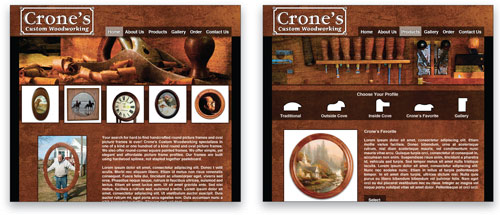
The current Crone’s site contains great examples of their custom woodwork, but it lacks the kind of information architecture that’s important for any website, especially one that sells a product. I set out with the goal of providing a clean, organized site that the visitor could easily navigate, view images of the products, get an appreciation of their craftsmanship, obtain pricing, and start the process of placing an order.
Simplifying the navigation scheme down to the most essential elements was crucial. I consolidated the original’s column of 11 buttons (two of which had submenus) to six straightforward choices to provide a more streamlined user experience.
I chose Helvetica Bold for the navigation buttons and the body copy to maintain a clean and subdued appearance. Knowing that the owner wanted to keep the cross-sections of the frames as a visual aid, I turned them into clickable icons that would allow the customer to choose a frame profile and wood finish as part of the custom order inquiry. Because the owner follows up every inquiry with a phone call, I felt this simplification wouldn’t compromise the user experience.
To convey the handcrafted quality of Crone’s woodwork through both the feel of the site and the color palette, I chose warm, deep browns to give the site a weathered and cozy feeling, like that of a workshop with a rich history. I added a texture to the background color to continue the hand-rubbed, worn look throughout and to add depth to the design.
While the original’s concept of a carved wood logo makes sense for the subject matter, the logo itself is difficult to read. I designed a new logo that’s simple and legible and adds more character. The Adobe’s ITC Garamond Handtooled typeface gives it a raised and dimensional appearance. And I chose Creative Alliance’s Conga Brava Standard for the logo’s subline because its chunky serifs lend a “carved” appearance. Simple line work finishes the design and suggests its containment in a plaque that might be handcrafted and displayed in the Crones’ workshop.
ABOUT THE DESIGNER
Joe Akers http://brainchildcollective.com
 As a former musician and trained chef, Joe has always embraced his innate creativity, and enjoyed sharing his talents with others. But after spending 10 years working on his feet in various kitchens, it was time for him to find another outlet for his creativity.
In 2007, Joe co-founded Brainchild Collective in Richmond, Virginia, as a way to bring together the cumulative talents of several friends to create awesome multimedia projects for a variety of clients. The idea behind Brainchild was to provide small-to-medium-size businesses a singular solution for graphic design, Web design, photography, and video. By offering all of these services in one studio, Joe and his fellow collective members can better control the integrity of the brand and the quality of the designs and materials they produce for clients.
Finally out of the kitchen, Joe is happy to be behind the desk and the lens full time. He’s also glad his wife is a wonderful cook.
APPLICATIONS USED: Adobe Illustrator CS4 and Adobe Photoshop CS4
After
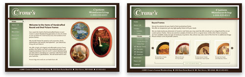
A white frame (or mat) lifts the site from the deep-brown background and a thin wooden trim (or molding) separates the header from the side panel.
DESIGNER: Stephen Chachere www.solaramedia.com
My first step when designing a website is to inventory and arrange the content in a coherent structure using Microsoft Word. For Crone’s Custom Woodworking, I was able to identify the text and images I wanted to highlight and, more importantly, I knew what the site navigation was going to look like before I considered the colors, logo, or layout.
For my second step, I work with the colors and logo, the elements that establish the feel of the site. In this case, I used Illustrator to set the company name in Bitstream’s Century 731, a bold italic, serif typeface; I framed the “C” to convey both the delicate curves and strong nature of the frames; and for readability, I used TheSans from LucasFonts for the navigational elements. I limited myself to three earthtone colors—brown, green, and beige—in addition to white, to complement the colors of the wood. I chose muted colors because I didn’t want to divert attention from the frames.
And my third step is to design the layout. Here, I used a combination of Illustrator and Photoshop to sketch out various formulas before deciding on left-side navigation. For the header and side panel, I created textured green panels with Photoshop lighting effects to quietly highlight the logo, title, and navigation bar. A white frame (or mat) lifts the site from the deep-brown background and a thin wooden trim (or molding) separates the header from the side panel. I wanted these elements to be subtle and elegant—the wall on which Crones’ frames would hang.
For site production, my first choice is usually Flash, but for Crone’s I’d recommend a hybrid site combining Flash navigation with HTML that Mike Crone can continue to update himself. The samples in each category (organized by shape, wood type, finish, etc.) are presented as thumbnails that scroll across the page. Clicking on a thumbnail opens a new window with a larger view. Because the content of each page is presented within the area framed by the header and side panel, the site visitor won’t have to scroll down to view content, and the site navigation will always be onscreen.
ABOUT THE DESIGNER
Stephen Chachere www.solaramedia.com
 Stephen is co-owner of Solara Media Inc., based in the Hudson Valley (just north of New York City). He was introduced to digital media in 1991 when completing his MFA in photography at the State University of New York at New Paltz. During the 1990s, Stephen worked as a media designer, providing graphics and presentation services to various Fortune 500 companies. At the same time, he was an instructor in art history and digital media at Marist College in Poughkeepsie.
Stephen founded Solara Media Inc. in 2000. From inception, the company’s emphasis was on interactive multimedia and a less-is-more philosophy of design. Macromedia Director was the preferred platform until a matured Flash came on the scene. Stephen creates custom interactive designs for clients in the medical, consumer products, and nonprofit sectors. His medical education applications have been particularly successful in securing awards for his clients. Stephen is also the videographer behind the original digital video featured in many Solara Media projects.
APPLICATIONS USED: Adobe Illustrator and Adobe Photoshop
After
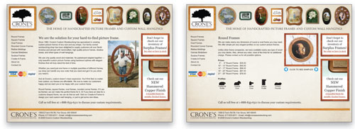
…it made sense to somehow display their craft in the header so visitors would quickly get the idea of exactly what they do.
DESIGNER: Chris Pickey www.chrispickey.com
First, I created a workable logo for Crone’s: something simple and elegant, not too slick, but one that would scream, “We work with wood!” I pictured a logo in my head that used a silhouette of an Oak Tree along with “Crone’s” stacked on top of ”Custom Woodworking.” I tried a few combinations of that and finally decided the best had the tree on top, with “Crone’s” in a larger classic typeface and “Custom Woodworking” at the bottom. After twice going through my font library, I decided upon Castellar, a Microsoft font originally drawn for Monotype. There was something about its classic chiseled look that fit—it was strong and regal, yet organic.
With the logo taken care of, it was on to the overall look. Because Crone’s creates custom wooden frames, it made sense to somehow display their craft in the header so visitors would quickly get the idea of exactly what they do. Since I was working with pictures of frames, I decided to have them look like they were hanging on the wall.
I kept the left-side navigation, but made the categories more specific to shape—that way they wouldn’t need flyout menus. And instead of an Idea Page with just pictures, I created a fictional Create-A-Frame page. In the future, Crone’s might possibly allow users to start the design of their own frames through an online application.
I also wanted to give Crone’s an area to feature new offerings and special promotions, so I created a right-hand column for those; CSS would give the items a wooden-frame border with a slight drop shadow to carry through the “frames-on-a-wall” theme.
For the homepage, I focused on building the relationship between customer and company with a text explanation of what Crone’s Custom Woodworking is all about. Plus, the picture of the man holding the man-sized oval frame is priceless. On the product page, I kept the examples of their work but consolidated them into a slide show that people could flip through, which added more interactivity and helped to keep everything important above the fold.
ABOUT THE DESIGNER
Chris Pickey www.chrispickey.com
 Pickey (that’s what he goes by) is one of those jack-of-all-trades; however, he does claim to be master of a few. He cut his design teeth in 2000 at the Daily News Journal in Murfreesboro, Tennessee, where he worked as a classified ad designer with no design degree. With the help of friends and hours of hard work, he quickly built up his knowledge, skill set, and experience.
In 2002, he and his wife moved to Indianapolis, Indiana. There he eventually became the graphic arts manager of Wild Birds Unlimited, the largest specialty retail franchise specializing in backyard bird feeding. At Wild Birds he got his hands dirty in every aspect of design: print, Web, audio, video, interactive, packaging, and so on.
After five years, Pickey left Wild Birds Unlimited to set up shop as a freelance designer. That not only freed up time for his family, it also enabled him to devote more time to his other primary pursuit: being the drummer for the Jake Brothers band (www.jakebrothersmusic.com).
APPLICATIONS USED: Adobe Illustrator CS3 and Adobe Photoshop CS3

