Design Makeover: Design Emergency
Client:
Animal Medical Emergency Response System www.animalmedics.com
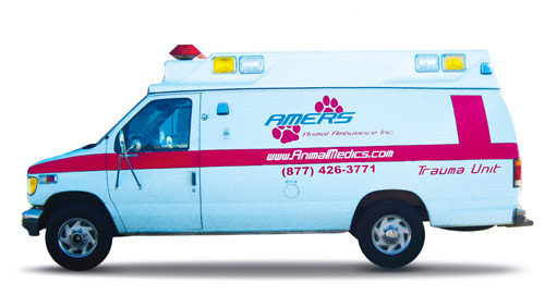
…when people see the AMERS vehicles on the street, they mistakenly assume they’re ambulances for humans.
Animal Medical Emergency Response System (AMERS) operates vehicles that provide mobile care and transportation for injured and ill pets. In other words, they’re just like ambulances, except that they’re for animals rather than humans. And therein lies the organization’s design problem: the vehicles don’t successfully communicate what they’re for.
AMERS was founded in 2001. CEO David Watts tells the story of a friend of his whose beloved dog collapsed one day; she called 911 and an ambulance arrived, but the responders were unable to help because they weren’t trained in animal care. They couldn’t even transport the dog to a vet, Watts recalls, because government regulations forbid it. The dog died, but the idea of an animal ambulance service was born.
The service is based in Antioch, California—in the San Francisco Bay Area—but is available to provide assistance statewide. AMERS has what Watts calls a “Domino’s” service area, comprising four counties in the San Francisco Bay Area, within which they can respond to a call in 30 minutes or less. But they’ve sent an ambulance as far away as Los Angeles to pick up a dog and transport it to veterinary facilities near Sacramento, a total trip of nearly 800 miles.
The problem, Watts says, is when people see the AMERS vehicles on the street, they mistakenly assume they’re ambulances for humans. At least twice a month, he says, they get flagged down by police or citizens who want them to respond to an emergency. It’s not only awkward for the AMERS personnel, who have to decline, but a threat to public safety because it can delay calling for a “real” ambulance. So he requested a new look for the vehicles, one that would identify them as providing services for animals without diminishing the seriousness of their services. “We considered putting a picture of an animal on them,” says Watts, “but we were afraid it might look like a cartoon. He also wants to make sure the new design projects “compassion—that we’ll treat a pet like one of the family.” With that in mind, we asked three designers to come to AMERS’ rescue and give them a vehicle design that leaves no doubt as to their mission.
AFTER
DESIGNER: Quinton Wash www.nicheonline.net
My overall approach to this project was influenced by the fact that the vehicle would primarily be seen in motion, heading to an emergency. Because of that, I knew that an extremely detailed design would not be necessary. My design is intended to be printed onto a vinyl vehicle wrap, rather than being painted onto the vehicle.
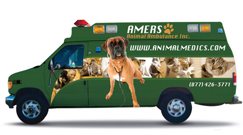
I chose a dark green for the base color of the ambulance because you rarely see vehicles that color. The green would cause the vehicle to stand out on the road while also differentiating it from a human ambulance. In addition, I’ve learned that green is a motivating, action-oriented color. Once I chose the base color, I generated ideas for other colors that would work well with it using Adobe’s kuler website (http://kuler.adobe.com), which has been a lifesaver on many of my projects.
I decided to display images of animals along the side of the ambulance so that viewers would be able to get a clear idea of the organization’s services, even if they weren’t able to read the writing as the vehicle sped past. The variety of animals—besides being cute—shows the range of services provided, while the enlarged image of the doctor makes the nature of the services clear. I found the images I needed on iStockphoto.com through a simple search for “Animal Medicine” and “Animal Doctors.”
The only font I used was Silom, a system font that comes with Mac OS X. I wanted to make sure that the name and Web address were clearly visible because they’re both easy to remember and pretty catchy. I set the name of the organization in a different color to make sure it was perceived as a separate element, so viewers wouldn’t read the whole thing as one phrase (AMERS Animal Ambulance). The contact numbers were left on the lower end of the side panel and back door panel of the car.
The green would cause the vehicle to stand out on the road while also differentiating it from a human ambulance.
[ABOUT THE DESIGNER]
Quinton Wash NicheOnline.net
 Dallas-based Quinton P. Wash learned from his father what it takes to become a successful and respected businessman. Working under his father’s tutelage in the field of concert promotions, Quinton realized that among the most important tools a businessman needs are honesty, integrity, and talent.
With an undying desire to follow in his father’s footsteps as an entrepreneur, Quinton founded NicheOnline.net. At the start of his career, Quinton’s projects consisted of company logos and custom pages for members of BlackPlanet, an online community aimed at African-Americans. Since then—still with no formal training or design classes—Quinton has had the pleasure of adding to his portfolio such high-profile clients as comedian Rickey Smiley (from the Rickey Smiley Morning Show), Doug Banks and DeDe McGuire (from ABC Radio Networks), Paul Quinn College in Dallas, and the University of North Texas.
His progress is built on the foundation of those who gave him a head start in life: God, his mother Cynthia Pierre, and his father Al Wash.
APPLICATION USED: Adobe Photoshop
AFTER
DESIGNER: Kat Sheldon www.pollencreative.com
The existing ambulance graphics are chaotic, plagued by a nondescript logo and a “tossed salad” of illegible fonts with no particular hierarchy or order. I approached the job like a branding project, not just the creation of graphics for an animal ambulance. I started with nomenclature—in the acronym of their name, AMERS, the S stands for “Systems.” I changed it to “Services,” since they’re primarily a service organization.
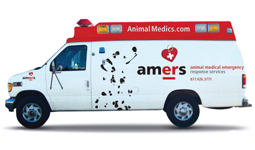
Developing the identity was the next step. My proposed design is a family of graphics including a logomark, the AMERS acronym, and the image of a Dalmatian. The logomark is a combination of a heart-shaped dog tag with a white cross. Rotating the logomark to a 15˚ angle adds personality and enables it to point to the prominent “ER” (for “Emergency Room”) in the acronym.
The Dalmatian graphic serves as a secondary element. Its posture is attentive, trusting, and caring. The Dalmatian is not instantly recognizable; its spots imply its outline. This graphic solution makes viewers think, then it makes them feel smart that they figured out what it is. From this point forward, they’ll always see the Dalmatian.
I chose the typeface Frutiger for their corporate face. The lowercase treatment for the acronym gives it a “living and breathing” quality without being stylized and sacrificing legibility.
The red, white, and black color palette creates a sense of efficiency and trust. When picking colors for the ambulance, I choose to make the top red and to differentiate it from the body of the vehicle. This color scheme streamlines the shape of the ambulance and gives it a custom look. My intention is to have the top painted and all of the graphics on the body to be applied as cut vinyl.
This proposed design has flexibility and can be adapted for use in various formats.
The red, white, and black color palette creates a sense of efficiency and trust.
ABOUT THE DESIGNER
Kat Sheldon Pollen Creative
 In 1992, Kat graduated with honors from Arizona State University with a BFA in Graphic Design. She then moved to Denver to start her career as a designer. She worked for Genesis, Inc., on projects for Disney, Frontier Airlines, Schwinn, Scott USA, and the Quaker Oats Company. After relocating to San Francisco in early 2000, she worked for the firms Man Bites Dog and SMWM on projects including the San Francisco Ferry Building and Galleria Dallas.
In 2004, with 12 years’ experience in the field, Kat founded Pollen Creative. Her diverse client base includes ArtSpan, Keystone Strategy, Microsoft, and Steinberg Architects. In the last few years, Kat has been working with alternative energy clients including Recurrent Energy, Shai Agassi, and Tesla Motors. She commits to cultivating originality and thrives on the “Aha!” moment where client, designer, and campaign cross-pollinate.
Kat’s colleague, Susan Carter, collaborated with her on this project. Constructive criticism and pushing the design process is critical to an enriching design experience and a successful product.
APPLICATIONS USED: Adobe Photoshop CS3 and Adobe Illustrator CS3
AFTER
DESIGNER: Drew Dunlap http://dunlapstudios.com
When I first began this project, I started creating an elaborate vehicle wrap filled with images and vectors. I soon discovered that the more I included, the less the result looked like an ambulance. So I decided to go back to the drawing board and play off of the typical ambulance style. I started again from scratch with three key factors in mind: simplicity, readability, and understandability. My intention was to create something that would be printed on vinyl and applied to the vehicle, so keeping it simple means the design will require fewer materials and less printing, thus keeping customers’ costs down.
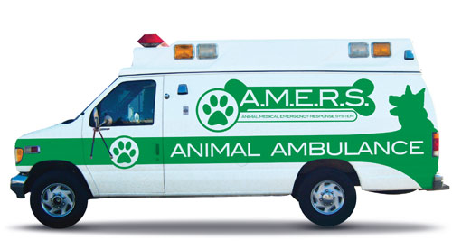
I decided to go with a single-color approach, which is characteristic of most ambulances. But I wanted to steer clear from the typical red to help distinguish this ambulance from the norm, since confusion with human ambulances is the main issue AMERS is trying to address. I chose green because I think it’s a neutral color for both males and females, and I think it would catch other drivers’ attention. For ultimate readability, I chose the bold sans-serif font ITC Blair Medium, a revival of a turn-of-the-century engravers’ typeface. I not only chose it because it’s a great font, but also because I felt that its clarity and timeless elegance fit the piece perfectly.
To help viewers understand that this ambulance service is for animals, I included a couple of simple identifying elements. First, I played off the Red Cross symbol and placed a paw in the circle instead. Second, as an alternative to enclosing the text in a simple rectangle, I decided to use the shape of a dog bone. And finally, I traced an image of a dog and worked it into the ambulance bar. Once I had everything in place, I felt that it was, if anything, too simple. So I worked on the green center bar a bit more and made it wrap around into a large back piece with the paw print symbol boldly displayed.
I decided to go with a single-color approach, which is characteristic of most ambulances. But I wanted to steer clear from the typical red…
ABOUT THE DESIGNER
Drew Dunlap Dunlap Studios
 Drew is a 21-year-old graphic designer and illustrator based out of Gilbert, Arizona. He’s been using design software for almost a decade, and says he’s been drawing ever since he could hold a pencil. He’s currently completing the requirements for an Associate’s Degree and Digital Art and Illustration Certification at Chandler-Gilbert Community College. Once he finishes, he plans to pursue a Bachelors Degree through Arizona State University.
Drew works full-time as a graphic designer for Group Imaging, a small- and large-format print company located in Mesa, Arizona. He also pursues several freelance ventures, one of which is Indie Web Studio, a progressive design studio focusing on indie music. (Look for www.indiewebstudio.com coming soon.) He also maintains a blog at his website (where he offers free Photoshop brushes of his own design).
When not designing, Drew spends time with his family. “I have a beautiful wife and a 1-year-old daughter that are my main priority,” he says. “I love what I do, and there’s nothing else I’d rather do.”
APPLICATION USED: Adobe Photoshop CS4


