Design Makeover: Dental Clinic for Pets
Client:
All Pets Dental Clinic www.dentalvet.com

The brochure has to convince the prospective client that All Pets offers great medicine and phenomenal customer service.
The All Pets Dental Clinic was founded about ten years ag ao by Dr. Jan Bellows, one of only about a hundred board-certified veterinary dentists in the U.S. The clinic is a state-of-the-art facility, with the latest in dental technology. “The second you walk in, you know you’re in a special place,” says Practice Administrator, Paul Camilo.
The clinic also tries to make it a special encounter for their clients. The waiting room provides Starbucks coffee along with snacks and has a big-screen TV. The doctors don’t wear lab coats and they introduce themselves by their first names. The treatment areas are scrupulously clean—“it looks and smells like a plastic surgeon’s office,” says Camilo.
Most of the clinic’s patients are household pets—dogs and cats—but they also sometimes treat exotic animals from local zoos. The clients generally come through referrals from other practitioners. The clinic produces a brochure that they provide to other veterinarians, who then give it to their clients when referring them to All Pets Dental. Other vets have to be aware of three things, according to Dr. Bellows: “One, the client will have a great experience here; two, the doctor knows what he’s doing; and three, I’m not out to steal their clients.” The brochure also has to convince the prospective client that All Pets offers great medicine and phenomenal customer service.
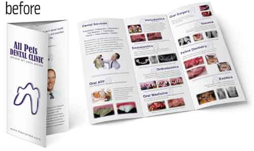
The current brochure is a simple trifold printed on matte white paper. They like the clean appearance of the front flap, but there’s a lot more they don’t like. They worry that it looks too busy on the inside. “We wanted to cover all the treatment areas,” says Camilo, “but clients may be overwhelmed by too much information. I’m into pictures, but I don’t know if the busy-ness of it conveys how clean we are.” And Dr. Bellows thinks the typeface for “All Pets Dental Clinic” is too “tough” and “military-looking,” where they’d prefer a warmer feeling.
AFTER

For me, everything starts with the logo; that sets the tone and feel for the entire brochure.
DESIGNER: Ihor Gernaga www.coroflot.com/1kreator/portfolio
My impression of the original brochure is that it misses the mark in presenting a professional image: there’s sameness of color, font selection, and usage throughout the brochure. The information feels like it was placed haphazardly, which is very confusing and unappealing.
Since this brochure is used as a referral that other veterinarians would give to their clients, the challenge was to create a design that would appeal to professional veterinarians and at the same time have it look nonclinical and inviting for potential clients.
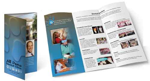
For me, everything starts with the logo; that sets the tone and feel for the entire brochure. I decided to keep the overall format of the logo—two lines of centered text—because it was a good start for an identity and just needed some work to bring it front and center. I set the clinic’s name in Adobe Immi 505, which has a playful feel without being too juvenile or unprofessional. Instead of a tooth (which is somewhat overused for dental services), I decided to focus on the “all pets” part of the name. I incorporated paw prints of various animals as part of the logo and picked them up as an ongoing theme throughout.
I played around with the idea of using a different format instead of the trifold, but the existing format won out. It’s portable, easy to store, and provides just enough space to get your message across. I filled some of the panels with a background gradient that goes from blue to earthy brown because that color combination lends a calming and grounded feel, which works well with this particular brochure.
The next order of business was to organize the information into palatable bits. I used panels with a color background to highlight important aspects of the business, and I left the rest of the space white to focus on the specific services, location, and directions. I chose Dante MT and Myriad fonts for their subtle differences from more typical serif and sans-serif fonts. Those nuances give the whole brochure a more updated feel.
ABOUT THE DESIGNER
Ihor Gernaga www.coroflot.com/1kreator/portfolio
 Ihor was born and raised in northeast Ohio, where he showed a keen interest in drawing and other creative activities from an early age. He eventually graduated from the University of Akron with a dual degree in photography and commercial art. His original goal was to design cars, but that all morphed into a whole different direction.
In his 15 years of designing, he has worked for in-house design departments in various industries. He started as a production artist setting up food containers and worked his way up to senior designer. Along the way he created a wide variety of corporate collateral, logos, brochures, event posters, and retail advertising. In addition, he has freelanced and worked as a contractor for local companies, nonprofits, and small businesses.
Ihor resides in North Royalton, Ohio, with his wife and three cats.
APPLICATIONS USED: Adobe Illustrator CS4, Adobe InDesign CS4, and Adobe Photoshop CS4
AFTER

They had mentioned that the client had a “Disney-like experience,” so I made the logo into a small cartoon with a slight professional style.
DESIGNER: Jeff Carpenter www.whitewolfgraphics.net
The original design for the All Pets Dental Clinic brochure is very cluttered and unorganized, and the haphazard placement of the medical photos on the interior is distracting. It lacks the personal feel that they wanted to communicate to potential clients. There’s also a lack of color throughout, except for the photos. I believe that if a client is willing to spend the money on full-color brochures, a designer should use plenty of color.
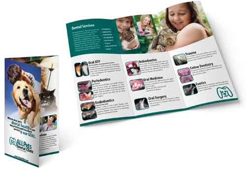
My redesign started with the logo. They had mentioned that the client had a “Disney-like experience,” so I made the logo into a small cartoon with a slight professional style. The original tooth is subtly retained in the new mark.
After that, I moved on to font choice. I used Myriad Bold Condensed and Myriad Regular for the titles and body copy throughout the brochure. Myriad communicates a sophisticated, professional appearance, but it has a softer edge to it, which makes it more playful than Helvetica or Arial. Next, I wanted to give the brochure a comforting feeling and selected imagery of people enjoying their pets. The range of images also communicates the idea that all animals are welcome, including rabbits.
Choosing a color was more difficult. I wanted to use a refreshing, clean color and ended up using a green with a little blue in it. I also decided to go with full color throughout, mostly because having the full color helps to communicate the message.
Ultimately, my hardest decision was whether or not to keep the medical images. Having them there was helping to clutter the design, but do the images help the consumer decide whether or not to go to this dentist? My answer was yes, but I also felt that having so many of them was not the way to go. Therefore, I made them small and only used one per service.
ABOUT THE DESIGNER
Jeff Carpenter www.whitewolfgraphics.net
 Jeff has always had a passion to be creative, and has dealt with many different types of clientele: construction, pond equipment, government, and the entertainment industry. He started his career as a graphic artist in a community arts organization and then moved on to an advertising agency. His dream of having his own business began with White Wolf Graphics in Saginaw, Michigan, in February 2004.
White Wolf Graphics has been meeting the needs of their clients in many different types of media: logo design, brochures, direct mail, multimedia presentations, and websites. Jeff has also served as a design instructor at a local community college, helping students to learn the field of graphic design and new software programs. One of his hobbies is learning new software, and he always gets excited when Adobe comes out with a new version of their software.
APPLICATIONS USED: Adobe Illustrator CS4, Adobe InDesign CS4, and Adobe Photoshop CS4
AFTER

I eliminated the before and after photos in the original in favor of softer, friendlier photography showing doctor and patient interaction.
DESIGNER: Chris Owens www.dpicreativeservices.com
The image that the existing brochure projects is that of a business not nearly as renowned and professional as All Pets Dental Clinic. I felt that it was important for the redesign to convey those qualities, and that effort started with a new logo. I eliminated the detached tooth image and incorporated a simple, strong font with silhouettes representing a selection of the various types of animals they treat at the clinic.
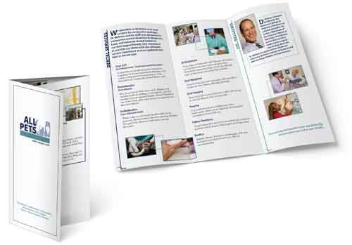
The new cover retains the white space of the original brochure, but I added the summary of services at the bottom, which allows the reader a quick overview of the services All Pets provides.
I divided the interior of the brochure into two sections: one for the explanation of services and the other for Dr. Bellows’s bio. The vertical rules with the headers running along them and the use of initial caps draw the reader’s eye to each section. I eliminated the before and after photos in the original—frankly, I found them somewhat off-putting—in favor of softer, friendlier photography showing doctor and patient interaction.
An updated Location panel, also designated by a new vertical header, presents clearer directions to the office. I also included a photo of the building’s exterior as a visual reference for the customer driving to the office for the first time.
The color palette was chosen for its medical feel and subtlety, which will help the brochure to maintain a contemporary look for many years. I used Myriad Pro in the logo to project a feeling of stability and longevity, and I carried that font into the brochure’s headers. I chose Caslon for the body copy because it’s straightforward and readable, and as a classic face it also won’t go out of date any time soon.
ABOUT THE DESIGNER
Chris Owens www.dpicreativeservices.com
 After graduating from Pensacola Christian College in 1996 with a Communications degree, Chris spent time as a member of the inaugural class at Virginia Commonwealth University’s AdCenter, studying copywriting before turning his attention to the world of graphic design. His career path has taken him from production artist to creative manager for national automotive retailer CarMax, where he leads a team of three art directors in producing a wide spectrum of both print and digital graphic design projects.
Concurrently, Chris is principal of dpi creative services, a burgeoning photography and graphic design business. Chris’s photography has appeared in local and national publications such as WORK magazine and Fortune online, and he has graphic design clients throughout the southeast.
Chris resides in Richmond, Virginia, with his wife and their new baby girl.
APPLICATIONS USED: Adobe Illustrator CS4 and Adobe InDesign CS4


