Although InDesign works wonderfully with Adobe Photoshop, it’s always nice when you don’t have to constantly go back and forth. Adobe InDesign CS3 takes some lessons from Photoshop in the way of transparency effects. Those effects we’ve come to know and love—such as Bevel and Emboss, Inner Shadow, Inner Glow, Outer Glow, and Satin—have now made their way into InDesign CS3. This will be a real boon to your creativity and productivity. Let’s take a look at how this stuff works.
STEP 1 We Need a Document
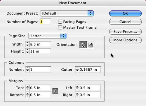
As with most InDesign tutorials, we need a document to get started. So, as usual, you can either open an existing document or create a new one. We’re going to start with a new, one-page 8.5×11″ document (File>New>Document). Click OK.
STEP 2 Create Large Frame for Background Image
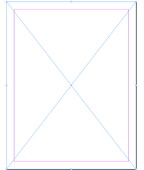
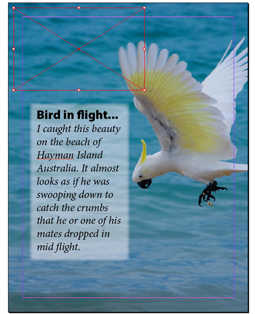
We want to have an image in the background so we can place text frames on top of it. So grab your Rectangle Frame tool (F) and create a large frame that fills most, if not all, of your page. Of course, if you’re going to go to the edge of the page and take this document to press, you’ll probably want to bleed the image (frame) off the page. It this is what you want, you’d create a page with a bleed area in Step 1 (click the More Options button in the New Document dialog).
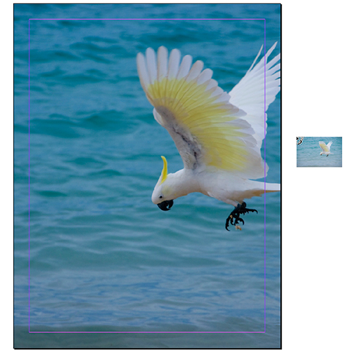
STEP 3 Place Large Background Image
You can either drag-and-drop or File>Place your image into the frame we created in Step 2. If you use the Place command without a frame selected, you’ll notice that InDesign now shows you a preview thumbnail of the next image about to be placed.
STEP 4 Put Background Image on Its Own Layer
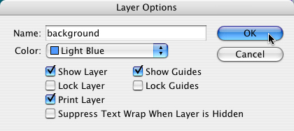
This step is one that will make it easier for you to work on top of the image you’ve just placed. What we’re going to do is put it on its own background layer. Bring up your Layers panel (Window>Layers), double-click on Layer 1, rename it “background,” and click OK.
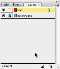
STEP 5 Lock the Background Layer; Make a Text Layer
Next we need to lock our background layer and create a new layer on top so that we can place our next frame. In the Layers panel, click the little box to the right of the Eye icon to lock the background layer. Now hold down your Option key (PC: Alt key) and click the Create New Layer icon at the bottom of the Layers panel. (By holding down the Option key, you can name the layer while you’re creating it.) Name it “text” and click OK.
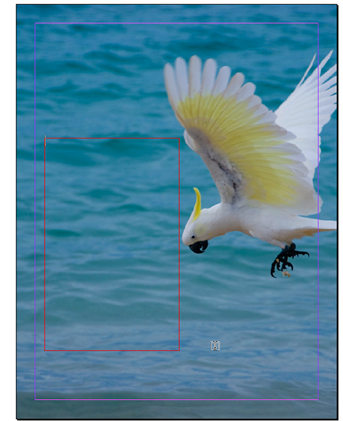
STEP 6 Create Your Text Frame
As you might have guessed, by naming our new layer “text,” it’s time to create a new text frame on top of our background image. Grab the Type tool (T) and drag out a new text frame on top of your image where you want to place your text.
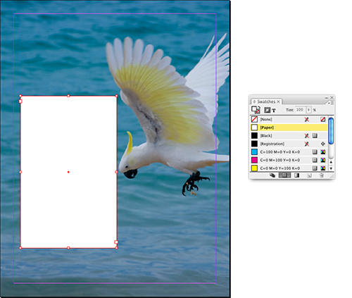
STEP 7 Fill Your Text Frame with White
Now we need to fill the newly created text frame with white. Bring up your Swatches panel (Window>Swatches, or press F5). Because we created the frame with our Type tool, InDesign defaults to the insertion point, expecting you to begin typing; but we want to fill the frame with white, so we need to select the frame as an object. Simply switch to your Selection tool (V), click the Fill icon at the top of the Swatches panel, and then click Paper to fill your frame with white.
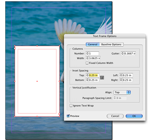
STEP 8 Give Your Text a Little Room
By default, InDesign will flow your text to the edges of the frame but we don’t want that for our effect, so we need to create an inset on our text frame. With your text frame still selected, choose Text Frame Options from the Object menu. Set your Inset Spacing to at least 0.25 in and click OK.
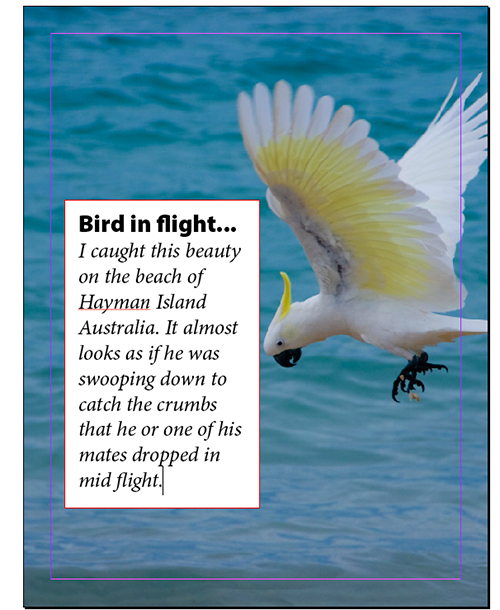
STEP 9 Create Your Text
Next we’ll need some text. Double-click your Selection tool in the middle of your text frame to switch to the Type tool. At this point you can just start typing or place your text. Get your text looking the way you want. Go ahead, I’ll wait….
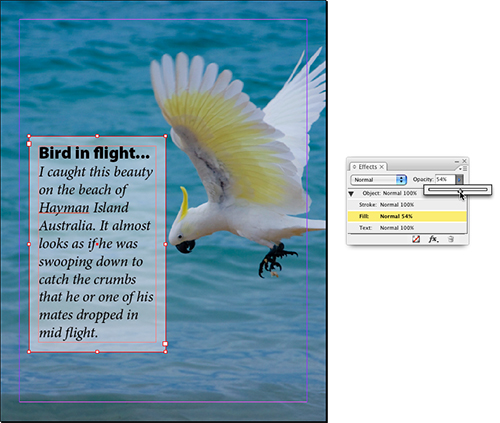
STEP 10 Time for Some Effects
We’re all set now to try out some of those new effects. First, we’ll try lowering the opacity of the white in our text frame. Unlike previous versions of InDesign, you can do this without lowering the opacity of your type. Here’s how:
Switch to your Selection tool and then go to your Effects panel (Window>Effects). It’s on Object by default, so click on Fill and lower the Opacity (we used 54%). This lowers only your white fill’s opacity.
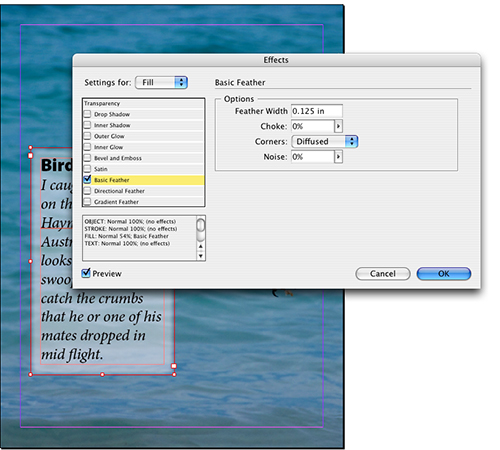
STEP 11 Soften the Edges
We could stop here, but the edge of the frame has a hard edge, and depending on your design, you may want a soft edge. Click on the flyout menu at the top-right of the Effects panel, and choose Effects>Basic Feather. Since you already had Fill selected in the Effects panel in the previous step, it will already be set to Fill in the Settings For pop-up menu. This may be fine, but you can also choose Object, Stroke, or Text from the menu to change the feathering for each individual attribute. Click OK when it looks the way you want.
STEP 12 One More Thing…
Lowering the opacity on your text and graphics seems like child’s play now, doesn’t it?
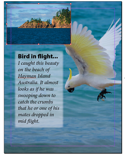
Here’s an additional feature that was one of the most requested in InDesign since transparency was introduced: the ability to have an object or text go from opaque to transparent. And now we can do just that. Start by using your Rectangular Frame tool to create another frame on top of your background image.
STEP 13 Place Another Photograph
In this frame, we’re going to place a smaller shot of a nearby island where this guy came from. Place your image and then fit it to the frame using your preferred method.
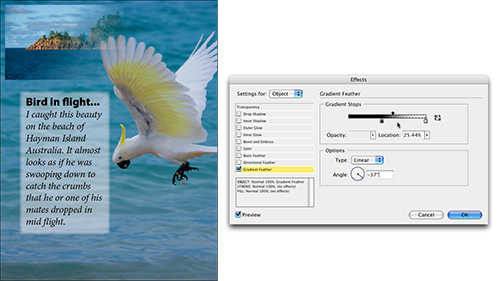
STEP 14 Apply a Gradient Feather
Now click on the fx icon at the bottom of the Effects panel and choose Gradient Feather. You can control the direction of the gradient feather as well as the amount of transparency applied to your edge by dragging the Gradient Stops (as shown). You can also choose a linear or radial gradient. Click the Preview box so you can see what’s happening and once you have your desired effect, click OK. Note that Gradient Feather can also be applied to vector artwork and text frames too—so go nuts!