
The Art of Type: Following the Script

Typographically speaking, the term “script” refers to any typeface that’s designed to look hand-drawn. Script faces come in many forms, from formal engraving faces to loose advertising faces to those that attempt to imitate everyday handwriting. They fall into three general categories (shown here): calligraphic (including chanceries, uncials, and blackletter or fraktur faces), roundhands, and brush faces. In most cases, the shapes of their characters move them well beyond the predictable and manageable boxy forms of everyday roman characters, so setting requires extra attention—often in unexpected places.
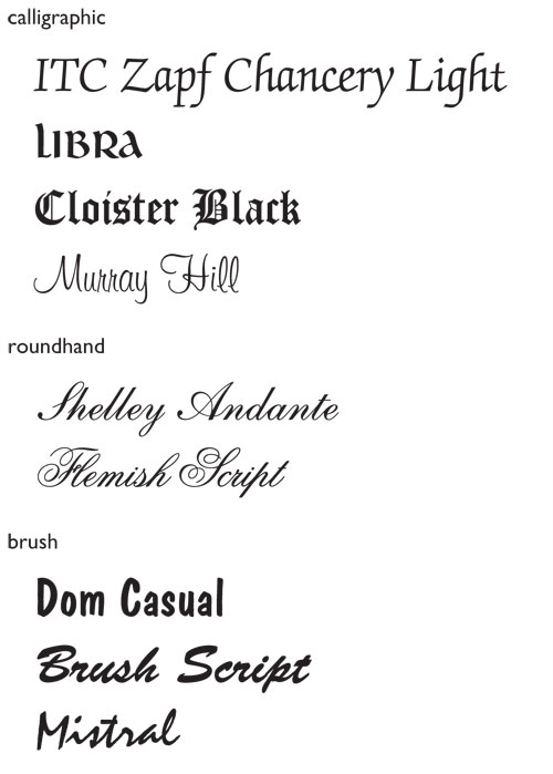
Script faces
For example, very few script faces can be set in all caps. Most just weren’t designed to be used this way, and some of the more exotic forms used for script capitals can be unrecognizable without the accompaniment of more familiar lowercase forms to provide some context. Exceptions to the rule are faces such as Impress and Dom Casual, which were designed as advertising faces and derive from the kind of lettering—often in all caps—that you see in hand-painted supermarket signage.
Joining script faces
So-called joining script faces—whose characters actually connect—are the trickiest to deal with, even though they’d seem to all but eliminate the use of most of your typographic armaments, such as spacing adjustments. Roundhand faces, which imitate elegant formal handwriting, are a good example of joining faces. The connections between characters in these faces effectively make the entire word a single ligature, which means that you can’t adjust their tracking very much, if at all. If their spacing gets too loose, the letters disconnect; if you tighten tracking too much, adjoining characters will overlap instead of merely abutting. For the same reason, you can never set joining scripts with justified margins—the stretching and squeezing needed to fill justified lines will make hash out of these faces’ carefully calibrated spacing.
Consequently, there’s no need to kern lowercase characters in joining script faces. On the other hand, you’ll almost always need to kern the spaces between capitals and the lowercase characters that follow them (shown in this album cover). Because all the lowercase characters connect, the gaps after capital letters look extra large, as seen in Prokofiev’s name. Romeo and Juliet were thoughtful enough to have initial caps that have connecting forms, at least in the face used here, Embassy.
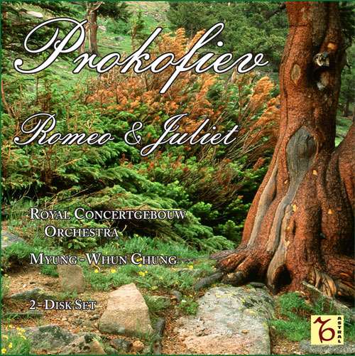
Before ©COLORBYTES 1992
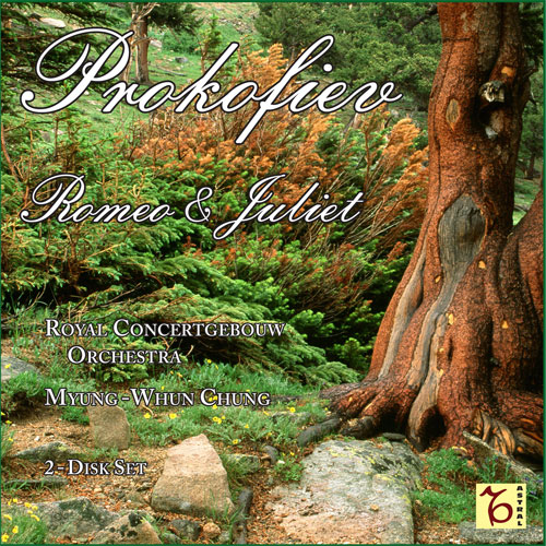
after kerning type
The often loopy, flamboyant forms of script faces also oblige you to look for spacing problems in places you’d normally ignore, such as around the ampersand in the album cover type. The swerving shape of the Embassy ampersand makes it appear to lean away from Romeo and reach out to tickle Juliet. Restoring typographic decorum demands kerning the ampersand away from the latter and toward the former. You don’t normally have to worry about kerning against word spaces, but in script settings it happens all the time. Script faces play by their own rules and we’re all obliged to follow along.
Get that calligraphic slant
Most typeset characters are content to contain themselves within the bounds of the normal em square in which they’re constructed, but not joining script characters. To get that calligraphic slant and have all the characters “link hands,” one character has to overlap the next. Here, we’ve selected a single character to highlight the bounding box of such script characters and show how peculiar the spacing of these faces really is.
Snell Roundhand (top) and Lucia (bottom) samples
For a joining script face, the inclined characters have been constructed to overlap each other in order to connect. Because typesetting programs align characters at the margin according to the edges of their bounding boxes, tricky alignment issues arise in flush-left or -right settings. In midline, this overreaching doesn’t have much practical impact for the typesetter, but at either end of the line, this method of constructing characters can affect margin alignments.
Typeface designers have two possible strategies when it comes to accomplishing this overlapping. For example, Snell Roundhand (the top sample) could be called left-handed because the overhanging parts of its characters occur on the left side of their bounding boxes. By contrast, Lucia (the bottom sample) is right-handed: The overhanging parts of its characters extend beyond the right-hand side of the bounding box. Both accomplish the same end, but with the result that Snell will hang out beyond the left-hand margin when it starts a line, and Lucia can be a struggle to align flush-right if a line ends with a character (such as one with an ascender) that leans far out of its bounding box. In such cases, you’ll be obliged to manipulate the horizontal position of such lines using left and right indents to get them to appear properly aligned.
Lastly, most roundhand script faces don’t work well in small sizes. Many of these faces started life as engraver’s faces and were never meant to be used in tiny sizes. In computer settings, they become spindly as their point size decreases, and any kind of competition with the background (tints and patterns, for example) makes them very hard to read. Even in the large sizes used in the sample album cover, I chose to stroke the characters in black to give them some contrast against their busy photographic background. Reversed script type (set white on black) in small sizes tends to break up, as the black ink invades the super thin strokes. In this, they’re like italics, only worse!

