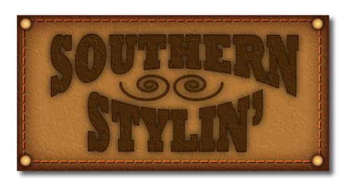
Leather Stylin' in Illustrator
People tend to forget that Illustrator contains several Photoshop filters that can be applied directly to vector objects inside Illustrator. Here we’ll use them to create a quasi-realistic leather patch logo complete with buttons and stitching. As always, experiment with the settings as you go: You just might stumble onto a happy accident!
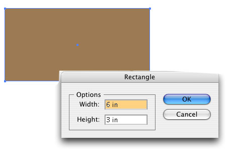
1 START WITH A RECTANGLE
Select the Rectangular tool (M) from the Toolbox, then click once on the artboard. In the dialog that appears, enter 6″ for Width, 3″ for Height, and click OK. In the Color panel, set the Fill color to R:156, G:123, B:83 and the Stroke to None.
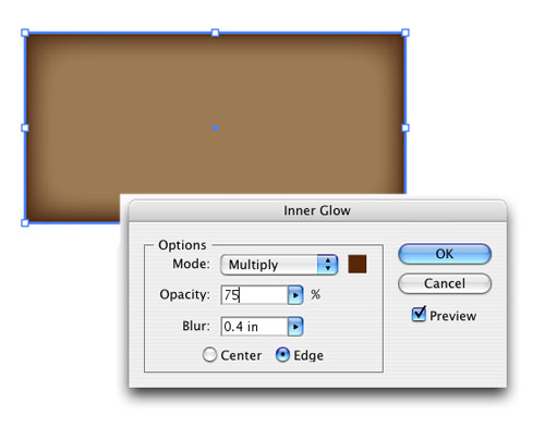
2 APPLY INNER GLOW
With the shape still selected, go under the Effect menu, under Illustrator Effects, and choose Stylize>Inner Glow. In the dialog, change the Mode to Multiply, then click the color swatch and enter R:89, G:39, B:5 in the Color Picker, and click OK. Next, change the Blur setting to 0.4 in, leave the Edge button checked on, and click OK.
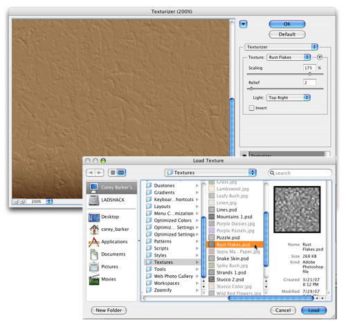
3 CHOOSE PHOTOSHOP TEXTURE
Go into the Effect menu again but this time go under Photoshop Effects to Texture and choose Texturizer. In the dialog, click the small arrow to the right of the Texture pop-up menu and select Load Texture.
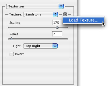
4 LOCATE THE TEXTURE
Because this is a Photoshop filter, we have to look in the Photoshop folder to find the texture, which is located in the Applications folder (PC: Program Files folder). In the Adobe Photoshop CS3 folder there’s a folder called Presets; inside this folder is the Textures folder; then inside that folder, select the texture called Rust Flakes, and click Load. In the Texturizer dialog, set the Scaling to 175%, the Relief to 2, the Light direction to Top Right, and click OK.
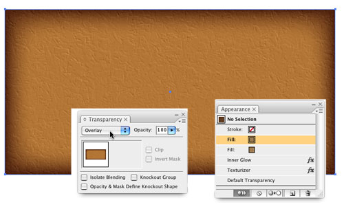
5 DUPLICATE THE FILL
Go under the Window menu and select Appearance to open the Appearance panel, where you’ll see all the properties and effects applied to your shape. Click-and-drag the Fill item to the Duplicate Selected Item icon at the bottom of the panel. Now open the Transparency panel (Window>Transparency) and change the blend mode of the duplicated fill item to Overlay. This will enhance the color of the shape.
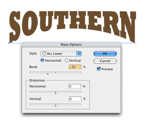
6 SET TEXT AND WARP
Click once in the artboard with the Type tool (T) and type “Southern” using the Rockwell Extra Bold font at 60 points. Set the Fill color to R:107, G:78, B:46 and the Stroke to R:127, G:94, B:64. Click on the Selection tool and enter “2 in” in the Height field in the Control panel (make sure it’s not linked to the Width field). Go under the Effect menu and choose Warp>Arc Lower. Change the Bend to –30% and click OK. Set another line of text (“Stylin’”) the same way, using the Arc Upper warp instead, but still keeping it set to –30% for the Bend.
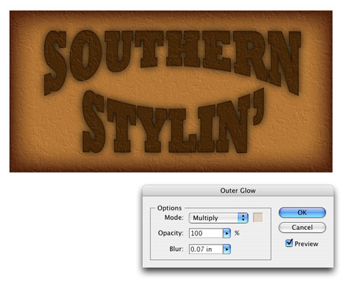
7 BLEND THE TEXT
Select both text objects and position them inside your textured rectangular shape. Open the Transparency panel and change the blend mode to Difference, which will dramatically change the look of the text. Next, go under the Effect menu, under Illustrator Effects, and choose Stylize>Outer Glow. Set the Mode to Multiply; click the color swatch and choose R:224, G: 210, B: 198; and then set Opacity at 100% and Blur to 0.07 in. (Note: Multiply mode usually affects darker colors but because the object is in Difference blend mode, it’s just the opposite.)
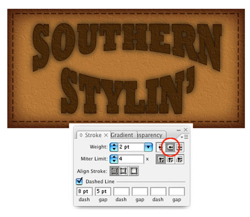
8 CREATE STITCHING
Select the Rectangular tool and draw a box that covers all but the outer edges of the original rectangle. Set the Stroke to the same light brown that we used in step 1 and the Fill color to None. In the Options Bar, click on the word “Stroke” and in the dialog that appears, set the Weight to 2 pt, click on the Round Cap icon to the right (circled), check the Dashed Line box, set the Dash option to 8 pt, and the Gap to 5 pt. Now open the Transparency panel and change the blend mode to Multiply.
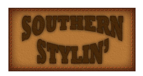
9 DUPLICATE THE STROKE
With the stitching object still selected, copy it to the Clipboard by pressing Command-C (PC: Ctrl-C), and then press Command-F (PC: Ctrl-F) to place the object directly in front of the original. Change the blend of this object to Color Dodge in the Transparency panel and press the Left Arrow once and the Up Arrow once—this will give the illusion of dimensional threading.
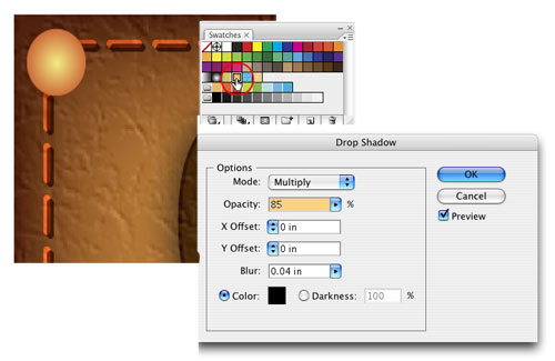
10 CREATE THE FIRST BUTTON
Select the Ellipse tool (L), hold Shift, and draw a small circle in the upper-left corner over the stitching. In the Options Bar, set the Stroke to None, click on the Swatches panel, and choose the Radial Gradient 2 (circled). Go under the Effect menu under Illustrator Effects, and choose Stylize>Inner Glow. Set the Mode to Multiply, Opacity to 100%, and Blur to 0.04 in. Click OK. Then access the same menu and choose Drop Shadow: Set the Mode to Multiply, Opacity to 85%, and the X and Y Offsets to 0. Set the Blur to 0.04, leave the color as black, and click OK.
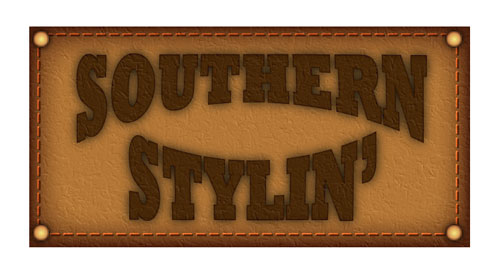
11 DUPLICATE AND PLACE OTHER BUTTONS
With your initial button created, copy-and paste the object by pressing Command-C (PC: Ctrl-C) then Command-V (PC: Ctrl-V) three times, and place one button in each of the corners of the shape.
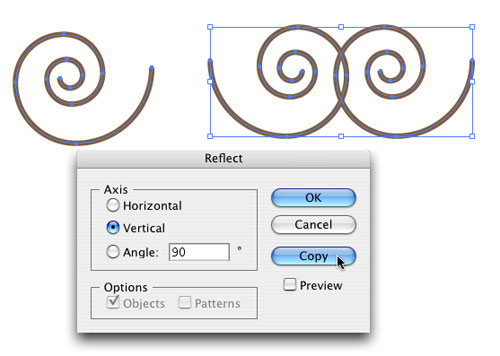
12 ADD ORNAMENTAL SHAPE
Now we need a small ornamental shape between the words. Choose the Spiral tool from the Toolbox (it’s under the Line Segment tool), hold the Shift key, and click-and-drag to the right to draw the shape. Set the stroke Weight to 4 pt and the color to the same light brown. Now select the Reflect tool (it’s grouped with the Rotate tool). Double-click the tool icon to open the Reflect dialog. Select Vertical, 90º Angle, and click Copy. This will create a duplicate and flip it. Then just nudge the shape over to complete the design.
13 FINISHING TOUCH
Finally, change the blend mode to Multiply and apply the Outer Glow effect that we applied to the original text in step 7. Then just place the shapes in the center between the text. And there you have it!
You obviously don’t have to use the exact same text as we did—it’s the technique that’s important. So feel free to experiment with the settings as you go along. You may discover something new and exciting.