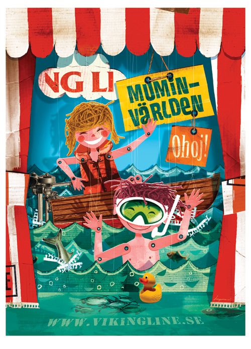
Designer Spotlight: Jonas Bergstrand
Jonas Bergstrand was born in Stockholm, Sweden, where he still resides today. Jonas knew early on that he wanted a career where he could draw all day long but had no idea at the time what an illustrator or graphic designer was. After graduating from Forsberg’s School of Design in 1997, Jonas got his start by assisting a former teacher. Three years later, he was picked up by CIA (Central Illustration Agency), a critically respected agency in the U.K. According to Jonas, “Illustration may not be rocket science but to me it’s a blast.” His long list of clients includes Chrysler, Hasbro, MTV, The New Yorker, Priceline, T-Mobile, and Yahoo!
Layers: On a student blog in the U.K., you mentioned that illustration is just another form of communication. What did you mean by that?
Bergstrand: I think illustration is much more than just decoration. A good illustration/illustrator provides illumination. And this doesn’t happen by chance—it’s not a byproduct to style. Illustration may not be a science but it certainly communicates in a precise way.
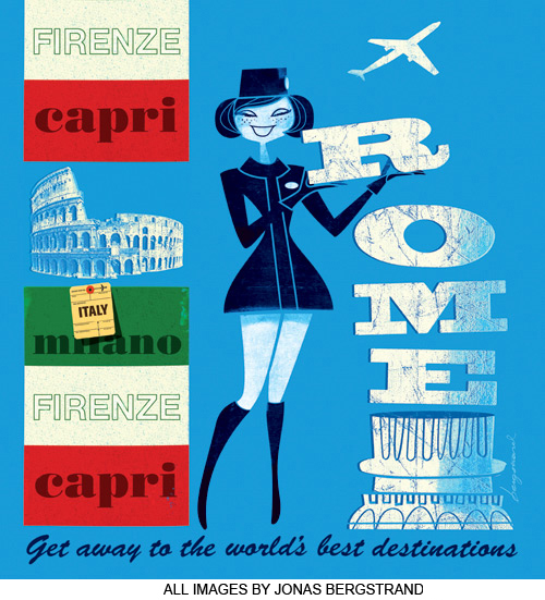
Layers: A lot of your images use solid colors or various shades of the same color in the background, which really helps to focus the viewer’s attention on the subject. Does this occur more in your commercial work, or is this a personal preference?
Bergstrand: It’s a personal preference that luckily works pretty well as a way to direct focus to what’s important. I can’t pinpoint exactly when and where I picked up on this way of treating colors. A conceptual color treatment is something you’ll find throughout the history of illustration, I guess. Many of my personal favorites like Paul Rand, Abram Games, and Saul Bass used limited palettes.
Layers: Many of the characters in your illustrations are very two-dimensional—some even have the appearance of jointed cardboard cutouts. How did this style evolve and how do you feel it impacts the viewer?
Bergstrand: When I started out, I was very exited about the precision that computer-generated images offered. I was heavily into flat areas of color and perfect shapes without jagged edges. I still like the control that Illustrator provides when I lay out my images, but over time I’ve backtracked slightly and I enjoy the presence of the hand more and more. I think my current style is something of a hybrid where I try to pick the best out of two worlds. Control and chance brought together is what I’m hoping for.

Layers: What applications do you work with regularly? Do you have a favorite?
Bergstrand: I use Illustrator and Photoshop for all my images. I produce the basic drawing in Illustrator and then apply “makeup” in Photoshop.
Layers: You have a lot of photographic elements in your images that create a collage effect. How do you decide what should be illustrated and what should be a photograph? How does the mixture of photographic elements and illustrations help to convey the message you’re trying to get across?
Bergstrand: When I plan an image, I have something like a wish list of what photo material I’d like to feature. Many times though I have to reconsider because I can’t find what I’m looking for. Sometimes the clash between photo and drawing helps underline the message but I also grant myself the luxury to use the effect just for the fun of it.
Layers: What artists have most inspired you? How has that inspiration carried over into your own work?
Bergstrand: Paul Rand is the undisputed king if you ask me. I don’t want to use “was” because his work is still so fresh. (What was UPS thinking of when they destroyed their classic logo?) His work proves that there’s no boundary between illustration and graphic design. In all things important they’re the same. This is a fundamental and very inspiring truth—many times sadly forgotten, though. Why are design schools so keen on separating the two? I don’t see the gain in that, only loss.
Jonas Bergstrand:
www.jonasbergstrand.com