
Design Makeover: Microbrewery
Microbrewery Rethinks Presentation for One Niche-Market Beer
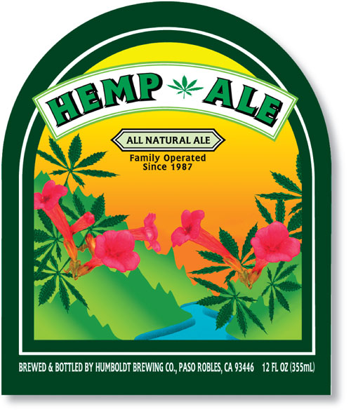
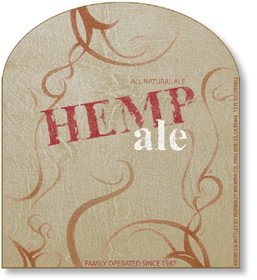
BEFORE
Client: Firestone Walker Brewery www.firestonebeer.com – www.nectarales.com
“The company is looking for a new label to broaden Hemp Ale’s appeal and increase its market share among 25- to 35-year-olds who embrace a healthy lifestyle…”
Firestone Walker Brewing Co. in Paso Robles, California, has grown in only a decade from a tiny microbrewery to a mid-sized company that makes award-winning craft ales for craft beer lovers. The brewery makes two types of ale. Firestone is its more traditional brand of British ales that’s made using a process uncovered in England by founders Adam Firestone and David Walker. On a smaller scale, they also produce Nectar Ales that appeal to a younger breed of beer connoisseurs who enjoy more unusual flavors and all-natural ales. One of these is a niche beer called Hemp Ale. It’s a brown ale brewed with sterilized hemp seeds to add subtle flavor and is something of a marketing challenge.
The company is looking for a new label to broaden Hemp Ale’s appeal and increase its market share among 25- to 35-year-olds who embrace a healthy lifestyle that includes organic foods, natural fibers, a focus on well-being, outdoor activities, environmentalism, and grass-roots politics. “We want to market the lifestyle through the beer,” says Jamie Smith, marketing manager of Firestone Walker.
The current label focuses too much on hemp leaves, he points out, and the company wants to downplay any association with marijuana. In fact, there’s no THC (the active ingredient in marijuana) in the beer. They’d also like to update the label’s clip-art look and artificial colors. “We’d like the label to have a natural, earthy look. Our goal is to emphasize the natural aspect, but we want it to be fun too,” he says.
All of Firestone Walker’s labels, including the one for Hemp Ale, are die-cut and have an oval-shaped top. For this project, the brewers asked the designers to create a 3-1/8×3-1/2″ label for a 12-oz bottle. The art is important because it goes on everything related to the beer: six-pack packaging, posters, advertising, and the bottles too. The brand should also correspond to what the customer expects it to look like. “Sometimes we’ll advertise a beer on the radio and later someone will tell us they couldn’t find it at the store. They didn’t connect the packaging with what they heard,” says Smith. “Successful packaging also draws new customers. If they like the way the package looks, they may try the beer.”
AFTER
DESIGNER: Kimberly Graham
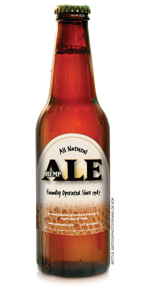
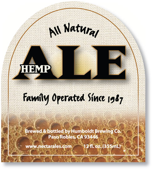
“I knew from the beginning I wanted to include the font FF Erik Right Hand somewhere on the packaging, because it has a natural, earthy look to it.”
When I first began this project, I wanted to find out what other products in the same category looked like. I did a Google™ search for images using keyword phrases such as “organic beverages” and “hemp ale” to get an indication what kind of packaging already existed for this target market. I needed to visualize how this label could stand out from those of other products in the category, but also look as though it belongs with the other beers.
The challenge for this project was to give the label the natural look the company had asked for but still create a complex design. I knew from the beginning I wanted to include the font FF Erik Right Hand somewhere on the packaging, because it has a natural, earthy look to it. I used Matrix Extra Bold for the word “hemp” and made it smaller to deemphasize the relationship between the ale and marijuana. I created the background in Photoshop, showing hemp fabric in its natural state blending down into beer bubbles. I then masked it to the appropriate label size and shape in Illustrator and added the text.
ABOUT THE DESIGNER: KIMBERLY GRAHAM
 Kim Graham graduated in 1991 from the Graphic Design and Advertising Program at Conestoga College of Applied Arts and Technology in Kitchener, Ontario, Canada. Since then, she’s worked for a variety of companies, including a design studio, a kitchen-product manufacturing company, a greeting-card company, and St. Jacobs Printery in St. Jacobs, Ontario, where she’s been employed for the last 11 years. She likes the challenge of creating new concepts that take into account both the client’s wishes and the reality of the market. Aside from graphic design, her other passions include poetry and psychology. She credits her son, Nicholas (her greatest influence), with reminding her that it’s okay to be silly once in a while.
APPLICATIONS USED: Adobe Photoshop CS2 and Adobe Illustrator CS2
AFTER
DESIGNER:Alicia Markey www.atomic17.com
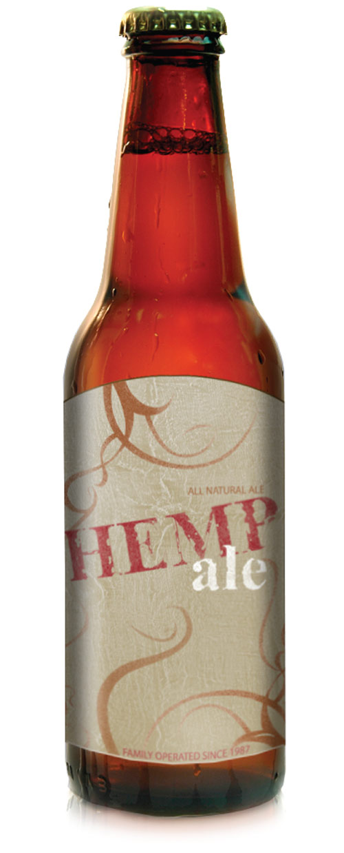
“…I was influenced by the flowing curves of henna tattoos. I wanted the curves to flow throughout the design and blend into the background at times as smoke would.”
When I thought about the design for Hemp Ale, I kept in mind the very narrow demographic the company is reaching out to. I wanted the label to speak to them and match the clothes and jewelry they wear, the art on their walls, and the music they listen to. When these laid-back 25- to 35-year-olds see the label, it should make them feel comfortable, as if they were already familiar with it.
I began my design with the color palette—natural earth tones with a hint of energy. For the background, I used an image of burlap, but adjusted the colors to fit my design. For the drawn design superimposed over the burlap, I was influenced by the flowing curves of henna tattoos. I wanted the curves to flow throughout the design and blend into the background at times as smoke would. The type has a rustic feel to it. I used Times for the name of the beer, but gave it a heavily textured feel to make it worn and tattered-looking. In contrast, I used Myriad for the subheadings for a cleaner look. I didn’t want them to stand out as much, so I used type in the same color family as the background. Overall, I wanted the design to be edgy, yet reflect a laid-back lifestyle.
ABOUT THE DESIGNER: ALICIA MARKEY
 Alicia Markey received a B.S. in Graphic Design from Drexel University. She has been a graphic design specialist at Cecil Community College in the marketing department since 2002. Before working at the college, Alicia held an internship at the Philadelphia Museum of Art where she was part of a team that designed and installed the Honami Koetsu Exhibit—shown for the first time in the United States. Alicia also does various freelance projects for clients, including the New York City Classical Guitar Society. Currently, she’s pursuing her graduate degree at Wilmington College in IST, specializing in Web/Internet design. Alicia’s interests also include swimming (far distances…too far for most to think sane), coaching, and spending time with her husband, Shawn.
APPLICATIONS USED: Adobe Illustrator CS2 and Adobe Photoshop CS2
AFTER
DESIGNER: Loredo Rucchin www.rucchin.com
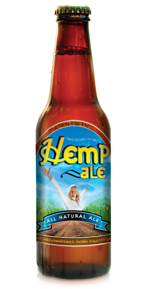
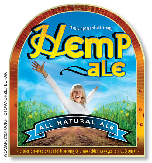
“I used the picture of a young woman to suggest a holistic, active lifestyle among people in their twenties and thirties who do yoga and embrace physical, mental, and spiritual well-being.”
My overall design concept was to make the label convey something fresh, unique, and modern, yet give it an organic, natural feel, thus appealing to the target audience. I wanted to go with an earthy look, incorporating the unkempt trail pathway—with its wildflowers and dirt—against a clear blue sky. I used the picture of a young woman to suggest a holistic, active lifestyle among people in their twenties and thirties who do yoga and embrace physical, mental, and spiritual well-being.
The subtle background border shows the Hemp Ale color in all its golden glory. I also wanted to make the name “Hemp Ale” unique by using different fonts—Suburban and Triplex condensed—detailed with fine vertical lines.
I created the Hemp Ale logo and the Natural Ale banner in Illustrator and then placed them in Photoshop. But the majority of the work was done in Photoshop using layer masks and layer positioning.
ABOUT THE DESIGNER: LOREDO RUCCHIN
 Loredo Rucchin lives and works in Vancouver, British Columbia. A self-taught designer with more than 12 years’ experience, he has worked with a wide range of mostly American clients—from gaming companies to pharmaceutical firms. He specializes in Web and print design and also does photography. Influences: director and producer Peter Jackson (love his knack for detail). Design likes: clean, modern, urban design. Design dislikes: tacky clip art and designs obviously executed in Corel Draw. His creativity is inspired by his wife and new baby, Lucas, who was born while dad was working on this makeover. Loredo, an Ironman competitor, loves pushing himself to the limit. He works an average of 16 hours a day on what he calls “fun projects.”
APPLICATIONS USED: Adobe Illustrator CS and Adobe Photoshop CS

