
Choosing Type Combinations
One of the most challenging—but also one of the most satisfying—aspects of designing with type is choosing several typefaces that “look great together.” But who’s to say what looks great together? Often you choose several faces and after experimenting for a while, you instinctively know that a particular combination “works.” But since we’re all so busy and under such deadlines, we need to find type solutions quickly. To do that, it helps tremendously to be able to put into words exactly why a particular combination doesn’t work and what to look for when trying to find faces that complement each other.
First, follow the Holy Font Guideline #1 when choosing different typefaces for a piece: Concord or contrast, but don’t conflict.
That is, either stick with different styles in the same typeface family (concord), or choose completely different faces (contrast). Do not choose typefaces that are similar (conflict).
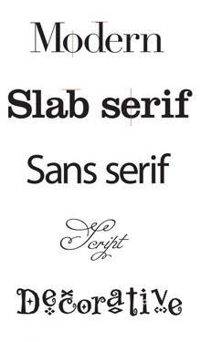
To feel confident about which font combinations concord, contrast, or conflict, it helps to first train your eye to categorize typefaces. We can break down type families into six broad (very broad) categories:
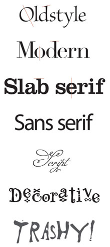 1. Oldstyle: Slanted serifs, a moderate transition between the thick and thin strokes of a letterform, and a diagonal stress (the angle of a line drawn through the thinnest parts of curved letters).
2. Modern: Thin, horizontal serifs, a radical difference between the thick and thin strokes of a letterform, and a vertical stress.
3. Slab serif: Thick, horizontal serifs, little to no difference between the thick and thin strokes, and a vertical stress.
4. Sans serif: No serifs, and most often monoweight (the strokes are pretty much one thickness).
5. Script: Anything with a flowing, handwritten style.
6. Decorative: Whimsical and fun. Grunge faces are a subcategory in that they are definitely decorative, but lawless and edgy, breaking the rules, trashy and trendy.
CONCORD
For a concordant look, choose one type family from any category. Use only the fonts from this one family. As you can see in Figure 1, a concordant look can be quite elegant if you don’t use a lot of contrast; it stays rather sedate and comfortable.

Fig. 1: This example uses the Bauer Bodoni family, a modern typeface—Bauer Bodoni Regular, Italic, and Bold.
Now, if you want a juicier yet still concordant feeling, you can add a little contrast, such as a contrast of size or weight, as shown in Figure 2 (more about contrast in a minute).
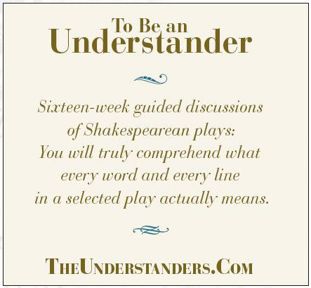
Fig. 2: Using the same copy and type family, in this example I merely emphasized the differences.
Limiting yourself to one type family is always safe. It can actually be a fun challenge to create something provocative from a limited type family. But typically we tend to use more than one family in any design.
CONFLICT OR CONTRAST?
The trick to combining different faces is to choose fonts from different categories. In other words, don’t combine typefaces from the same category—don’t use two different sans serifs on the same page, or two moderns, or two scripts, or two oldstyles, or two decoratives. Choosing from different categories gives you a basic contrast of structure (how the typeface is built). The reason this is a fail-safe guideline is because of Holy Font Guideline #2: It’s the similarities in typefaces that create conflict. When you see a designed page with a font combination that makes you twitch, I guarantee it’s because of the similarities—not the differences.
Take a look at these three examples, and listen to your eyes.
Fig. 3: This is a concordant combination with italic in the same font (Brioso Pro) for emphasis.
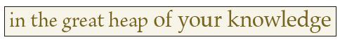
Fig. 4: These two oldstyles (Brioso Pro and Palatino) in the same point size have too many similarities, creating conflict.
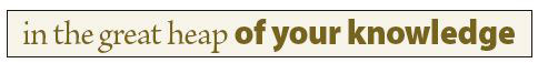
Fig. 5: This oldstyle (Brioso Pro) contrasts well with the bold sans (Myriad Pro Black)—the structures are very different, the stroke weights are very different, and the stresses are very different.
Figure 3 uses the regular roman font of an oldstyle family with the italic of the same family as a subtle emphasis. Nice and concordant, your eyes are at peace.
In Figure 4, can you feel your eyes twitch as they notice the change in font? Your eyes twitch because they know it’s a different font, but it’s so similar that they can’t quite figure out what’s going on (is it really different? is it the same? is it trying to tell me something? am I missing the point? aacckk!). So it’s a little befuddling and annoying and you quickly scurry on just to get away from the confusion.
In Figure 5, your eyes feel much more comfortable and peaceful because they understand the change in font. It’s clear, it’s obvious, your eyes know what’s going on, and they feel secure. Listen to your eyes.
CONTRAST
The key to strong, bold, clear communication is in the differences, the contrast. Start with fonts from different categories; for instance, a sans serif headline with oldstyle body copy. That’s the first place to begin, but it’s rarely enough. In Figure 6, you see a sans serif headline with an oldstyle body copy—fonts from two different categories. It’s a good start for a combination, but in the example there are too many other similarities causing conflict: their sizes are similar, their weights are similar, and their forms (italic vs. roman; caps vs. lowercase) are similar. So you need to juice up the contrast, as in Figure 7.
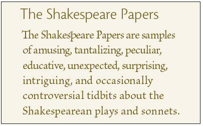
Fig. 6: Here we have a good combination of structure with a head from the sans serif category and the body copy from the oldstyle category. But it’s not enough.
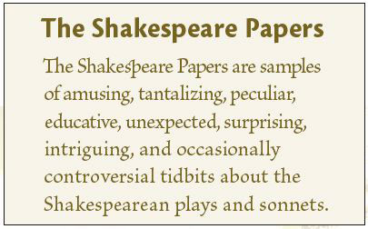
Fig. 7: The contrast of structure is the best place to start, but we need to strengthen the contrast. Here I used a heavier weight in the head and a lighter weight in the body copy.
You see, Holy Font Guideline #3 is about contrast: Don’t be a wimp. Don’t contrast semibold with bold, or light with regular. Don’t contrast 10-point type with 11-point type. If it’s not going to be the same (concord), then dammit, make it different (contrast).
You might have a modern face as a large headline, and choose the body copy from another category, such as slab serif. These two families have great contrasts in their stroke structures and serif shapes, but because they’re both serif faces, you’ll need to emphasize their contrasts. Moderns are particularly gorgeous when set large so everyone can admire their elegant structures, so take advantage of that.
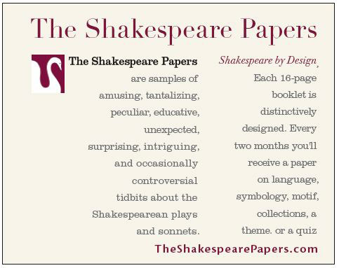
Fig. 8: “The Shakespeare Papers” is in a modern font (Didot), set horizontally, with several short vertical body copy segments in a slab serif (Clarendon).
So how exactly do you emphasize the differences? There are six forms of typographic contrast, many of which I’ve alluded to already:
1. Structure: The structure of a typeface is how it’s built. Imagine you have to create a typeface out of the materials in your office. A font made out of pencils would have a different structure than a font made out of printer cables or staples. Whatever you use creates its structure. The different categories of type each have different structures.
2. Size: You know what different point sizes are. Follow Holy Font Guideline #3 when combining sizes.
3. Weight: How thick the strokes are in a typeface determines its weight. It’s always good to have a couple of really heavy weights in your font collection.
4. Form: The form of a letter is its shape. For instance, a capital F has a very different form/shape from a lowercase f, even though they might have the same structure (same font, even). A capital F has a very different form from an italic f, even though, again, they might have the same structure.
An easy way to think of a contrast of form is italic vs. roman (which simply means type that is straight up and down), or all caps vs. lowercase.
A conflict of form would be two italic fonts used together, or a script with an italic, because they both have flowing, usually slanted forms. Two different faces both in all caps have potential for conflict.
5. Direction: I don’t mean a slanted direction, although that’s sometimes useful. Type automatically has a direction when set in lengthy headlines or narrow columns, for example. If you see a contrast of direction happening in your design, take advantage of it, emphasize it.
6. Color: Typographers have always referred to color in text, even when all the text is black. It refers to the impact of blocks of text. Squint at a page in a novel and you can see the even gray tone; in a newspaper, notice the darker colors of the headlines compared to the gray stories. You might call out words in the main text by using a different color, even if the “color” is a sans serif bold in black.
Looking back at Figure 8, you’ll see that I created or emphasized four different contrasts:
• Size: 40 point vs. 9 point (in the original graphic).
• Structure: Modern vs. slab serif.
• Direction: The heading is horizontal, while the small columns have a vertical emphasis.
• Color: A dark plum vs. gray.
To avoid a potential conflict in Figure 8, I used the warm color for the words that I wanted to catch the eye of someone skimming the page (warm colors attract the eye), thus emphasizing the headline. If I had used the warm color in the small body copy, it would conflict with the headline in that the small body copy would be calling attention to itself in one way (the dark plum), but the headline would be calling attention to itself because it’s so much bigger. Be careful that your contrasts themselves don’t conflict with each other!
Take a look at the beautifully designed headlines in this magazine. Put into words the contrasts the designer employed and it will become very clear exactly why the headlines are pleasing, dynamic, interesting, and communicate clearly: There are three lines of type—the title of the article, a subtitle, and the byline. In these three lines there are contrasts of size, weight, color, and form (lowercase vs. all caps). Make sure you can point out where each contrast is happening.
Take a particular look at the byline. When using caps vs. lowercase as a contrast of form, you run a risk when the smaller text is in all caps: The two pieces of text have the potential to conflict in that the larger type says, “Ha ha! I’m bigger!” and the smaller text says, “Well, you might be bigger, but I’m in all caps!” However, the designer of these particular headlines avoided that disaster by strongly emphasizing the size and weight differences so there’s no competition, plus he added letterspacing to the text in all caps to further emphasize the difference between it and the other two lines, especially the main title with its extra-tight letterspacing. Contrast is the key.
Now, if you’re really typographically astute, you’ll say, “But in those three lines of the article titles, there are two different sans serifs (Trebuchet and Cronos)! Doesn’t that break the Holy Font Guideline #1?” Well, yes it does, and it just goes to show you what a good designer can do with contrast. Take note.
LISTEN TO YOUR EYES
Look carefully at every great piece of design that catches your eye. Get in the habit of putting into words where the designer used contrast in the typography. Also notice pieces where the type is not so great—exactly what is the problem? Name it and you can fix it.
Remember, if you feel that the typefaces in your design conflict, take a look at what is similar—that is probably where your problems lie. If you absolutely must use the particular type combination that you’re working with (a corporate style sheet, for instance), emphasize the contrasts.
The other issue of conflict might be that you’ve used contrast, but the contrasts are competing with each other. Decide how you want to lead the reader’s eye around the page. Use contrast to do it, but always keep in mind the order in which you want information to be read. You, as designer, have almost complete control of a reader’s eye.
Also keep in mind that contrast doesn’t always mean big and heavy. It’s merely a reference to the elements around it. Small and thin might be the most appropriate and effective contrast on a field of empty white space; a small splash of red type might be exactly what you need amongst a lot of other text.
RULES? WHAT RULES?
Rules, of course, are made to be broken. The trick about breaking the rules is to be able to articulate in words why you’re breaking them—then break them with gusto. Don’t just break a rule a little bit, for heaven’s sake. If you’re going to be a maverick, then do it with glee, do it with panache. But that’s another story.

