An Interview with David Carson

 David Carson is considered by many to be one of the world’s most influential graphic designers. He describes himself as a “hands-on” designer and has a unique, intuition-driven way of creating everything from magazines to TV commercials. In addition to various awards and achievements for his graphic design and typography work, Carson has also written books on design, including The End of Print (with Lewis Blackwell), Trek: David Carson, Recent Werk, and the soon-to-be-released The Rules of Graphic Design.
Graphis magazine referred to Carson as a “Master of Typography.” I.D. magazine included Carson in their list of “America’s most innovative designers.” In Newsweek magazine, a feature article said of Carson: “…he changed the public face of graphic design.” Emigre, a graphic design journal that ran for 21 years up until 2005, devoted an entire issue to Carson. His long list of clients includes American Express, AT&T, Atlantic Records, Budweiser, CNN, Levi’s, MTV, Sony, Toyota, Warner Bros., and Xerox, to name just a few.
Carson travels throughout the United States and the world, speaking at seminars and conferences on topics of graphic design and typography. He also enjoys surfing and at one time was a professional surfer.
Layers: David, could you tell us a little about your new book?
Carson: It’s called The Rules of Graphic Design. I’m working on it now in Zurich, Switzerland, where I have a small studio, besides my one in the states. It will show a lot of the new work I’ve done over the past few years, and will, as the title suggests, finally get the official “rules” out on graphic design. It should be out early spring 2008.
My first workshop I ever attended on graphic design was in Switzerland, so the book will no doubt be affected by my being here. I started it in the states and it will be finished there.
Layers: As one of the most well-known and influential graphic designers in the world, how do you balance work and play? Do you still get to surf often?
Carson: I’ve always felt I make my living from my hobby, so I’m lucky in that respect. As Marshall McLuhan said, if you’re totally involved in something, it is no longer work, it’s “play or leisure.”
I surf in the Caribbean every winter. There’s a perfect point break in my front yard. I watch the Internet surf reports, and when a swell is coming, I head down to the British West Indies. It’s a very special place and helps me recharge.
Layers: When creating a design such as a magazine cover, article, or website, what are a few of the most important things a designer should consider?
Carson: Who is the audience, what is that audience’s visual language, what type of things are they seeing? How can you communicate and reinforce visually what is written or spoken, and how can you stand out from the competition in that particular field?
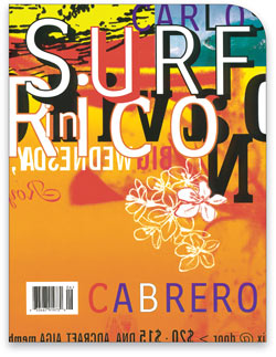
Layers: You redesigned Surfer Magazine in 1991 and founded Ray Gun as well. How does redesigning a medium, whether it’s a magazine or advertising campaign, differ from creating something from scratch?
Carson: In some ways they are very similar. You have to determine who the audience is, and what is the message you want to portray through the design. A new design gives you a bit more freedom, as you can help define the language. I think Ray Gun helped establish a certain visual language for alternative music. But redesigning, or inventing something new, both have their challenges and rewards, and I enjoy both. As long as you look for the solution in the particular thing you are working on, and not some predetermined formula or system, you will never run out of ideas.
Layers: I remember attending a seminar when you spoke at a local school here in Central Florida years ago, and you told us a story about where you had the text in a magazine article covered up or unreadable, but the layout was spectacular. Do you have any other humorous or quirky stories of editors getting mad that your layout caused the article to be unreadable?
Carson: You might be referring to the article I set in the font Dingbat, largely because I found the article very boring. To start designing, I have to read the article, or brief it or listen to the music, to see where it takes me visually and emotionally. It was [a] bit funny, maybe, that at Ray Gun some of the writers complained early that their articles were hard to read. But then by the 30th issue, the same writers would complain if they thought their articles were too easy to read! The layout came to signal something worthwhile to read, so the writers came to look forward to see how their words were interpreted.
Layers: Some have said that you are heavily influenced by the ocean. Is that true, and where do you find other sources of inspiration when creating a design?
Carson: My environment always influences me. I’m always taking photos and I believe things I see and experience influence the work. Not directly, but indirectly in some shape or color or something that registers. The ocean has always played a big part in my life, but it’s hard to say exactly what that influence is in regards to the work. But I’m always scanning the environment I’m in, and I’m sure it ends up in the work.
I think it’s really important that designers put themselves into the work. No one else has your background, upbringing, life experiences, and if you can put a bit of that into your work, two things will happen: you’ll enjoy the work more, and you’ll do your best work. Otherwise, we don’t really need designers—anyone can buy the same programs and learn to do “reasonable, safe” design.
Layers: You have branched out into directing television and video commercials. What aspects of print design do you also use when directing video? Do you often focus on typography as a major part of it?
Carson: I’m often asked to direct commercials where the type plays an important role, and sometimes I add type to other peoples’ work. My approach is very similar to print: who is the audience, what is the emotion of the spot, or the feeling we want the viewer to get from watching, and how visually can we make that happen?
Layers: Could you give an example of a video project that you enjoyed directing? What software do you or your associates use when creating these, and do they include Adobe After Effects?
Carson: After Effects is hugely important in the commercials I work on. It’s hard to imagine how we did them before. Well, actually I know—we did them in very expensive suites in post-editing houses in Los Angeles and New York! I just did some work for Saturn cars, and it was almost all done with After Effects. It’s clearly the best tool for motion graphics.
I directed an in-flight commercial for American Airlines—a 90-second spot—that I enjoyed very much, from casting the actors to selecting footage to having some fun with the type. I also made a commercial for the band Nine Inch Nails for the MTV music awards, and the launching of Lucent Technologies, which were type-only spots. In general, I’m drawn more toward moving images and type, but I’ll always do print, even though “print has ended.”
Layers: Finally, what advice would you have for other graphic designers just starting out?
Carson: Do what you love, trust your gut, your instincts, and intuition. And remember the definition of a good job: If you could afford to, if money wasn’t an issue, would you do the same work? If you would, you’ve got a great job! If you wouldn’t, what’s the point? You’re going to be dead a long time. So find that thing, whatever it is, that you love doing, and enjoy going to work for, and not watch the clock or wait for weekends and holidays.
For more information on David Carson, visit www.davidcarsondesign.com.