
13 Artists With a Beautiful and Unique Approach to Minimalist Design
Minimalism is an art form that thrives on simplicity – yet it’s anything but simple when it comes to the creative process. Through the use of symbolism, precise forms, reduced elements, and thoughtfully-chosen colors, many artists and studios tirelessly work to take an elaborate concept and present it in a straightforward, yet novel, manner. The most important component of minimalist art is arguably the viewer’s reaction to such art because, in the end, an artist’s audience must be able to take what they’re given, interpret it, and figure out what the overall message is. In order for an artist to get such an idea or concept across, they must put faith in their audience, working with them to bring their vision to life.
To get a behind-the-scenes look at the world of minimalism, we reached out to several artists and design firms, asking them to give us their take on this art form. What resulted were many different perspectives – proving that minimalism is a style with an impressive amount of creative depth.
1. Misha Petrick – Food GIFs
“I see the art of minimalism as being a concept that is natural and sharp. Yet, I do not approach minimalism as a strict, unwavering movement – instead, minimalism is much more personal to me. It is my passion. That’s why I genuinely love to experiment with tools such as Photoshop, AfterEffects, and Cinema4d. Ultimately, I’d say that my minimalist philosophy is ‘infantile perfectionism.’
If I were to give advice to someone who’s interested in learning more about minimalistic art, I’d say: it is all in the details. Just make sense of what’s the most important characteristic and tell the story from there.”
Connect with Misha on Behance or Instagram.

2. Pedro Almeida – Brand Logos
“As you may already know, minimalism comes from the saying: ‘Less is more.’ Less visuals, more communication – since you can recognize something with very little visual/graphic information. It is a smart way to represent something and you can clearly see when a website has a minimalistic layout design. How? When it has a clean, simple, and sleek background image or pattern; based on how the thumbnails are displayed; the fonts it has; etc. And we all like this minimal look, but not only in web design. Why? Research says that our brain ‘likes’ this minimalistic look because it does not have to process a lot of information in a short amount of time and you can easily focus on what’s before you. It is also beautiful to look at. Of course, all this works if the concept is well-done.
I approach this branch of design as a challenge and exercise to develop my design skills and creativity.
I also approach minimalistic design as an evolution in visual communication and an opportunity to show something new. The best tool you can use is your brain and your creativity, which are fast tools that help you translate your idea with a piece of paper and a pencil. If your idea and concept make sense and are functional, make it happen and share it with the world.
If you want to explore the world of minimalism – which you should because it is an incredible style – you should look at everything from a designer’s perspective. How could it be improved? For example: A poster. What fonts, colors, and graphic elements could, or should, it have to make it visually pleasant and more informative? Minimalism is the style that society wants and needs. They (non-graphic designers) sometimes just don’t know what it takes to get there, they don’t know how the creative process works, and that may be one of the reasons why they underestimate and undervalue this creative field.”
Connect with Pedro on Behance, Facebook, or Instagram.

3. Christian Jackson – Fairy Tale Covers
“As backwards as it sounds, to me minimalism is all about understanding the details. The more you know about the subject, the more effective a composition will be. Minimalism isn’t about cherry-picking and arranging a few elements. It’s a potent concentration of the details through distillation. Much like a seed. All the information for the plant is packed in a tiny space. When minimalism is done well, it catches you off guard, because the visual that is seemingly nothing seeds a grand amount information – which creates that ‘Ah Ha!’ moment everyone enjoys.
I have a ‘study and stew’ approach to minimalism. I absorb as much information as I can about a subject and then I sit on it for a while. Let my subconscious mind do the heavy lifting. Then, I’ll go back and revisit that information and study it again. It sounds redundant, but the doubling-back is actually the most crucial part for me because now I can make connections between things that I couldn’t before. I then get to work while the connections are still fresh.
My tools are both analog and digital. It really depends on the idea or the inspiration if I’m going to whip out pencil or my mouse. I grew up in the art world right as digital was making its grand entrance, so I have a love and appreciation for both.
My advice to those who want to explore this art form is: don’t be lazy. Simplicity does not equal easy. It is the precursor to complexity; like a kernel of profundity that gives birth to new ideas. Take the time and care to fold the plant back into the seed so it can be shared again in a new way.”
Connect with Christian on his Website, Facebook, or Instagram.

4. Michela Buttignol – Famous Painter’s Lifestyles
“When it comes to the concept of minimalism, I couldn’t be more aligned with Mies Van Der Rohe when he says that ‘Less is More’ and that ‘God is in the details.’ By developing my style over time, I’ve actually noticed the incredible effect minimalism has had on my work.
When I’m experimenting and approaching my work, no matter what the project or challenge, I’ve pretty much always worked on a process of reduction and synthesis. With this process, I’ve analyzed the importance of details by reducing them for a bold and immediate transmission of information.The tools I mainly work with today are digital (from software to a sketching app), even though I worked with a black, thick pencil for a long time before that.
My advice to artists who want to explore the world of minimalism is to start out using a traditional tool that’s not erasable like a pastel or a marker. This will allow you to see, first-hand, the importance of each line and marking because you will not be able to undo what you’ve done. You will see that not everything is erasable and that you must take care with what you choose to put down on paper. In terms of minimalism, that should be the ultimate goal when you’re working.”
NOTE: This particular series was created in collaboration with Giorgia Lupi and the whole project was made possible by her team of designers at Accurat: a design firm which is based in Milan and New York.
Connect with Michela on her Website, Facebook, or Instagram.
![]()
5. Nicholas Barclay – Movie Posters
“For me, personally, minimalism is the challenge of breaking something down to its simplest form – while still holding on to the original idea – and giving people that ‘Eureka!’ moment when they work it out. I like to approach minimalism so it has a bit of fun involved. I like to inform and, hopefully, make people smile at the same time. When it comes to my favorite tools, 90% of my work is designed in Indesign.
I would advise minimalist artists to try and think of an original idea (it’s harder than it sounds). If you can’t do that, try and take an existing one and come at it from a new angle. Movie posters have been done many times, which is why I wanted to challenge myself to do them in a new, unique way. I also try and do work that people will want to hang on their wall by keeping it simple, bold, and clean.”
Connect with Nick on his Website or Instagram.

6. re:design – TV Shows
“To us, minimalism means reduction of elements. It can be very extreme, like in the case of some posters that simplify a whole movie into a single shape, but it can also be, so to speak, softer. This particular project, Iconic Posters, is definitely the latter kind because there are still elements in the illustrations that could be removed, but we chose to keep them for decorative purposes.
There are two main aspects to minimalism: aesthetic and conceptual. Aesthetically, minimalism is a reduction of decoration, the use of simple graphic means and solutions. These days, it often means flat colors, geometric shapes, and sans serif typefaces (to put it simply). Conceptual minimalism is harder to define, but it has to do with finding a simple sign to stand for a complex whole – like representing a whole story with one icon (or, you know, with three). It’s often an intellectual challenge, with a playful side to it. In fact, because the visual component of minimalist design can be so simple, in an ‘anyone-can-do-it’-kind of way, the idea becomes all the more important.
That’s why all our works you could describe as minimalist (or, we like to think, all our works, period, but perhaps these in particular) start with an idea that we think over for a while. We gather details for it and possible solutions and we actually do a lot of manual sketching. It’s only at a much later stage that we transfer the work to the computer. As a matter of fact, we often don’t know what the color scheme will be before this stage because it’s easier to work it out on the computer. However, if color is an important part of the concept, then we definitely figure that out before working on the computer.
Having said all this, we wouldn’t like to idealize minimalism. It can be fun, but it certainly has its risks. It can be boring if the idea is not strong enough. It can be repetitive. Also, the less you use, the more important every decision becomes – so we feel strongly that minimalism only works if you put a lot of thought into it. And, as with every other style, it should be used for a reason: because it works for a particular project, not just because it’s simpler to create.”
Connect with re:design on their Website, Blog, or Society6.

Game of Thrones by re:design.
7. Josh Brill – Birds
“I, personally, define minimalism as: stripping the artwork down to its iconic essence to say more with less. It’s a process of learning how to draw the subject more realistically, to learn the portions and the character. Then, it’s an iterative process of making newer drawings that get simpler to the core idea and visual vocabulary of what I’m trying to achieve. Once I get to the stage of a drawing or painting that has that certain something, I translate it and evolve it to work in vectors. I take away as much detail as possible – till I find that harmonic balance of representational and inventive expression.
My work’s end result is done in Illustrator – though the rest of my process is always changing. I try to keep my process open to find better ways to make the artwork. Switching processes keeps me out of my comfort zone, allowing for more experimentation to keep the vitality in the work. Many of my pieces start as simple pencil sketches or Photoshop painting studies or Flash vector sketches.
My advice to those who want to explore minimalism would be: constantly study and draw from life. You need to learn how it is visually built before you can deconstruct it. How do these shapes, edges, and colors come together to trigger in the viewer’s mind that it’s a hawk, not a falcon? This minimal, visual grammar only allows you so much description, so every curve and shape counts.”
Connect with Josh on his Website, Facebook, or Instagram.

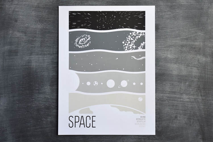
8. Brainstorm – Earth Science Prints
“Minimalism means careful curation. It’s easy to say too much or do too much in design. It’s definitely more difficult to aggressively omit content and still feel confident that the viewer will understand and enjoy what is there. Minimalism is trusting the intelligence of the viewer.
Some of our work is heavily conceptual, and with that we like to take the visual content down to the bare bones. With our science prints, we try to do just that. The concepts are very scientific and it would be easy to overload it with facts and figures. But, we choose to display just enough. As far as tools go, we use a regular, old pen and paper to sketch ideas and illustrate details. Sometimes, we draw right in the computer. We use old-fashioned scanners for anything hand-drawn, then clean everything up in Illustrator and Photoshop. Then it’s off to be screen-printed either in-house by us or at one of our fantastic printers.
Simplicity is everything! So my advice to minimalists just starting out would be to clean your desk and studio of all the clutter. It can help you think and it might encourage ‘breathing room’ in your designs. At least it does for me!”
Connect with Brainstorm on their Website, Facebook, or Instagram.
9. Genís Carreras – Philographics
“Minimalism is using the most simple elements to generate a reaction. It’s not always the best way to approach a project: if done too simple, it can seem dense and boring. But if done correctly, it can generate strong results. In my work, I always try to use minimalism carefully, so I don’t lose the message I’m trying to communicate. And, at the same time, I try to add something to the design to make sure it’s interesting and attractive to the viewer: a strong concept, a visual metaphor, or the use of symbolic language.
My process always starts with a pencil and it ends with Illustrator. When you use the most simple elements to create a design, everything that’s left at the end has a reason to be there and therefore you’re showing the essence of what you’re trying to communicate. You leave the idea naked, without decoration, so it better be a good one.”
Connect with Genís on his Website, Facebook, or Instagram.

10. Tata&Friends – Rock Bands
“When you try to explain something really difficult to your grandma, you would go to the heart of the matter and put it into very simple words. That’s minimalism, putting no barriers between a message and the receptor.
The shortest distance between two points is a straight line, that’s minimalism.
When approaching minimalist design, I try to take out everything that’s ornamental, try to take out everything that compromises the meaning and the message. Sketching, time, and thinking are the tools I use to approach this form of art.
When you’re working on a minimalist design, a good indicator of success is when you feel that you don’t have to think anymore. At that point, you’ve probably reached the core of your work.”
Connect with Tata&Friends on their Website, Facebook, or Instagram.
![]()
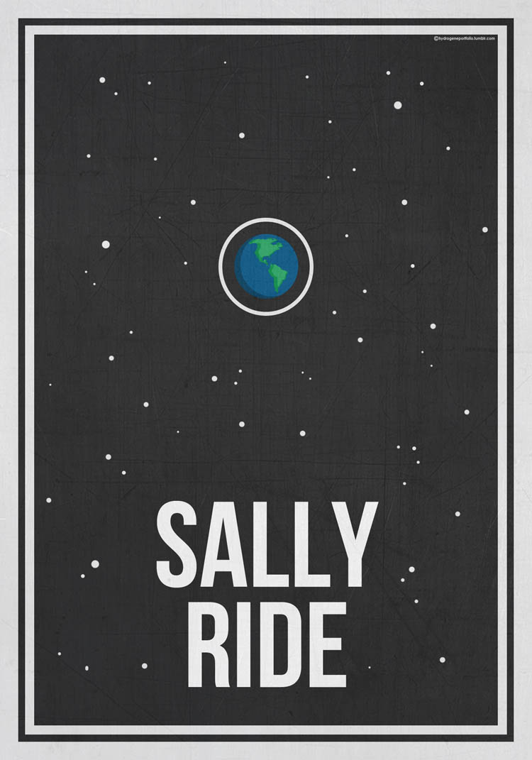
11. Hydrogene – Pioneering Science Women
“Minimalism in design means the utilization of simplicity and clarity. I originally created Hydrogene Portfolio to design minimalist film posters because I felt bombarded by advertisements which only served as promotional tools, rather than representing the films that they were created for. I try to utilize minimalist design to display the stripped, digestible message or symbol of the film.
I approach minimalist design by understanding that removing everything but the essentials will not create good design. Rather, it means that I have to approach it by communicating as much as possible with fewer elements.
Despite my work being primarily digital, the vast majority of my designs are initiated on pen and paper, and then later transferred and refined on Adobe Photoshop.
The best advice I can give to other artists who want to explore the world of minimalism is that it’s anything but easy. Minimalist design is the solid foundation on which details and ornaments can be added. Minimalism shouldn’t be considered easier than traditional design because it’s much more difficult to create a good minimalist piece, especially since a shoddy foundation cannot be hidden behind decoration.”
Connect with Hydrogene on Tumblr, Facebook, or Instagram.
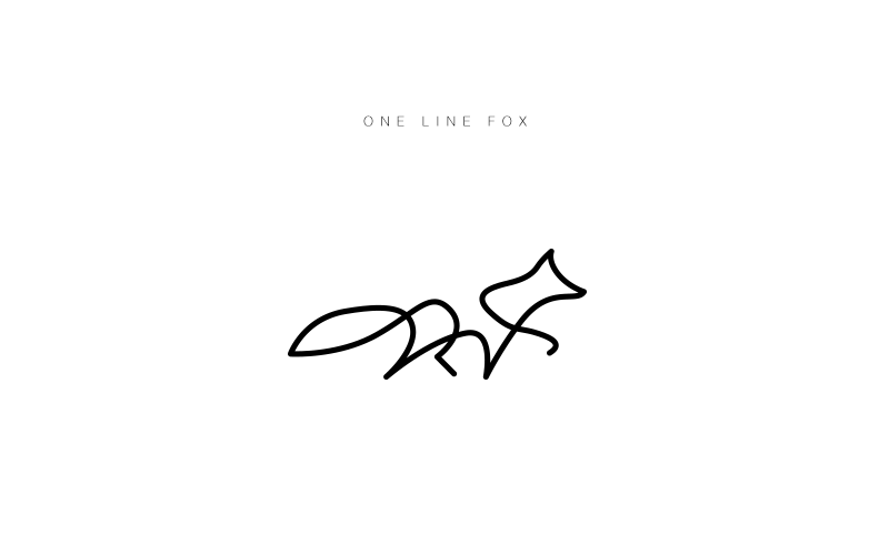
12. Differantly Studio – One-Line Animal Logos
“Minimalism is efficiency, displaying as little as possible. It’s poetry with a few words. Minimalism is self-sufficient, essential. But surprisingly, it doesn’t take less work. It’s pretty much the opposite and we find minimalism pretty hard to achieve. It requires considerable effort, enough depth, and a form of maturity.
During our creative process, we usually go through several phases that are visually rich and complex. Then, we take the necessary time to remove what’s not substantive. It’s a maturation process that is somehow painful as it consists of letting go, giving up. But, it’s also very demanding as minimalism requests a certain level of perfection. Every element must have its sense, its utility, its intrinsic beauty.
We also see minimalism as a self-assertion tool. It implies that accepting ‘less’ is not an admission of weakness, but a choice. It says, ‘I’ve nothing to prove to anyone.’ It frees you.”
Connect with Differantly Studio on their Website or Behance.
13. Ji Lee – Word as Image
“I see minimalism as being a conceptual design approach that’s used to make something extremely simple and effective. It’s all about the idea. Then, one must communicate that idea, visually, in the simplest way possible, stripped down to the minimal elements – but it must still be easily approachable and understood by everyone.
I use my iPhone, laptop, Photoshop, Illustrator, a sharpie, a pen, the internet, Facebook, Instagram, Google, and the streets to bring my minimalist ideas to life.
Overall, I’d encourage others who are interested in minimalism to focus on the idea and message before style or trend.”
Connect with Ji on his Website, Facebook, or Instagram.


