
This Artist Has a Very Specific Reason For Preferring Photoshop Over Illustrator For Her Lettering Projects

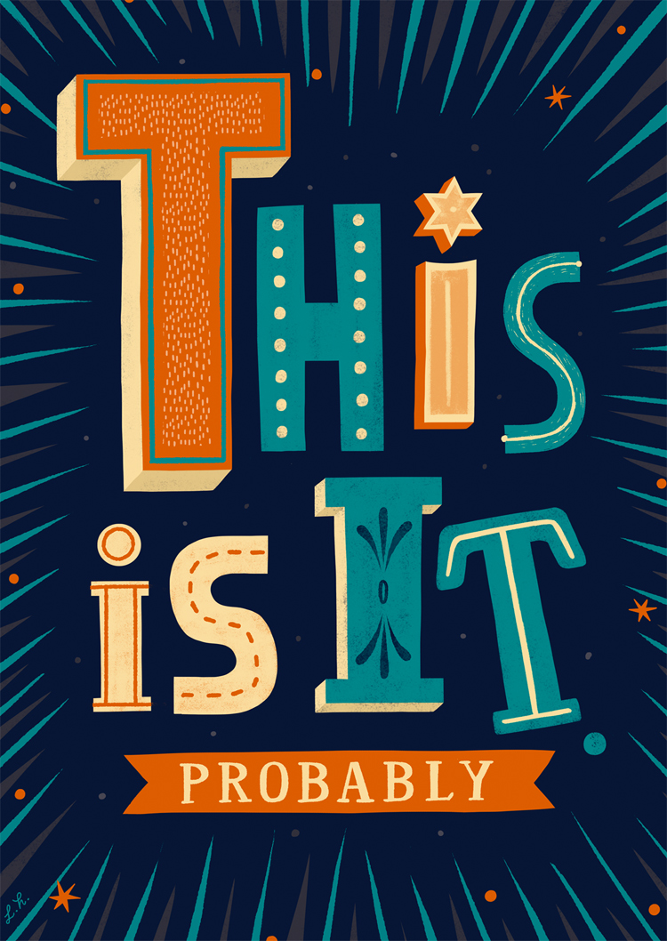
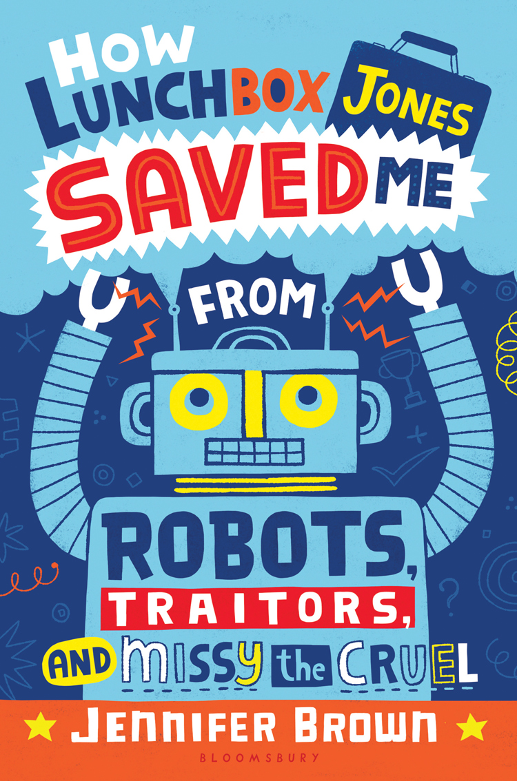
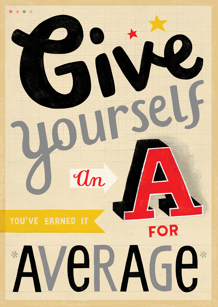
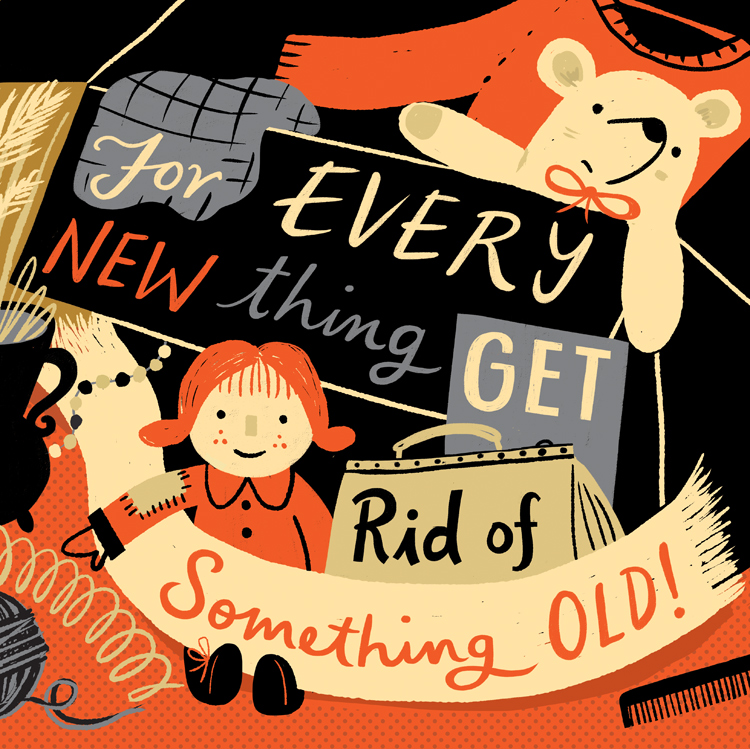
London-based illustrator Linzie Hunter infuses her digital works with evidence of the handmade. Not one to let her work look “too perfect,” her charming typography has the look and feel of being hand lettered, but is completed using Photoshop. Colorful and engaging, each assignment—for editorial clients like Mental Floss, Time Out London, and The Washington Post—features unique letterforms that do a fantastic job at conveying the tone of the piece.
For the first couple of years in Hunter’s career, she focused on pictorial editorial illustrations. But that all changed in 2007, however, when she posted some lettering experiments on Flickr. They transformed annoying spam emails (that most of us know all too well) into pleasing works of typographic art—the same words, but now nicer to look at. The project’s uniqueness and clever tone took the Internet by storm, and it was later published into a postcard book format by Chronicle Books called Secret Weapon: 30 Hand-Painted Spam Postcards.
Since her spam email project, Hunter has continued to refine her style and lettering. I spoke with her about process, inspiration, and exciting projects in the works.
Q. Your lettering work is polished, yet still has the feeling it was crafted by hand. How do you maintain this delicate balance?
Well, I come to lettering as an illustrator rather than as a typographer so I think that is a factor. I probably have a more organic and less technical approach than some. When I started creating lettering I very deliberately kept things (very) loose and rough so that has influenced my style today. I always aim to have it look like it was created by hand and less by computer (even though pretty much everything ends up in Photoshop). My lettering has probably become more polished along the way as I became more confident in my style but I always prefer for it to not look too perfect. I like leaving in the mistakes. I dislike working in vectors for this reason, as any time I do work in Illustrator, I always feel my work looks too clean and consequently loses some of its personality.
Q. You use a ton of great and varied letter forms. Where do you find the inspiration for them?
Everywhere. Folk art, shop frontage, hand-written signs in windows, vintage ephemera. I have collected mid-century ephemera, furniture, clothes and household goods since I was in high school. At primary school, I started collecting Victorian and vintage postcards. I definitely have the collector mentality which has served me well by providing an inspiration archive. When I was starting out, I used to also keep a lot of scrap books for reference.

Q. Give us an idea of your process — do you always work in the same way?
I don’t always work the same way, it depends on the job and the client. While in my personal work I enjoy using ink and japanese brush pens and always try and keep a sketchbook, when it comes to client work I mostly now work up my sketches digitally in Photoshop with a pen and tablet. I like working this way as it allows me rough out an entire layout fairly quickly. Often clients need to see a few options so sketching directly in Photoshop really helps speed things up. I also like to do my client lettering sketches in color (this helps especially with Magazine and Book covers where roughs are often presented to a number of different people for approval) so working digitally lets me play around with lots of different color options and offers much more flexibility than working on paper.
At this preliminary stage my lettering will be pretty rough around the edges – I tend to focus more on color and overall layout. Much of the lettering will just be place-holding to be begin with. Once the concept is approved, I’ll use my sketch as a base layer. I will then start tidying up and re-drawing each bit of lettering with more focus on spacing and proportions. The secondary stage for me is to add in some extra decorative detail and texture. I mostly use custom dry brushes and scanned textures that have created or collected over the years.
Sometimes I will incorporate hand-drawn/painted and scanned lettering, especially when the work requires more ornate calligraphy or obviously hand-inked words. It really does depend on the job and of course, how tight the deadline is. A mixture of the two is a more fun way of working but sometimes a quick turnaround doesn’t allow for it.
Q. Is there any tip (or tips) you’d offer to people who want to create their own digital hand lettering?
I’d suggest always keeping a daily sketchbook. Sketchbooks are the best way to develop your own work and individual look. Being comfortable in your own drawing and hand-lettering styles is very helpful before approaching hand-lettering on a computer. I see creating lettering digitally as just an extension of working traditionally on paper, rather than seeing them as two distant methods.
I would also suggest practicing lettering with different dry and wet brushes in Photoshop for interesting effects. If you are not confident in creating your own brushes, I would highly recommend trying some of Kyle T. Webster’s brush collections.
Q. Do you have any exciting projects on the horizon?
I’m lucky to always be busy with something. It’s a particularly exciting time at the moment as I working in some areas outside my normal lettering work: art licensing and children picture book publishing. These are areas which I have not devoted so much time to since being so focused on hand-lettering. I’m finding it really fun to incorporate my digital lettering along side some new sketchbook work.
Follow Hunter on Instagram to see her delightful doodles and works in progress. All images used with permission.

