
The Dos and Don’ts of Portfolio Presentation
Portfolio Review
Mike Campau
Creative Director, SevethStreet
Mike Campau is the Creative Director of SeventhStreet, a small studio in Birmingham, Michigan, that uses retouching and CGI to create dynamic imagery for the advertising community. He oversees all creative production and marketing for the studio and one of his duties as Creative Director is to interview talent and hire new artists for full-time or freelance positions. Most of Mike’s time is usually spent in production but he tries to take a break at least once a day to review portfolios and online showcases.
You’ve submitted your portfolio and are waiting for that call back, but you made some critical mistakes that will leave you waiting. Hopefully, we can correct them and help you get that position.
Sloppy presentation
Just like showing up to an interview in a T-shirt and jeans, a poorly put together portfolio could cost you a job. Your portfolio should portray your personality, your professionalism, and most of all your creativity. Bad laser prints in an office supply store binder don’t do your work justice. Get some quality inkjet prints or even digital proofs; with the low print prices these days, there’s no excuse for poor print quality. And just like you, dress it up in a nice outfit. A quality book or even a handmade case will start you off on the right foot.
Filler images
Don’t try to fill your portfolio to make it look big. Your best pieces should make your book and if you aren’t completely excited to show it, it probably shouldn’t be in there. One subpar piece can leave questions about your ability and can take away from your strong pieces. If you’re young and don’t have quite the arsenal to select from, you still shouldn’t leave a bad impression with a mediocre piece. Instead, show some of the process behind your better pieces. This will not only add some size to your book, but also give some great insight on your creative process and problem-solving capabilities.
What do you do?
Jack of all trades, master of none—don’t try to show everything to everyone. If you’re applying for a designer position, don’t fill your portfolio with photography. It’s good to show that you’re a well-rounded artists, but keep the supporting pieces to a minimum or, better yet, separate your book into sections so that the interviewer can look over what he or she is interested in.
Disc, drive, disaster
Make it easy; otherwise, your portfolio might not get looked at. Sending a disc or flash drive with a cover letter is more than likely to get tossed because even the little effort of inserting a disc is too much for some people. Plus, some places are a little hesitant about inserting media into their computers for fear of viruses and malicious intent. A better plan is to send a sampling of your work along with a link to an online portfolio, then follow up with an email that includes the link. That way it’s an easy and safe click for your contact to find out a little more about you.
Online and on point
This has less to do with your actual portfolio and more about you as a brand. Make sure everything online represents who you are and the type of work that you do. Yes, an online portfolio is a must these days, but so is what shows up in a Google search. Guaranteed, if you’re in the running for a position, you’re getting Googled. So always be careful what you post, but don’t be afraid to get involved. The more good exposure and activity behind your name shows that you’re involved and up to date with new media.
Beauty and the book
In the end it really is about the work, so don’t let your portfolio case outshine your work or, even worse, distract the viewer as he or she is trying to view your samples. An elaborate, overly complicated portfolio can be a real turn-off: hard to turn the pages, binding that bends the prints, or just awkward to handle.
Words and pictures
We’re all visual people, but sometimes it’s nice to know the story behind the images. Who was it for? How long of a timeline was there? What was your role in the image? Just leaving images on a blank page with no information can leave one with more questions than answers.
Going digital
If you’re a digital artist or Web designer, an online portfolio is a must. For online portfolios, don’t get too clever for your own good. Use common user interface practices and make it easy and quick for someone to look through your work. Leave the complicated scripting and magic in your samples. If people have a hard time sifting through your work, they’re more likely to move on to the next site. And just because you live in a digital world, there’s something to be said for ink on paper and it might be a good idea to put together a physical book to have with you just in case.
Hooked
Some of the best portfolios that I’ve seen over the years have been handmade pieces of art: custom-wrapped boxes, jewelry posts, hand-bound leather, and letter-pressed type, all very tastefully done to give a great first impression. But again, they didn’t get the job because of the portfolio alone, they still had to have great work. But it did show they felt their work was worthy of a case built with care and the overall design gave a little bit of insight into their personality. No matter what you do for your portfolio, buy it, make it, borrow it, just make sure it represents your style and enhances your work.
One example of this was a portfolio book that concentrated on fishing and outdoor photography. The book cover was thin leather bound by fly fishing line; all the photo prints were put on the pages with antique photo corners; and the paper stock was a thick, heavy, textured paper that really tied into the subject matter. This is a perfect example of how to enhance your work and show a little bit of your personality.
Finally, don’t sweat the portfolio too much. You’re better served to put your time and effort into improving yourself as a designer and artist. Just keep it clean, personal, and put your best work forward and you should be in good shape for your next interview.


Bio
Mike Campau has a background in graphic design and scientific illustration from the University of Michigan, and has been creating effective marketing imagery, through creative retouching and CGI for more than 15 years. Mike lives in Commerce Township, Michigan, with his wife, Krista, and 5 kids: Emmalyn, Nathan, Ansley, Tessa, and Cassidy.
ALL IMAGES BY MIKE CAMPAU
Fred Machuca
Art Director, Skechers Footwear
In-House Advertising/Art Department
Fred Machuca is the Art Director for the In-House Advertising/Art Department at Skechers Footwear located in Manhattan Beach, California. This department consists of a talented and diverse group of designers. Together as a department, they create the diverse product range that consumers are so excited about worldwide. As an Art Director, Fred oversees the creative process in action and keeps the Skechers vision on track.
Due to our success and tremendous growth in the marketplace, I’m consistently meeting with new designers. Lately, I’ve been meeting with new designers anywhere from five to six times a week. I make sure that I take the time to meet, discuss, and explain the vision we have here at Skechers. After I meet with everyone, I put together the “big picture” of which designer can adjust and adapt best to our world.
The résumé
One major mistake that designers can make is the presentation and vision of their résumé. In the world of design, a résumé is just as important as a portfolio because it’s the first impression. Often, I’m handed a résumé before even having a chance to review a designer’s portfolio. I then ask myself, “How much does this individual really care about design?” A creative person who lives and breathes design shouldn’t be handing out a résumé that was typed in Word using default settings. That only shows me that he or she can convey a message that’s similar to an IRS form.
The résumé is an opportunity to show what you can do in a tasteful manner. It needs to showcase your design skills by adding visual elements, using a grid, playing with typography, color choices, and so on; however, overdesigned résumés can also be overlooked. In other words, what’s most important is to present your information with a solid layout and font choice that will allow you to show your personal design style. Printing on a stock that has a little weight and color tint is a nice touch.
What kind of portfolio?
The physical portfolio is another key component that can go wrong, and the worst kind is a heavy, briefcase-style portfolio. The portfolio should be clean, simple, and easy to maneuver. Too much work in a portfolio is a common mistake. Most art directors are pressed for time and don’t want to feel obligated to look through a 50-plus page book, especially if the work isn’t hitting the mark. A portfolio should only include the best work and be closely related to the type of work that a client or employer does and wants while showing that you’re a versatile and well-balanced designer. I only want to spend extra time with a designer on my terms.
Keep it organized
Before an interview, you should look over your book and keep it neat, clean, and organized. Opening a book with loose artwork that’s piled together randomly or missing sleeved pages will only make the viewer question your attention to detail or how serious you’re taking the interview. In addition, when you have a portfolio with plastic sleeves, it’s very important to make sure you don’t see any smudges or fingerprints, for obvious reasons.
Beware of conceptual/student work
It’s important not to have too much conceptual work, especially if it’s only student work. An experienced designer shouldn’t have any past student work, no matter how good it might be. If the designer just recently graduated, student work is obviously necessary. However, this is why an internship during school is important. It can really give you the advantage over someone who’s just out of school and had no internship.
Viva variety
When showing your portfolio of work to an employer, it’s important to show a variety in both your style and the types of projects you’ve created. Even though you may have a great design style, it can really come across as limited in your creative thought process. For example, pushing a certain style is better suited for an illustrator or a photographer. Even among the pieces that focus on a specific area, offer a portfolio mix that shows your skills working with photos, primarily text layouts, full-color work, modern, classic, cutting-edge styles, etc.
Outdated work is a negative because it’s just not relevant. I think this is something that senior-level designers should really be aware of because there’s so much new talent out there. Staying modern is extremely crucial. With older-looking pieces, I’ve found myself assuming this person will not be able to produce fresh ideas.
No cheating
I tend to stay away from online portfolios except to get a quick peek before I meet with a designer. The face-to-face with a portfolio is what really matters. Not long ago, I met with a designer who pulled out his 15″ laptop and began showing me his portfolio. I realized it was the same exact PDF file he emailed me right before we met. I felt cheated and was expecting more of a reason to meet with other than to see what he looked like. At this point in time, viewing a designer’s portfolio from a computer screen when meeting face-to-face should only apply to Web designers.
The portfolio
The portfolio itself should be clean and contemporary. Black is classic but keep it neutral in color. I’ve seen many custom portfolios with covers made of metal or wood. I remember one designer who made furniture as a hobby and created a nice wooden case to contain his work. Something like this makes it exciting to see what is inside.
Another positive thing to see in a portfolio is mounted work. Unmatted work is impressive because the individual pieces aren’t bound together and can easily be picked up and looked at individually. This makes it possible to really focus and concentrate on detail of the individual piece.
Tailored fit
It’s a smart idea to tailor your portfolio for each position you’re applying for. You might need to take out, rearrange, or even add pieces that you feel will hit the mark for that studio or business. For example, focus on advertising design pieces for an advertising department. When a designer’s portfolio fits our style, I think to myself that this person has done his or her research and really wants to be here.
The best portfolios have a variety of design and execution, such as layout, typography, logos, and imagery. Not only do I get the sense of talent, but the confidence from the individual when seeing diversity in what he or she can do.
Keep it simple
Keeping your portfolio simple with a limited amount of pages is important. You may have extra work that is relevant but might just be too much for one book. There will be times when I really get into a designer’s work and I’m interested to look at more. There have been times I’ve asked designers to bring smaller side books or a box of actual pieces that have really added to the main portfolio. I have a personal mini portfolio showcasing all my logos that’s easy to go through.
Printed work can really add specialty finishes because it shows great attention to detail. When designers show physical pieces it takes things up a notch. The best way to do this is to have the piece mounted to a board, but if it’s something more substantial such as a booklet or folded piece, it’s best to keep it separate. Having those pieces in a box or some kind of sleeve that matches the main portfolio is impressive.
Highlight your skills
Even though having too much conceptual or personal work can ruin a portfolio, just a few pieces are a great way to improve your book. This can help show what you can do when given full creative freedom. I believe the best pieces are those that highlight your skills in Photoshop and Illustrator. When designers point out these pieces, it gives me a chance to start a conversation about their abilities and interests regarding their designs.
Chronological order rules
Organizing your work and how it flows is really important but in my opinion there’s no right way to do this except the usual suggestion of showing one of your best pieces first and finishing off with an equally strong piece. I get a better sense of the designer and his or her background experience when the work is organized in somewhat of a chronological order, grouped by place of business or work history. For example, a senior-level designer put his book together this way and it gave me a clear understanding of what he was capable of doing.
The book wins
One of the most creative portfolios I’ve seen was one where the designer printed his work on a high-quality stock and bound it as a book with a custom but simple cover. Each spread had the work on the right page and two lines of copy about the work centered on the left page. The work consisted of booklets, posters, music, art, logos, and type treatments. I enjoyed it because I got a strong sense of creative design from the various visual treatments, as well as a good understanding of his capabilities on the computer.


Bio
Fred Machuca earned a BFA in Visual Communications, Graphic Design, and Advertising from Cal State University, Long Beach, California, in 1992. Due to his interest in fashion and sports (surf and skate), he began freelancing for Quiksilver, Billabong, and Mossimo. Then he began working for skate and street wear brands, such as Freshjive, JNCO Jeans, Vans, and Rusty. For the past eight years, he has worked for Skechers Footwear in Manhattan Beach, California, as Art Director for the In-House Advertising/Art Department.
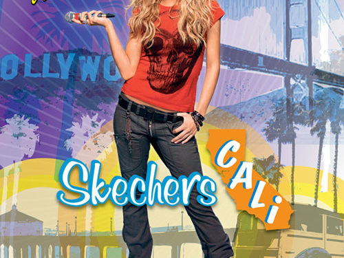
ALL IMAGES BY FRED MACHUCA
D. Neal Hettinger
Creative Director, Century, LLC
As the Creative Director for Century, LLC in Oklahoma City, Neal Hettinger tries to schedule one hour a week to review résumés and portfolios of potential full-time and freelance designers and photographers. His 16-member team creates and designs the branding, packaging, advertising, catalogs, and Web landing pages for UFC equipment, TapouT equipment, adidas boxing equipment, Century Martial Arts, and maSuccess magazine. They also use a few freelancers to help out with the workload.
The first step in submitting a portfolio is when designers send a résumé and samples in response to an ad or after they’ve made a cold call to a prospective employer. At this point, a prospective employer will make the decision to either look at more of the designer’s portfolio or file it.
In this crucial stage, designers shouldn’t send in a plain résumé; they need to show their knowledge of fonts, ability to communicate, and layout skills. Unlike other professions, this is the first piece in your portfolio. You need to design the résumé but don’t overwork the layout so that it’s busy. Most importantly, make sure there are no spelling mistakes in any of your written correspondences and résumé. With spellcheck available, typographical errors will portray you as careless.
What to include?
The next pieces of your portfolio are the examples. When narrowing down your designs, keep in mind what the employer has requested. Try to send pieces that are related to what they want and also submit your favorite piece and a design that others have told you is good.
Your full portfolio should start off strong, followed by work that relates to the potential job, followed by designs that will show you have other abilities and talents. Finally, finish with your strongest piece. Leave your portfolio open to that piece while you speak to the interviewers. You need to make sure they remember your face and at least one design in your portfolio when they make the final decision.
Avoid these mistakes
An art director usually receives design portfolios from three types of applicants: an artist just out of school, which may include a little freelance work; a designer who has been working for three to five years; and someone with more than five years’ experience. While all of these portfolios will contain different types of work, the designers should try to stay away from these common mistakes:
• Leading off with personal designs, such as birthday party invitations, club flyers, and birth announcements
• Poorly printed or worn samples
• Numerous photographs of paintings
• Numerous letterheads (unless that’s what the ad is for)
• More than 23 pieces if you have a lot of experience, and 11 pieces should be enough if you’re just out of school
• Bringing in a portfolio that’s large in size
• Accepting a cup of something to drink that may spill
• Having nothing in the portfolio that remotely relates to the position for which you’re interviewing
• Apologizing for the appearance of your portfolio—you shouldn’t be showing it if it’s not ready.
While these suggestions may seem obvious, you’d be surprised how many portfolios and interviews I’ve sat through where designers didn’t think about how they were presenting themselves or their portfolios. Every designer needs to approach the interview as a project. The pieces should be chosen carefully for that employer.
The leave-behind
The last stage of your portfolio is what you leave with the art director. A number of schools have their students create books with their designs that can be given to the art director. This extra effort will put them ahead of someone with similar experience and portfolio level who only leaves a résumé.
Just because you have 15 years’ experience doesn’t mean you shouldn’t leave behind something reminding them of your work. In Los Angeles, an ad for a graphic designer will bring around 600–750 responses. After art directors look at those résumés and then a number of portfolios, the interviews become a blur. Help them remember you and your designs by leaving something that represents your portfolio.
Communication and creativity rule
A few years ago, we were looking for a designer with five years’ experience. Of course, we received a lot of student résumés with “three years of freelance.” We were undecided about the samples and lack of experience of one artist but we included her in our interviews. She communicated well with the art director and me, but what we remembered was her leave-behind. The designer gave us a handmade 3D brochure that showed a few of her design projects but when you opened it, the center top area popped up with her name and contact info. That designer got the position even though she didn’t have the experience we wanted. The art director and I felt she would bring a good work ethic and spark of creativity to our agency. We were correct.
Be sure to…
When designers look for work in large cities such as New York, they may just drop off their portfolios and only interview if there’s a call back. In other cities, artists may present their portfolios. Designers need to be prepared for both circumstances and follow these suggestions for a good portfolio presentation:
• Keep it clean and simple
• Have a logical flow to your examples and group the pieces so the art director can follow along easily—don’t show a letterhead, then an ad, then two webpages, then another letterhead, and then another ad
• Rehearse your presentation—think of the questions you’ll be asked
• Have a number of portfolios, each geared toward different industries
• If you think you have too many pieces, you do
• If you have collaborative pieces, acknowledge them so you can show you’re a team player and willing to accept direction
• If the interviewers seem interested in a project, talk about it—tell them the software you used, what the client was like, how the piece exceeded expectations
• If you have 3D designs, bring one or two to the interview
• Be very critical of the pieces you choose—the prospective employer will.
A designer’s portfolio is a representation of his or her personality, abilities, and talent. Art directors will try to figure out if the applicant can design, work with their team, bring a new creative approach, and meet deadlines. A portfolio is your one shot to show you can do the job. Don’t choose the designs you love—choose the designs a client will love.


Bio
Neal Hettinger is the Creative Director at Century, LLC. Previously, he was the Vice President, Creative at The Lead Pencil, an advertising design studio in Los Angeles. A few of his clients were Nissan Motors, Universal Pictures, Technicolor, and YMI Jeans. Prior to The Lead Pencil, he worked at ad agencies in Nashville and Birmingham. He earned his Master of Arts degree in Advertising and Bachelor of Arts in Graphic Arts at the University of Alabama.
ALL IMAGES BY NEAL HETTINGER

