
Sculpting the Face by Dodging & Burning in Photoshop
An excerpt from Scott Kelby’s Professional Portrait Retouching Techniques for Photographers Using Photoshop
This is a very popular technique that accentuates the existing highlights and shadows in your subject’s face, and gives the face lots of depth and dimension for a really pleasing look. This adds so much dimension, I take the extra time to do this to nearly every image I retouch, so for me, it’s almost like a “finishing move” that gives the image that extra depth.
Step One:
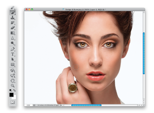
Here’s the image we’re going to use for our dodging and burning project. (Note: This dodging-and-burning technique is for sculpting the face. It’s not to be confused with the dodging-and-burning technique used by high-end retouchers for smoothing skin, using the pixel-by-pixel, pore-by-pore method.) Start by going to the Layers panel and choosing New Layer from the panel’s flyout menu. In the New Layer dialog (shown here), change the blend Mode to Soft Light, then turn on the Fill with Soft-Light-Neutral Color (50% Gray) checkbox, and click OK. This adds a new layer filled with 50% gray (as you see here), but because it’s set to Soft Light, it appears transparent, which makes it perfect for dodging and burning, because later we can blur this layer to soften the effect.

Step Two:
Get the Brush tool (B), choose a medium-sized, soft-edged brush from the Brush Picker up in the Options Bar, and while you’re there, lower the brush Opacity amount to 10%. You want to be able to gradually build up your strokes as you go (of course, if you’re using a Wacom tablet, just leave your Opacity set at 100%, and use the Pressure Sensitivity of the tablet to control the buildup of your strokes).

Step Three:
Now, here’s what we’re going to do: on this new layer, we’re going to paint over the dark shadow areas in black to make them darker, and then paint over the highlight areas in white to make them brighter (so, things that extend out from the face get brighter, and the shadow areas get darker). Here, with my Foreground color set to black, I’m making a few strokes along her cheek on the left to darken that area. So, exactly what areas are we going to darken? Basically, we darken the areas on either side of the bridge of her nose, right under her bottom lip, and along the cheekbones on either side of her face.

Step Four:
Another area I always burn is right along the hairline, all the way around her forehead (as shown here), kind of making a semi-circle going from her left ear, up to the top of her head, then down to the other ear. In this case, some of her hair is blocking me from going all the way down on the left side of her face, but that’s perfectly fine.

TIP: Changing the Ring Color
The ring the model is wearing was actually a dark green when I took the shot, but I didn’t think it matched her eyes very well with it that close to her face. So, with the Elliptical Marquee tool (press Shift-M until you have it), I put a circular selection around the center of the ring, went under the Select menu, under Modify, chose Feather, and added a 2-pixel feather to soften the edge a bit. Then, I pressed Command-Shift-U (PC: Ctrl-Shift-U) to Desaturate the green part of the ring, making it black and white. While my selection was still in place, I added a new blank layer, got the Eyedropper tool (I), clicked it once on her iris to steal that color and make it my Foreground color, then pressed Option-Delete (PC: Alt-Backspace) to fill the circle with that color. Then, I changed the layer blend mode to Color and deselected. That’s it.
Step Five:
After the face, I move down to the subject’s neck and darken all the shadow areas there and on their shoulders and arms, if they’re visible (as seen here). I follow the contours of the skin, so where you see my cursor, I’m painting almost up-and-down strokes (at a little bit of an angle). When I’m doing dodging and burning like this, I prefer to take a few extra strokes, and make the burning really dark (which makes it easier for me to see what I’m doing as I go), knowing that later, I’ll be able to control the amount by lowering the opacity of the layer. Once you’ve burned over all the shadow areas, it’s time to do your brightening by switching your Foreground color to white.

Step Six:
Now, it’s decision time. You can do your dodging on the same layer you did your burning on, or if you want even more control, you can choose to do your dodging on its own separate layer, so you can vary its opacity separately from the burning layer (just so you know, I usually do mine on the same layer). If you want to keep them separate, then create another Soft-Light-Neutral Color (50% Gray) layer just like you did in Step One, and then do your dodging on that layer. Again, I do both on the same layer myself, so that’s what we’ll be doing here. Now, with your Foreground color set to white, and using the same brush settings, start painting over the highlight areas to make them even brighter. Here, I’m painting over that highlight that runs along the edge of her chin on the right. This highlight is there because of the way I backlit the shot in the studio, so it won’t always be there, but since it’s a highlight, I accentuate it with dodging. Don’t forget to follow the contours of her skin, painting long strokes from the bottom of her chin up to the side of her cheek.

Step Seven:
So, which things do we brighten when we’re dodging? Typically, I brighten any areas that protrude outward from her face, so I dodge the highlight that runs the length of the center of her nose (as shown here), I dodge both cheeks just outside the dark area that surrounds the bridge of her nose, then the center of her forehead, the center of the front of her chin, the two little ridges right above her top lip, the area just above her eyes (where eye shadow goes), and just below the bottom left and right sides of her lips. You’ll have to vary your brush size—making the brush smaller for small areas (like her chin, or right above her top lip) and much larger for things like highlights down her arms or shoulders.

Step Eight:
I continue by dodging the highlights on her neck, hands, shoulders, and pretty much everywhere there are highlights created by the lighting I used. Basically, if it’s bright, I make it brighter, and if you look in the Layers panel, you can see how the darker and lighter areas appear on that gray layer. Also, by now you’re probably thinking that this dodging and burning looks really obvious, and way over the top, and at this stage, it does. But, don’t worry, we’re not done yet.

Step Nine:
Here, I hid the Background layer (by clicking on the Eye icon to the left of the layer), so can you see what we’ve really done, which is to paint a bunch of black, white, and gray strokes over our subject. You’ll also notice that the brush strokes don’t seem very soft, which is why the next step is so important, and it’s one of the two final things we do to control the amount of this retouch.

Step 10:
Turn the Background layer back on, so you can really see what’s happening to your dodging and burning. To soften your strokes, go under the Filter menu, under Blur, and choose Gaussian Blur. Now, you’re going to blur the living daylights out of those paint strokes to make them much softer and smoother, and have them blend nicely with the rest of the image. When the Gaussian Blur dialog appears, drag the Radius slider quite a bit to the right to totally blur your strokes (as seen here, where I dragged to 47 pixels) and have them smoothly blend the dodging and burning. It helps to toggle the Preview checkbox in the dialog on/off a few times, so you can really see the effect it has and to help choose the right amount of blurring. When you’ve found the right amount, click OK. Now, you get to dial in just the amount of overall dodging and burning by going to the top of the Layers panel and lowering the Opacity of your dodging/burning layer. If you used two different layers (one for dodging; one for burning), then you can use the Opacity slider to control each individually. In the final image, I lowered the Opacity to around 80%, but I often go much lower than that. Here, I wanted to leave it higher, though, for example purposes.


Learn more retouching tips from Scott Kelby in Professional Portrait Retouching Techniques for Photographers Using Photoshop or in his KelbyOne online classes.

