
Design Makeover: Pizzeria Menu
Three Designers Turn a Pizzeria Menu into a Feast for the Eyes
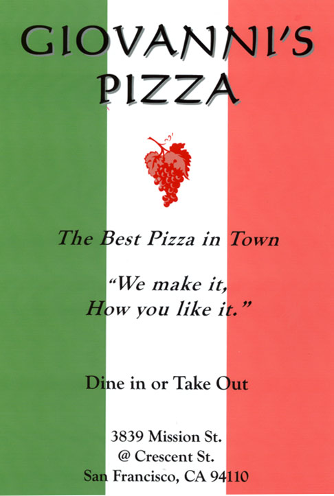
BEFORE
CLIENT: Giovanni’s Pizza
“The key to Giovanni’s appeal…is that people can kick back and relax.”
Giovanni’s Pizza is still run by the same Greek family that opened it 17 years ago. It seats about 40 hungry patrons comfortably in a storefront on San Francisco’s busy Mission Street, in between a Mexican grocery store and an old-time bar. The fare is familiar old-school Italian (emphasis on pizza), with a few Greek dishes thrown in.
The key to Giovanni’s appeal, according to the manager, is that people can kick back and relax. Besides individual diners, the restaurant welcomes birthday parties, after-game softball teams, and after-practice soccer players. Groups like that can even bring their own music to play on the house stereo. (At other times, the entertainment runs to Greek music on the stereo or sports on the TV.)
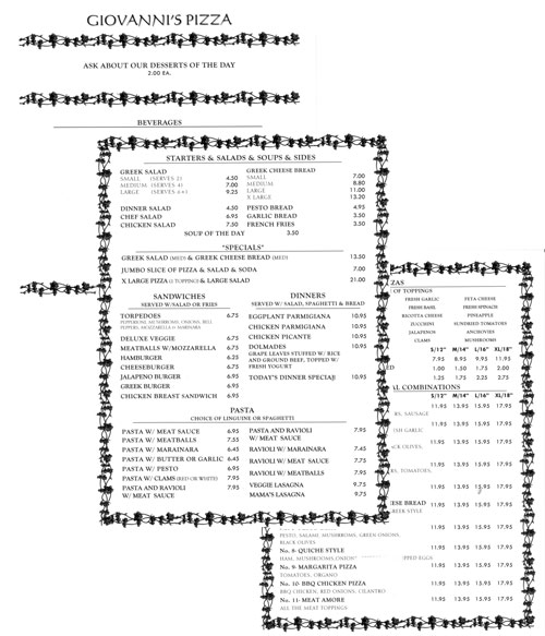
The couple that opened the restaurant is getting ready to retire, and their youngest son and his fiancée are preparing to take over the business. They’re planning some cosmetic upgrades to the place—some new carpet, new barstools—but aren’t planning to change the basic nature of the restaurant. So far, at least, the plastic grapevines behind the bar and the American and Greek flags are still on the wall. The existing menu is equally homey—the manager’s brother put it together on his computer, and the pages are printed on an inkjet printer and slipped into menu covers. But “homey” and “relaxed” don’t have to mean plain and boring, so we asked three designers to spruce up the menu to make it as inviting as the restaurant itself. Because color printing on an inkjet isn’t significantly more expensive than black and white, we gave the designers the green light to bring in color as they wanted.
AFTER
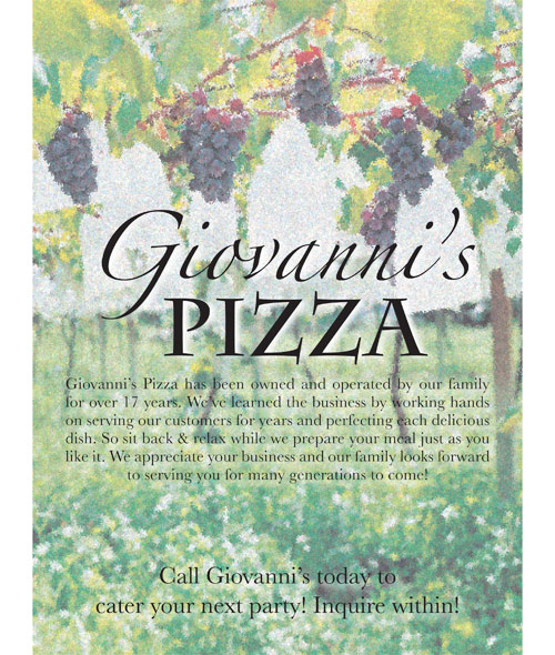
DESIGNER: Kristal Young www.kristalcleargraphics.webhop.net
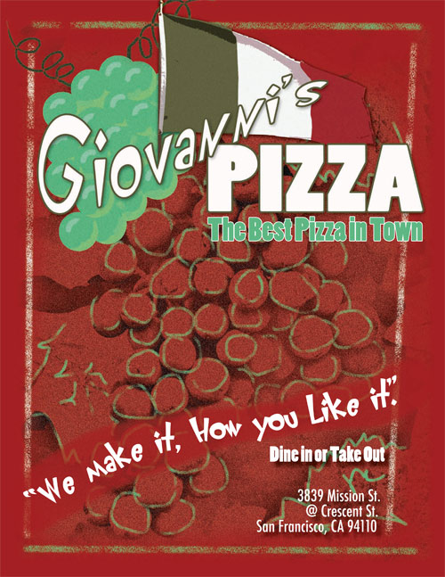
“I highlighted a couple of food items with stock photos, but I let them break through their conscribed ovals at the top.”
My main objective for Giovanni’s menu was to portray how the restaurant offers delicious authentic Italian cuisine in a casual, everyday atmosphere. The original menu used grapes on the front page to connect it to the plastic grapes behind the bar. I decided to keep this idea plus the original’s red, green, and white colors. However, I used different shades of the colors to make it stand out from the countless other Italian-flag-themed pizza menus. (Believe me, I’ve seen them all.)
Normally, I like to use a lot of photos in my designs, but this time I decided to limit them to just a few inside food pictures. The illustrations I developed in Illustrator and Photoshop—the dark watermark of grapes with light green accents—serve a twofold purpose. They direct the viewer’s eye to the realism of the large grapes, which suggest the high-quality Italian food they can expect, but the green accents lighten the effect and remind them to get comfortable. For fonts, I chose Poplar, Klunder, and Futura to further add to the relaxed feeling.
On the inside menu pages that list the food and prices, I carried over the fonts and variations from the front for background art. I highlighted a couple of food items with stock photos, but I let them break through their conscribed ovals at the top. This was just one of the different ways I used elements that pushed away from traditional Italian menus. Each one reinforced the overall feeling of a relaxing place to eat.
ABOUT THE DESIGNER: KRISTAL CLEAR GRAPHICS
 After receiving her bachelor’s degree from Wisconsin Lutheran College, a private liberal arts school in Milwaukee, Kristal Young jumped into the corporate design workforce, creating direct mail advertising pieces for clients nationwide. A large portion of these were restaurant menus for both big and small companies all over the country. At the same time, she was starting her freelance business, Kristal Clear Graphics. One specialty is a self-developed product aimed at wedding photographers called Designer’s Touch Wedding Albums. This innovative concept can be explored further at Kristal’s website.
Like any good graphic designer does, Kristal often juggles multiple life and work projects. Kristal thanks God for her supportive husband, family, and friends, who help her through the harder times of managing a full-time job, freelance business, and all of life’s happenings.
APPLICATIONS USED: Adobe Illustrator CS, Adobe Photoshop CS, and Adobe InDesign CS
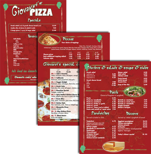
AFTER
DESIGNER Damien Pendrotti
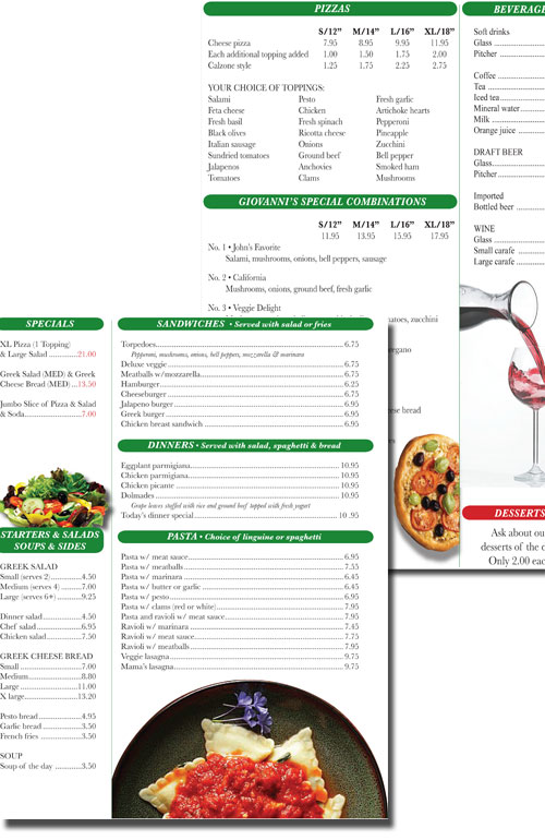
“Clean shots of food were the most inviting things I could think of short of pasting actual dishes onto the menu…”
Since most of my day revolves around the next meal (ask my co-workers), the challenge of designing a new menu for a pizza restaurant was most enticing. Since Giovanni’s Pizza is known for its after-game, family atmosphere, I wanted to keep the design open, colorful, and inviting. Clean shots of food were the most inviting things I could think of short of pasting actual dishes onto the menu—that just isn’t cost effective. Ideally, the menu would use photos of actual Giovanni’s meals.
I also wanted to make some reference to the longevity of the establishment and the Giovanni family ownership. So I treated a few photos to make them more painterly and give them a nostalgic feel and used those as a backdrop on the front and back cover. I kept the inside pages open and airy with silhouetted photos and small splashes of color. I thought it was important to do some suggestive selling, so I put the specials on display as soon as possible—top left of page 2—and made their prices red.
I maintained the red and green theme from the original menu throughout. If the price of going full-color is a concern, the inside pages translate well to black and white, and the photos on the covers can quickly be scaled back. But with color output getting less expensive, the stretch shouldn’t be painful. I used the Baskerville font family on the whole menu, except for the cover, where “Giovanni’s” is in Zapfino while “Pizza” is in Charlemagne.
ABOUT THE DESIGNER: DAMIEN PENDROTTI
 Returning to her home state, Maryland, after 10 years in Pittsburgh, Pennsylvania, Damien Pendrotti hung her creative hat at Asher Bartos Advertising (www.AsherBartos.com). She started as a freelance graphic designer more than two years ago with Asher Bartos and now is an account executive who occasionally wears an illustrator/designer/photographer party hat. With more than 12 years of creative and management experience, Damien offers clients the most for their money by drawing from a varied background and being a good listener. She has worked in higher education, media, entertainment, and advertising, what she believes are the most influential media of our time. She attributes the bulk of her success to a beautiful, supportive mom who encouraged her and sacrificed much to afford the luxuries of a good education.
Damien thrives on surrounding herself with other talented, fun, and inspiring friends and co-workers. She hopes to retire young as a philanthropist traveling the world and doing design jobs for free…don’t we all!
APPLICATIONS USED: Adobe Photoshop CS2 and Adobe InDesign CS2
AFTER
DESIGNER Adam Simpson www.walkthebeach.com
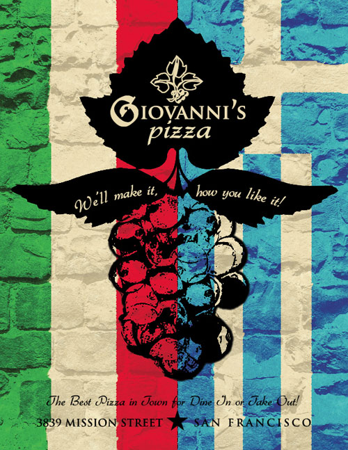

“The listed food courses should be itemized into a step-by-step game plan for a wonderful dining experience.”
As a moonlighting bartender, I’ve found that customers, particularly first-time arrivals, prefer to read from clearly defined menus. They’ve come to dine out, not decrypt a booklet on an empty stomach. The listed food courses should be itemized into a step-by-step game plan for a wonderful dining experience. When I first reviewed Giovanni’s original menu, I thought it was well organized and decided to commit to their layout for the most part.
Another detail about menu design is the menu’s consistency with the establishment’s atmosphere. I visited 10 different restaurants and compared each one’s menu to the interior ambience. Giovanni’s has a Greek family influence fused with a classic Italian style, serving Greco-Italian cuisine to everyday Americans in an environment characterized by Greek flags and grapevines. Drawing on all these elements, I colored the menu with national flair and layered the background with bitmap parchment and bricks to lend an old-world feel. Printing the menus on inkjet parchment paper would go even further to carry out that aspect of the design.
To carry this direction through typographically, I combined three working serif fonts: Augusta, Trajan Pro, and Gabrielle, all of which exhibit both an organic flow and a historical aura. Finally, I felt the grapevine icon was a crucial element better displayed as a rustic centerpiece rather than as a means to frame the text. I actually visited a local vineyard and snatched a few vine leaves that I scanned for the cover.
ABOUT THE DESIGNER: ADAM SIMPSON
 With a Bachelor of Arts from the University of Oregon, Adam Simpson resides in Portland, Oregon, where he works as a freelance graphic designer. He ventures across the Pacific Northwest engaging people with potential projects of all kinds: logo and image conception, photography, whatever. With each project, he meets new people and welcomes the opportunity to exchange ideas, aspirations, and fears.
But Adam really is a “history junkie” with a hungry eye for vintage photographs and antiquated typefaces. His favorite part of a design project is the research involved in procuring a visual concept for the client, which involves looking back on past design approaches, sometimes centuries old. Adam asks, “How can I manifest a look that has proven to work yet extends beyond or even breaks the mold?” It’s always a tough jig to dance between originality and the unflinching laws of time-tested design.
APPLICATIONS USED: Adobe Photoshop CS2 and Adobe InDesign CS2

