
Design Makeover: Photography
Develop a new image
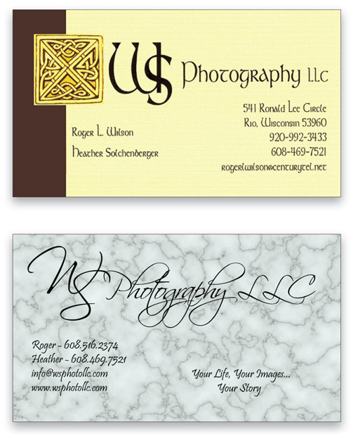
Client:
WS Photography – www.wsphotollc.com
While Wilson would like to maintain an open and friendly look, he’d still prefer something more professional.
Rio, Wisconsin, home to Roger Wilson and WS Photography, is a small town of fewer than 1,000 people located about 25 miles north of Madison. Wilson runs the business—now in its second full year of operation—with his stepdaughter Heather, who lives in a larger town nearby. According to Wilson, their customers are mostly local, from within 40 miles of Rio.
The photographers specialize in portraits of graduating seniors from area high schools; they also do family and maternity portraits. “We don’t do weddings,” says Wilson. Most of the work is on location, in the customer’s house or yard, though they do have a small studio in Wilson’s garage. Promotion is mainly by word of mouth; they also run some ads in the local free shopper paper, maintain a small portfolio on SmugMug, and send out business cards with their finished work.
Wilson says that what distinguishes WS Photography is its fresh approach to senior portraits, which he credits to his stepdaughter’s youthful sensibility. At the same time, he says, they’re more than willing to throw their own ideas aside and go with the customer’s point of view. “We want to do what the customer wants,” he says.
Wilson has made two business cards himself, the first in Broderbund’s PrintMaster and the second in Adobe Photoshop. He prefers the second because “it’s a little more elegant, less cluttered, and more refined.” But, he thinks the background texture is too distracting and he’s not really fond of either of the attempts to turn “WS” into a logo. Most of all, he thinks both just look homemade. While Wilson would like to maintain an open and friendly look, he’d still prefer something more professional.
We asked three designers to create a more flattering portrait of WS Photography and use it on a new business card.
AFTER
DESIGNER: Scott Robertson

The client was fond of the old business card’s elegance, so I decided to base the redesigned logo on another script font. The “WS” is done in Kon Tiki Enchanted from JAW Fonts; I used Adobe Illustrator to join the two letters together. The result is elegant but still personal, rather than a slick and corporate one, which is just what a small-town photographer needs.
My approach to the business card started with the color scheme. Since the client’s specialty is photos of graduating seniors, I called up the local high school and found out that the school colors are red and white. That’s perfect: I could now make this a budget-friendly, one-color job. The deep red is very readable, and picking up the school colors will give Wilson a slight competitive edge with the local students.
I liked the slogan from the original (“Your Life, Your Images…Your Story”) and elected to keep it. I decided the best thing to do was add visual interest when implementing it, and the idea of a filmstrip came to me. That addition adds character to the business card.
The layout relies on a strong left-right balance, though it’s not immediately apparent with the large logo in the upper left. The contact information at upper right is placed even with the top of the logo—this adds tension and keeps the eye moving. All the non-script text is set in Geo Sans Light, a free Avant Garde imitation. The word “Photography” contains a lot of round shapes in the p’s and o’s, and choosing a font with the roundness of Geo Sans let me bring out that shape in the g and a, as well.
This new business card is much more attractive and personal than the original. It’s a card Wilson can hand out without looking like a celebrity photographer, but rather a talented member of the community who is at your service.
“Photography” contains a lot of round shapes in the p’s and o’s, and choosing a font with the roundness of Geo Sans let me bring out that shape in the g and a, as well.
ABOUT THE DESIGNER
Scott Robertson
 Scott Robertson is a computer graphics major attending school in South Jersey. He was introduced to graphic design in 10th grade while taking a graphic communications course, and was soon designing everything from the school calendar to honor roll certificates to graduation programs. While he enjoys all things print, his passion is T-shirt design.
While still attending college full-time, Scott recently began freelancing, working on building an ever-stronger portfolio. He currently oversees some computer graphics labs at his college—helping students with software and assisting with design. After completing his studies at Camden County College, Scott plans to attend Drexel University in Philadelphia. Then after college, he hopes to run a small clothing line, silkscreening in his own small shop. And besides running the clothing company, he’d like to work his day job as an art director or graphic designer for an ad agency. Scott says he’s “a true graphic design nerd, a fan of Helvetica, and he can’t stand poorly designed menus.”
APPLICATION USED: Adobe Illustrator CS3
AFTER
DESIGNER: Elizabeth Rose – www.elizabethrosestudio.com

WS Photography needs a look that represents the company and speaks to their target market. Their current cards look homemade and don’t convey the image of a professional photography business. In the more recent version, the marbled background is a distracting element and the typography is fussy, making the company name hard to read. Overall, the card feels more like it belongs to a wedding photographer than a business specializing in portraits for high school seniors.
The bulk of WS Photography’s business comes from students, so the logo should be fresh and appealing to young people while not being so funky that it scares away other potential customers. As a starting point, I took a look at their website to get a feel for their work, then I created a clean, simple logo, using color to give it a more youthful vibe. The circle represents a camera lens without being too literal an interpretation.
Once the basic logo concept was done, I tested out a variety of fonts: Highway Gothic and Adobe Jenson Pro gave me the balance of modern sans serif and classic serif that I was looking for. For the color scheme, I chose to use black as a neutral and to pair it with a bolder color. The greenish-yellow has a nice bright feel without being overpowering—it gives the design some punch. Also, the logo can be updated with a different second color in the future, allowing the company to refresh its look without changing its branding. I included the tagline from one of the original cards because it adds a nice marketing element to the logo.
In designing the business card, I wanted to continue the clean, fun feel that the logo established. The color bar at the bottom helps ground the card and offers a nice contrast to the black-and-white text. I used only Highway Gothic to set the text, so that it would continue the clean, contemporary feel of the logo.
…the logo can be updated with a different second color in the future, allowing the company to refresh its look without changing its branding.
ABOUT THE DESIGNER
Elizabeth Rose – Elizabeth Rose Studio
 An independent graphic designer with 12 years of experience in the field, Elizabeth Rose has a dual degree in communication design and social history from Carnegie Mellon University. She’s worked as an in-house designer and agency designer in a variety of industries involved in projects ranging from traditional print design to tradeshow booths, and even some simple product design.
In 2007, she started her own business, focusing on working with small businesses and nonprofits to create “great design work on an affordable budget.” Her clients range from food-related businesses and restaurants to colleges. Specializing in print design—logos and branding, brochures, ads, and posters—and the occasional website project, Elizabeth also creates and maintains email marketing campaigns for clients. She’s creating her own email newsletter that focuses on design issues for small businesses. Elizabeth lives in Natick, MA, with her husband and dog, and in her spare time, she’s working through a drawing and painting program at Rhode Island School of Design.
APPLICATIONS USED: Adobe Illustrator CS2 and Adobe InDesign CS3
AFTER
DESIGNER: Paul Kazmercyk – www.granitebaydesign.com

To see the natural relationships that occurred between the letterforms in the logo, I experimented with a variety of old-style and contemporary faces and found a few interesting possibilities in some scripts. In each case, however, I felt the results were too old-fashioned or too ornate. I thought that Roger and Heather’s small-town photography business called for something warm and inviting without being overly ornate. I found exactly the right balance in Montoype’s Colonna typeface: The openness of the letterforms and the fact that these two characters actually contained five distinct forms inspired me to experiment with adding color to the logo. I wound up with a spectrum: colors starting with cool blue on the left and moving to warm red on the right. (The dual colors can also be a metaphor for two distinct people/personalities).
The words “Photography LLC” as well as the balance of the text on the card are in Adobe’s Hypatia Sans Pro. I like the way this friendly typeface works on its own and nicely complements the logo type. Placing “Photography LLC” in a 35% black bar with rounded edges not only serves as a soft base for the “WS” letterforms but also draws more attention to the word “photography,” which is, after all, what Roger and Heather are selling. My design is intended to be printed on white stock with subtle fiber and fleck inclusions to enhance the feeling of warmth.
One final note about their existing cards: Neither said anything about the type of photography one could expect. The slogan on one card (“Your Life, Your Images…Your Story”), while interesting, still didn’t address their specialties. My final design retains that line of text but is followed by “Portraits by…” One of my earlier drafts (perhaps a better alternative) instead read “Graduation, Family, Senior, & Maternity Portraits at Your Home or Our Studio.” I’d probably advise the client to consider that as a possibility.
Placing “Photography LLC” in a 35 % black bar with rounded edges not only serves as a soft base for the “WS” letterforms but also draws more attention to the word “photography”…
ABOUT THE DESIGNER
Paul Kazmercyk – Granite Bay Design
 Paul was born and raised in Connecticut and, though he loves to travel, has remained there—now in his 23rd year as a home-based, self-employed, graphic designer. His company, Granite Bay Design, is named after his Branford shoreline neighborhood.
Blessed with creative genes from both parents and inspired by Bewitched’s Darrin Stephens, Paul thought from an early age that a career in advertising looked liked fun.
He obtained his BFA in graphic design with a minor in printmaking from the University of Bridgeport in 1976 and learned design and production in the days of mechanical boards, Rubylith, Rapidograph pens, and metal type. He was quick to adopt digital production methods when the Macintosh II appeared in 1987 and was among the first designers in New England to begin four-color production exclusively from digital files.
Paul lives with his wife, Donna; daughters Melanie and Jamie; and dog, Gracie. He can be reached at paul@granitebaydesign.com.
APPLICATION USED: Adobe InDesign CS4

