
Design Makeover: Our Town Identity
Three Designers Go to Town on the Identity for a Michigan Community
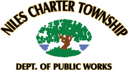
BEFORE
CLIENT: Niles Charter Township www.nilesmi.com/townships
“We’d like to represent ourselves as a progressive community with rural values.”
Niles Township, located in the southwest corner of Michigan—not far from South Bend, Indiana—was established in 1833. Set among rolling hills surrounding the St. Joseph River, the area has (to quote its website) “evolved over the last 200 years from solely a farming community to one that offers a variety of business opportunities including agriculture, industrial, and commerce.”
One manifestation of those changes is that the community has recently become Niles Charter Township, a change in administrative nomenclature that reflects the area’s growth. Along with the change of name, the township board decided to seek a new logo that would look to the community’s future.
The current logo features a tree of no particular species set in an oval with the township name spelled out in an arc over it. Before that, the logo was a drawing of a leaf from an ashwood burr oak, the township tree, sometimes in conjunction with the tagline “The Township With A Historical Past—From A Stagecoach Station To A Developing Community.” Neither of these conveys the kind of professional image the modern Niles Charter Township needs. “We really would like a creative logo,” says Town Clerk Marge Durm-Hiatt. “We’d like to represent ourselves as a progressive community with rural values.”
The town board foresees continued extensive growth, so they’d like a logo that will grow with them. At one time, they were considering an idea based on puzzle pieces to symbolize the way the community is made up of rural, commercial, and residential areas. And even while using the word progressive, Durm-Hiatt stresses that Niles Charter Township is a conservative community in a conservative corner of the state. That was the challenge for our designers: to express the spirit of a community that’s looking to the future while trying to honor its roots in the past.
AFTER
DESIGNER: Steve West www.68design.com
“I wanted the logo to have a modern look so they weren’t stuck with something that made the township look 200 years old.”
Niles Charter Township’s current look is all over the place with no single logo giving a consistency to the township’s communications. Some items feature the tree, some just an oak leaf, and some just use the state emblem for want of anything better. I wanted their logo to have a modern look so they weren’t stuck with something that made the township look 200 years old.
I looked through some information about the township (e.g., reports on the land use and population trends) and was struck by the layout of the township within the county. I played with using squares to suggest farm fields, but I just couldn’t come up with something I liked. Then I tried circles and really liked the way that looked. So I worked a circle pattern into the dot over the i in Niles. I also think that circles bring a scientific feel to the logo.
For the type, I started in a modern direction using standard fonts such as Helvetica Neue, Univers, and Akzidenz; however, I settled on Gotham Rounded because I thought it gave the logo a friendlier tone than the others. For the rest of the name, I wanted a serif font to add a more official, formal effect. I chose Mrs. Eaves and set it in small caps to give the logo a strong base without overwhelming it visually.
ABOUT THE DESIGNER: STEVE WEST
 Steve West graduated in 1996 from the University of Tennessee, Chattanooga, with a BFA in Graphic Design. After working in corporate, ad agency, and small design firm settings, Steve currently has his own freelance design business.
Steve also teaches typography at The Creative Circus, a design, art direction, and photography school in Atlanta, Georgia. Steve says, “I’m very committed to teaching my students to have fun with type. While very important in design, it should be approached as an opportunity to experiment. I push them to dress everything up, even to consider how page numbers are laid out and placed. Good type is what begins to separate you from the rest of your peers.”
APPLICATIONS USED: Adobe Illustrator CS2 and Adobe InDesign CS2
AFTER
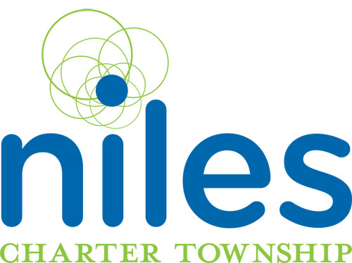
DESIGNER: Sandra Koenig www.sandrakoenig.com
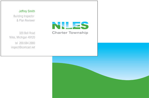

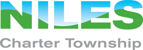
“It’s a contemporary design that conveys a sense of place and reflects the rural beauty of this township.”
Niles Charter Township encompasses farms along with residential and commercial areas, but what makes this area in southwestern Michigan uniquely beautiful is the rolling hills and its river valley. As the website describes it, “Entering Niles Charter Township driving north on the US 31 Bypass and descending into the river valley, motorists are greeted by a breathtaking vista—a mile-long view of rolling orchards, vineyards, pastures, woodlots, and the broad, shining St. Joseph River.”
After looking at several possible directions this identity could take, including others that maintained a tree motif, I chose this one for its strength and simplicity. It’s a contemporary design that conveys a sense of place and reflects the rural beauty of this township.
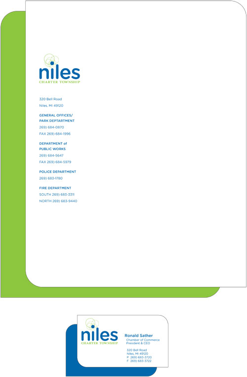
I used Berthold Akzidenz Grotesk Bold Extended for the logotype. This font’s boldness makes the graphic representation of the hills and sky easy to see. Helvetica Condensed is used for the secondary type on the letterhead and business card. The township has quite a bit of important information to communicate and a condensed font helps that chunk of information take up less real estate on the letterhead.
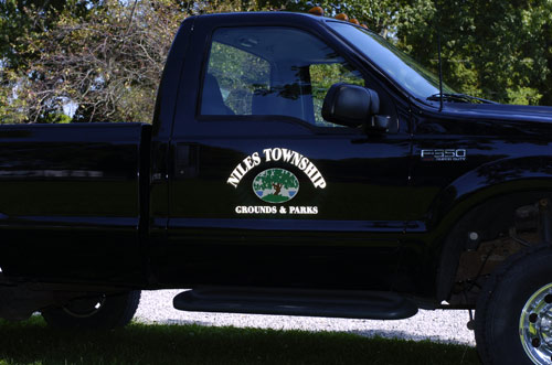
This logo can be used in a very straightforward way, as seen on the front of the business card. But the rolling hill motif can be enlarged and used as a secondary graphic to add color and interest to various pieces in the system, as seen on the truck and in the watermark at the bottom of the letterhead.
ABOUT THE DESIGNER: SANDRA KOENIG
 Sandra’s first love as a teen was art, so a career in graphic design was a natural choice, starting with a degree from the top-ranked University of Cincinnati School of Design. She has more than 20 years’ experience in graphic design and art direction and has worked with many of the largest agencies in San Francisco, including Landor Associates and Clement Mok designs. She’s experienced in a wide variety of media—print, Web, and packaging—and now leads her own design firm, specializing in brand and corporate identity. Her award-winning work includes projects for national and international clients including Apple Inc., Budget Rent A Car, E. & J. Gallo, Johnson & Johnson, Macromedia, Monsanto, Pacific Telesis, Symantec, Times Mirror, and Sanyo. Recently she designed, created content for, and project-managed a 100-page Intranet website for the Anheuser-Busch corporate-identity guidelines.
APPLICATION USED: Adobe Illustrator CS2
AFTER
DESIGNER: Michael Rowe www.upstreammedia.ca

There is nothing worse than a brilliant image of a fuzzy concept.—Ansel Adams
A brand is achieved through a consistent identity, and a good or bad design will determine whether it’s effective. The original Niles Charter Township material, however, was lacking in both design and consistency. It needed new vision.
I started to formulate the client’s perspective when reading the description of the township and their concerns about the current logo, and I continued to research the township culture, landscape, politics, heroes, etc. Before my pen ever hit plastic, I knew what I was trying to achieve: a respectful identity for a historical and agricultural community situated between two larger city centers.
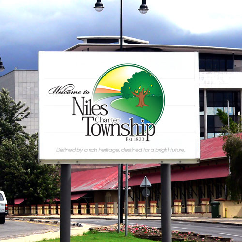
For starters, the old slogan was more of a dated description than a current vision. I asked my strategy planner, Joe Coffey, to bottle the essence of my research and give them something they could be proud of. He came up with “Defined by a rich heritage, destined for a bright future.” I tried to embody this theme in the design.
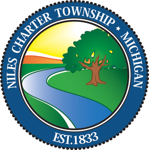
My intent has been to effectively unify who they are, rather than rebrand them completely. I also kept the burr oak tree and the river as significant elements; they represent the past, present, and future of the township.
I created two versions, one with the name of the township overlapping the drawing and the other with the name in a formal border, more like an official seal. This gives multiple display options but maintains consistency among official and public identity materials—the idea was modeled after the way the state of Michigan uses its coat of arms.
ABOUT THE DESIGNER: MICHAEL ROWE
 Once a full-time youth pastor, Mike is completing a business degree at Memorial University of Newfoundland with a joint diploma in Performance and Communications Media. Mike attributes the depth of his design skills to a three-year stint at his university’s Digital Media Centre. “I was on staff to assist the 17,000 students…that’s where I honed many of my techniques and was paid to play multimedia. It was a sweet job.” Mike has also handled an expanding company’s advertising, branding, Web development, and design for three years.
In September 2006, Mike launched his own marketing company, Upstream Media, where he currently hangs his hat as the creative and technical director. Mike and his business partner/strategy planner are passionate about return on investment and growing their small company as a player in their industry. They create everything from corporate videos to full-scale media campaigns.
APPLICATIONS USED: Adobe Illustrator, Adobe Photoshop, and Adobe InDesign

