
Design Makeover: Monster Ball
Client:
Swing Goth www.swinggoth.com
Before

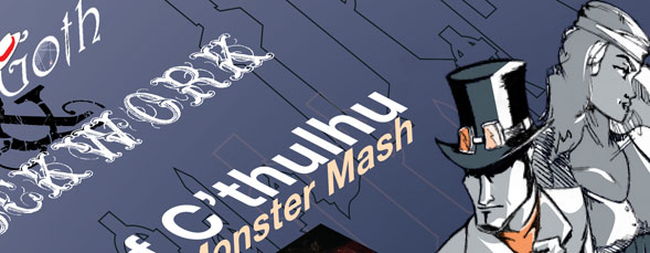
Swing Goth was born out of an attempt to marry partner dancing with modern music. “We dream of a future where dancing with each other is once again the norm, but we’re unlike other partner dancing clubs in that we dance to modern music,” said Brian Gardner, originator and promoter of Swing Goth. Gardner hosts biweekly dance parties and occasional live-music events in San Francisco—Swing Goth’s home—and the activity has spread to New York. “We teach partner dancing based on upper body connection, and we focus on developing a personal style and flair rather than on perfecting cookie-cutter footwork,” Gardner said.
Some of Swing Goth’s events, such as this October’s “Ball of C’thulhu,” feature steampunk bands. Steampunk is a visual aesthetic and literary genre that, like Swing Goth, combines old and new. “I think of it as what would happen if the combustion engine and mass production were never invented,” explains Gardner. Think of floating airships or computers with keyboards made out of typewriters. “Aesthetically, it is said that steampunk is what happens when goths discover brown.”
For the ball flyer, one of the participating bands came up with the tentacles-and-cemetery theme. Gardner took it from there, populating the cemetery with ghouls drawn by a friend or images from the public domain. The flyer will be printed as a 4×6″ postcard to be distributed in clubs, record stores, and the like; and as 8.5×11″ posters to be hung in appropriate neighborhoods.
Gardner likes some aspects of the flyer, such as the tentacles wrapping around the band, but he worries that it looks too wordy and doesn’t like the way the text breaks down into horizontal bars that interrupt the eye’s flow. He’d like a flyer that covered the event details but still gave a feeling of “gentle, dark seduction” between elegant ladies and gentlemen. We asked three designers to create an appropriately seductive—but appropriately spooky—monster mash flyer.
After
DESIGNER: Maria Stephens
www.tigerlillydesigns.co.uk

My immediate impressions of the original design were that it was busy, absent of any real focal point, and lacking impact. I wanted to give it a more professional touch that would complement the reputation of the promoter and musicians.
I began by stripping the poster down to its basics and identifying what the client liked about the current design: colors, central image, and dark mysterious vibe. I then looked at what elements were necessary to the flyer and reordered them in terms of size and location to create a more structured hierarchy. I considered the main focal point of this poster to be the event, theme, and date, and therefore concentrated the design on these areas. I liked the cemetery theme as it has a link with the headline act Abney Park (also a cemetery here in London), as well as being a perfectly fitting theme for this monster mash.
The overall colors of the poster remain dark so that the white, green, and yellow text can really pop in the ultraviolet lighting common in clubs. All the band logos have been displayed using white text in the style of their logos—this will ensure that they stand out in nightclub lighting while complementing the central image rather than detracting from it.
To reinforce the event theme of C’thulhu (a fictional cosmic entity created by horror author H.P. Lovecraft), stylized ethereal tentacles were added crawling out from under a headstone. The tentacles provide a sense of horror and mystery, as well as conveniently creating the perfect frame with which to emphasize the main details of the event. The event name and date appear on the headstone, almost as though they were carved there.
Overall, the final design is a classy, stylish, elegant take on a subject matter (Halloween) that can often be cliché and cheesy.
ABOUT THE DESIGNER
Maria Stephens
www.tigerlillydesigns.co.uk
 Originally from the beautiful valleys of South Wales, Maria Stephens has spent the last five years honing her expertise on the streets of London, working her way up through the ranks of design teams and enjoying both agency and client side projects. With a Masters Degree in Graphic Communication, Maria realized that she could have more fun and greater creative freedom working for herself and founded Tigerlilly Designs, a boutique design agency with big ambitions, in 2008.
Since its founding, Tigerlilly has worked with start-up entrepreneurs, blue-chip businesses, charities, and classy individuals on both sides of the pond. Recently, Tigerlilly nurtured a flourishing relationship with Razor Research, an award-winning research agency based in London. This partnership has led to work for well-known brands such as Green Giant, Betty Crocker, and Häagen-Dazs.
Maria lives in Central London with her boyfriend and her basil plant named Fred.
APPLICATIONS USED: Adobe Photoshop CS4, Adobe Illustrator CS4, and Adobe InDesign CS4
After
DESIGNER: Kwasi Amankwah
www.kwasi.net

This project was very interesting to me because it covered a topic that I truly knew nothing about. Swing Goth was a whole new world, and before I started any designs I spent time learning about the culture. Once I had a good understanding of the scene, I started by coming up with an element to focus the piece around.
I created a drawing that depicted two people heading to the party. The illustration was a composite of all the characters I saw in my research—the female guest, for example, was an homage to one of the band members. The figures and the background were colored in Adobe Illustrator. The blue used was sampled from the original piece, and the line drawing of a graveyard silhouette added a texture to the background.
The toughest part about this project was incorporating all of the different band logos, with each of them using a different font. I decided that a dramatic angle would allow me to incorporate the logos as party information more cohesively. The logos and information were manipulated so that they appear to fit into the same 3D space as the illustration’s people. Changing logo one into a spatial element allows the different fonts to act as a unit while being so different from each other. I set the ampersand in Angelic War, which I thought looked like a nice blend between the fonts used in the Swing Goth logo and the Clockwork logo. For the rest of the copy, I used Helvetica Neue Bold, Light, and Light Italic. It’s a simple font, but with the complexity of all of the other fonts used I wanted to keep the other information as simple and clean as possible.
ABOUT THE DESIGNER
Kwasi Amankwah www.kwasi.net
 Kwasi started as an illustrator and moved into graphic design after gaining a background in Adobe Photoshop. After getting his Bachelor’s Degree in Art History at the University of Illinois, he moved to Chicago to attend the Art Institute of Chicago. There he earned his BFA in graphic design, after which he attended the University of Illinois-Chicago for his MFA.
His diverse background and his love and interest in all different styles of art gives him a unique approach to his design projects. While he spends most of his time working on graphic design, he also draws, paints, and belongs to a screen print studio.
After school, Kwasi spent several years on an in-house graphic design team and teaching graphic design at a local college. Kwasi has now moved into the freelance world and started his own company, At Nine Design. Kwasi resides in Chicago with his wife and dog.
APPLICATIONS USED: Adobe Illustrator CS3 and Adobe InDesign CS3
After
DESIGNER: Matt Holley
www.mattholleydesign.com

Having no knowledge of Swing Goth, steampunk, or H.P. Lovecraft, I was jumping into a completely different world blindfolded. The name C’thulhu had little meaning to me until doing the research. This creature was created as a symbol of extreme horror and evil. While the “Ball of C’thulhu” bears the creature’s name, it’s an event filled with fun and fantasy.
Looking at the original poster, there are several elements that are distracting. There’s so much text and so many line breaks that it’s virtually impossible to notice the design. From the cartoon characters to the poorly beveled tentacles, this poster doesn’t reflect the vibrance and quality of this event.
Browns and greens gave me the fall feel I wanted, while allowing me to keep the poster bright, warm, and inviting. I drew my interpretation of C’thulhu as if he were going to a costume party (on paper, then redrawn in Adobe Illustrator). His plaid suit and paisley tie is what he grabbed from Goodwill the night before the ball. He’s positioned on the hardwood floor and is holding a mystical scepter as if he’s the dancing disco ball of the party.
The header text is Oliver’s Barney, which was the perfect thickness for me to apply the wood grain texture to. The leaves echo the warmth and fall feel of the wood. Reprise Stamp was used as the informational text because it’s eroded yet remains as legible as Helvetica. The header and footer text are both set in a triangular shape and give a nice sense of balance to the page. Logos were strategically placed so as not to take attention away from the overall design of the poster. I’ve always loved the look of screen-printed posters, and wanted to give this poster a similar vintage look and feel.
ABOUT THE DESIGNER
Matt Holley
www.mattholleydesign.com
 Matt Holley is a passionate freelance designer out of Columbus, Ohio. With a broad range of experience ranging from corporate rebranding to creative marketing and interactive design, Matt brings a clean approach to design and focuses on getting rid of unnecessary clutter. Clean lines, balance, and symmetry are at the forefront of Matt’s design profile.
After graduating from Marshall University with a Bachelor of Fine Arts in Visual Design, Matt moved to Columbus to pursue his design career. While he enjoys corporate design, nonprofits have always had a soft spot in Matt’s heart, as his dad and brother are both ministers. He loves using his talents to glorify God and help local churches grow, and impact their neighborhoods. Matt also enjoys playing music and is part of the Jared Mahone band, a groove-driven soulful pop band in Columbus. He is recently engaged and looking forward to being married to his fiancée, Krista.
APPLICATIONS USED: Adobe Illustrator CS3 and Adobe Photoshop CS3

