
Design Makeover: Community Arts Center
For Art’s Sake
Client:
Community Arts Center www.communityartscenter.net
Before
The Community Arts Center in Danville, Kentucky, serves the artistic community from the surrounding Bluegrass region by providing music and art lessons, exhibiting local and international artwork, and hosting artist receptions and lectures. “We target all demographics,” says Mary Beth Touchstone, the Center’s Executive Director. “Our mission is to cultivate and support the arts for the benefit of our community. We teach the fundamentals, and most of our activities and lessons are free or low cost.”

The Arts Center’s website was designed about five years ago by their Web developer, who just wanted to get something up quickly. Touchstone and the Center staff like some aspects of the site’s functionality, such as the way visitors can download registration forms for the classes and events right from the homepage. But they wish there was a Donate button too, since the Center is a nonprofit organization and relies on donations. They also think the site is too plain for an arts center and has a lot of wasted space on the sides.
The latest marketing brochures from the Center have a more sophisticated look, with lots of evocative black-and-white photos and a blue, tan, and black color scheme. Touchstone would like the website to look more sophisticated as well, but remain engaging. The brochures are part of a fundraising campaign that gets sent to the Center’s patrons and supporters, for whom an upscale, polished design is appropriate. But participants in the Center’s activities come from a wider demographic; furthermore, current participants are mostly families and seniors, and the Center would like to attract more 20- and 30-somethings, and students from the local college. The website needs to appeal to all those audiences without putting off any of them.
“We want to be seen as accessible and inviting,” says Touchstone. “We’re in the central part of a small town, and we’re the place to go for all sorts of arts activities.” We asked three designers to help the Center welcome all their constituencies with a revamped homepage.
AFTER
DESIGNER: Joel Glovier
http://jagdesignideas.com

To me, the Community Arts Center homepage felt anticlimactic. This organization is doing really great things in the community and apparently has a rich history behind it, but you don’t get that impression from their site.
I wanted to make the homepage engaging and full of content, partly because Web industry stats show you really only have a handful of seconds to make a first impression with visitors before they decide to either leave or keep browsing. I gave the header plenty of breathing room, and this treatment would remain the same site-wide. Also, reused on every page would be the footer, which has important info that should appear on the entire site.
The new Featured Content slider could be used with up to five or six slides. (The Center’s staff says they have the capability of making slide shows.) Replacing a whole separate link in the navigation for the newsletter is now just a banner on the homepage to sign up directly. Upcoming Events are big and bold, right under the main content, and additional images and promotional items also take a prominent place.
I intentionally restructured the navigation, trying to get each link down to a single easily recognizable word, removing any unnecessary links. The number one rule in usability is don’t make the user think. So making the meaning of navigation links painfully obvious is a big help in getting visitors to browse more pages of the site.
Stylistically, I built on aspects of the current design, reusing key colors and sticking to a style that’s relatively minimal. Most design cues were typography based, and I made use of negative space. I made some minor tweaks to the logo, using Garamond Bold both there and in headings throughout the page. I incorporated as much imagery as I could—using photos from the Center’s new brochures—to make the page feel more personal.
ABOUT THE DESIGNER
Joel Glovier http://jagdesignideas.com
Joel Glovier is the Web and graphic designer at CURE International (www.helpcurenow.org), where he’s  been diligently working on a complete redesign of their website for several months. CURE is a nonprofit charity that provides surgery to disabled children in developing countries.
Joel also runs a freelance business, JAG Design Ideas, doing design work for mostly nonprofit clients. He’s been doing freelance design since graduating from Liberty University in 2004 with a degree in communications. Although being a designer and quite visual by nature, he has come to greatly appreciate the balance that coding HTML and CSS brings to his work. He feels there’s something really energizing about building something he designed.
Joel says his driving focus in life is knowing Jesus Christ and doing all things to bring Him glory. He also enjoys breakdancing, skateboarding, his better half (Ashley), the Pittsburgh Steelers, and most recently, Iron Man 2.
APPLICATION USED: Adobe Photoshop CS4
AFTER
DESIGNER: Chris Anderson
www.chrisanderson-designs.ca

The first thing that came to mind when I viewed the Community Arts Center (CAC) website was that it was stark white and clinical looking. My objective was to ensure that the end user quickly recognized that the CAC was a warm, fun, and accessible local “community” environment.
I started with a small gallery of six expressive black-and-white photos taken from the brochures, showcasing a variety of artistic activities enjoyed by all ages. I also added a secondary slide show using photos already on the site for a quick look at all the activities and events.
For the CAC brand, I chose to use the Adobe serif typeface Trajan Pro, which is popular for movie posters, book covers, and branding. It’s known for its stability and subtle sense of excitement.
It was important to keep consistency throughout the site. To do this, I first chose to use the humanist sans-serif typeface Trebuchet MS for its bold, classy strength, and ease on the eyes. It’s also a standard for Web browsers going back as far as Internet Explorer 4. Second, I added a bright red title banner wrapped around the top-left corner of each section.
With bluegrass music in mind, I used a soft woodgrain paneling to span the background. I delineated each section using two shades of red to help organize and prioritize the content. For a nice contrast, I used gold for the gallery borders and for the navigational typeface. These choices result in simple and clear navigation, with the primary content (the main links and feature events) split across the top and bottom of the header, and the secondary content in the footer in a two-column stacked sitemap.
ABOUT THE DESIGNER
Chris Anderson www.chrisanderson-designs.ca
Chris Anderson was born and raised in the heart of Muskoka cottage country in Ontario, Canada. From a young age,  Chris enjoyed illustrating anything and everything. This passion was carried onto the screen using early visual manipulation programs such as LightWave, Modular, CorelDRAW, FreeHand, and then moving quickly into everything Adobe.
After graduating from Cambrian College through the Arts and Technology Graphic Design program, Chris spent time enjoying something else that he loves: working as an outdoor adventure instructor and guide leading whitewater canoe trips in and around Ontario and Quebec. Shortly thereafter, he joined an in-house design team in Toronto, but looking for more design freedom and flexibility, Chris decided to start his own design business. For the past two years he has had the pleasure of working with all aspects of the design process from website design and development, custom management frameworks, and eLearning modules to branding, photography, illustration, company stationery, etc.
APPLICATION USED: Adobe Photoshop CS4
AFTER
DESIGNER: Anita L. Elder
www.lolaludesign.com

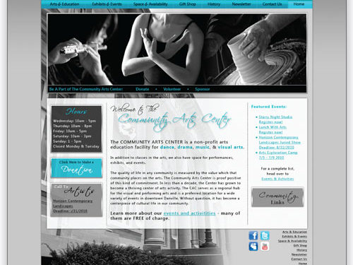
My first goals in redesigning the Danville Community Arts Center’s website were to create a site that was easy to navigate and to showcase what the organization offers. I also wanted to reinforce the brand message by coordinating it with the newly created brochure and rack cards, in both color and the use of the Scriptina font.
I moved the main navigation near the top of the page so viewers could easily find it, and changed the background color of the relevant tab on the navigation bar so they would know where they are within the site. Because donations are critical to the Center, I included a call to action, as well as easy navigation for site visitors wishing to offer other kinds of support.
The Center hosts a variety of art events and activities, and many of those images are in the main photo (which could be a slide show). The organization is housed in a lovely old building easily recognized by the local population, and I incorporated its image into the background, where it’s visible but doesn’t dominate the page. For site visitors not familiar with the center or its location, I included the address and phone number in the header where it’s easily found. I set the Center’s name in the classic California FB.
The Center staff edits the featured events list weekly, so the process needs to be user-friendly; I stuck with a similar bulleted list in the right sidebar. For the list and the body copy, I used Segoe UI, familiar to any Windows user.
The homepage’s content concludes with larger text to emphasize that many of the Center’s events are free. In addition to the Facebook icon they currently use on their site, I added other social media icons and recommended they use those services to help promote the Center.
ABOUT THE DESIGNER
Anita L. Elder www.lolaludesign.com
Anita has spent the past fourteen years living in the Seattle area. She has always had creative tendencies and started designing websites as a hobby in 1995.  In 2000, Anita went back to school, receiving an AAS in Multimedia Design and Production and a Bachelor of Fine Arts in Visual Communications. She worked for Vulcan Inc. and the Seattle Times before venturing out as a successful freelance designer. Design projects aren’t just a job, they’re her passion.
When not creating Web and print designs on the computer, Anita enjoys photography, cooking, and traveling the world. She also volunteers her time teaching English as a second language to women refugees, answering phones during KUOW public radio pledge drives, and doing pro bono print design for nonprofit organizations.
Anita lives with her husband William and two cats, Rico and Lola.
APPLICATION USED: Photoshop CS4

