
Design Makeover: Alternative Music Club
Winning Designers Update a Baltimore Alternative Music Club’s Logo
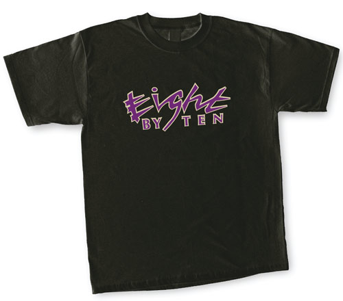
BEFORE
CLIENT: Eight by Ten Club, Inc. www.the8x10.com
“Clients rarely ask designers for something generic, but in Berg’s case, that’s exactly what he’s looking for—a logo with general appeal rather than one associated with a specific musical genre.”
Having recently gone through a name and ownership change, Baltimore’s Eight by Ten Club—formerly known as The Funk Box—has been desperately seeking a new logo. “We’ve gone through three logos in the past two months,” says Mike Berg, manager of the alternative music venue, which features live performances by emerging artists and Indie musicians in a spectrum of genres from reggae to rap and jazz groups to jam bands.
Clients rarely ask designers for something generic, but in Berg’s case, that’s exactly what he’s looking for—a logo with general appeal rather than one associated with a specific musical genre. Perhaps more so than for other businesses, a club’s logo is its brand, appearing everywhere from the marquee to the website, to newspaper ads, and T-shirts. And for the Eight by Ten, whose 18- to 35-year-old customers are serious alternative music fans, getting the brand right is crucial to the survival of the club.
We asked three designers, each of whom is a 2005 Adobe Design Achievement Award winner, to give the Eight by Ten a cool new logo.
AFTER
DESIGNER: Klaas Neumann www.orang-magazin.net
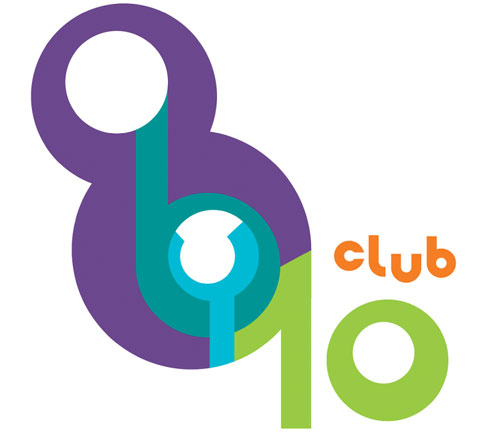
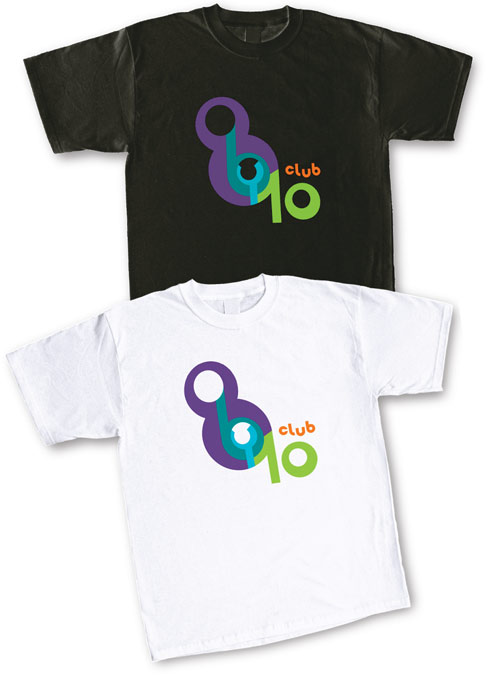
“To put more swing and music into the design, I chose nonconcentric circles and arranged the letters and numbers somewhat arbitrarily. The irregularly placed circles remind me of emerging sounds.”
Before starting to redesign the Eight by Ten logo, I looked at the club’s website. Ideas that may have lent themselves to illustration (such as showing musicians or a street crossing) turned out to be too complicated for a logo, so I focused on arranging the various parts of the club’s name into one design element.
To make the name recognition immediate, and create something more like a picture than a row of words, I used numerals rather than spelling out the club name. The word “by” had to be included because it’s an integral part of the name, so I positioned it in such a way that it can’t be dissociated from the numbers. I used circular shapes to simplify the logo—more complex letters might have drawn associations with certain music styles. To put more swing and music into the design, I chose nonconcentric circles and arranged the letters and numbers somewhat arbitrarily. The irregularly placed circles remind me of emerging sounds (although that may be a bit of a stretch).
I chose colors that conjure up a nighttime mood (a purple “8” that heats up to yellow at the bottom; a bright, warm orange for “club”). The colors also point out the sequence in which the logo should be read. And the color scheme works well with the black background of the existing webpage. The logo fits in with the insider attitude that alternative clubs often project: If you’ve been to the club, you know what the logo means. I did the entire logo in Illustrator, as it allowed me to play around with shapes, create basic letters, and try out different color schemes.
ABOUT THE DESIGNER: KLAAS NEUMANN
 A student at the University of Applied Sciences in Hamburg, Germany, Klaas Neumann studies illustration. Although his professional focus is on information design, he indulges his lifelong passion for drawing as a regular contributor to the print publication Orang Comic Magazin, a zine about comics and graphic novels (www.orang-magazin.net).
In addition to studying, Neumann works as a graphic artist for the Financial Times Deutschland. Far from a digital snob, he’s also interested in analog media, such as books and cinema. “I’d like to create more comics,” he says, “but you can hardly make a living doing that in Germany.” Neumann is the 2005 Adobe Design Achievement Award winner in the Digital Illustration category.
APPLICATION USED: Adobe Illustrator CS
AFTER
DESIGNER: Micah Ganske www.micahganske.com
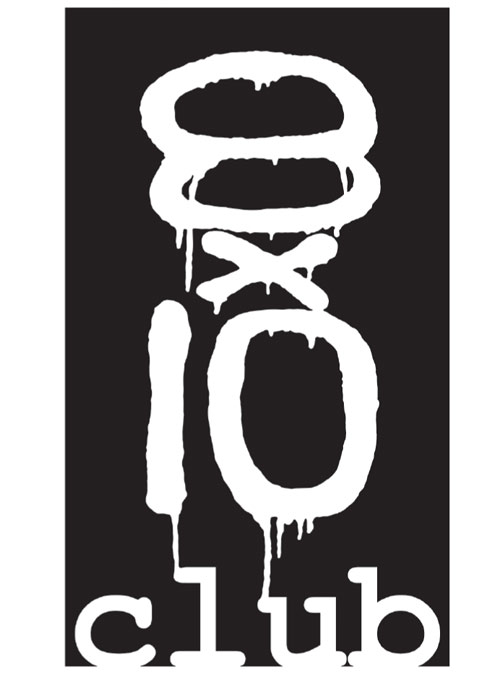
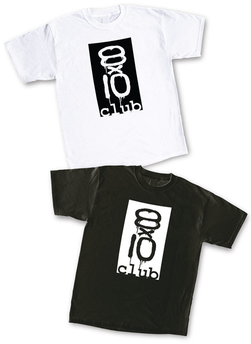
“To capture the feeling of real paint, I spray painted the logo on cardboard, photographed it, and digitized the tag in Photoshop.”
For the design of this logo, I went with the first and most basic concept that came to mind upon hearing the name of the venue, the numbers “8” and “10.” Numbers are the most powerful and easy-to-identify characters in language and for this reason, they make an excellent starting point for any design.
As a response to the attitude and orientation of the venue, I decided to go with a spray-paint motif. A simple, sprayed “tag” speaks to the immediacy and rawness of the independent music scene. To capture the feeling of real paint, I spray painted the logo on cardboard, photographed it, and digitized the tag in Photoshop. I kept the type for the word “club” simple by using a basic font—Courier.
This all comes together to form a logo that is both simple and bold. And keeping it all in black and white makes it cost-effective from a printing standpoint.
ABOUT THE DESIGNER: MICAH GANSKE
 Micah Ganske received his BFA from the School of the Art Institute of Chicago in 2002 followed by a Post Baccalaureate certificate from the Maryland Institute College of Art in 2003. In 2005, he completed his studies at the Yale School of Art, where he received his MFA in Painting. While primarily a painter, Ganske is very interested in photography and digital aesthetics and has integrated these into his art-making process. Ganske has been featured in group shows in Atlanta, Chicago, Baltimore, and New York, and is currently living in New York City, where he’s working toward his first solo show. Ganske is the 2005 Adobe Design Achievement Award winner in the Digital Photography/Imaging category.
APPLICATION USED: Adobe Photoshop
AFTER
DESIGNER: Roxane Zargham & Ryan Weafer www.studio-r-r.com
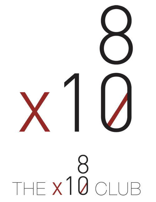
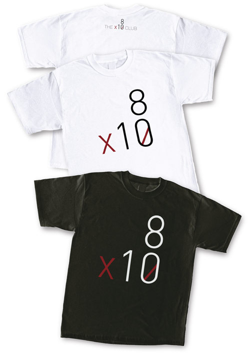
“We designed the logo in red and white against a black background, a combination that projects a sort of radical, sexy minimalism. The colors are also a nod to neon signs that are often associated with nightlife and club culture.”
My design partner, Ryan Weafer, and I wanted to make the logo something that appealed to a broad range of music patrons, so we gravitated toward a clean, simple typeface. We decided to use numerals, so we selected the FF DIN typeface, which has beautiful but simple numerals.
We designed the logo in red and white against a black background, a combination that projects a sort of radical, sexy minimalism. The colors are also a nod to neon signs that are often associated with nightlife and club culture. And the black background of the T-shirt (or the website) becomes the stage, the night, or the emptiness from which the nightlife emerges. The strike-through in the zero enables the logo to be read as a logotype rather than a simplistic default set of characters. Much like the logo of New York’s music venue CBGB, it becomes a sort of code that only insiders will understand.
We think this simple, pared-down identity for the Eight by Ten has broad appeal and will position the club as a premier insider’s music venue in the Baltimore nightlife scene.
ABOUT THE DESIGNER: STUDIO R+R
 Roxane Zargham is the 2005 Adobe Design Achievement Award winner in the Print Design category for her work on the UCLA Design/Media Arts identity under creative director Rebeca Méndez. A senior in the UCLA Design/Media Arts department, she’s had design internships with Harper’s BAZAAR and V Magazine. Zargham plans to attend graduate school next year but she’s also focusing on Studio R+R, the design firm she and design partner, Ryan Weafer, opened in March 2005 to create identity systems, print work, websites, and other designs for clients. Zargham and Weafer are also writing and designing a book entitled Dual. Duel. Do all., which explores the contexts and inspiration for their personal and collaborative works.
APPLICATION USED: Adobe Illustrator CS

