
Design Makeover
Magnetic personality
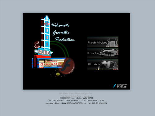
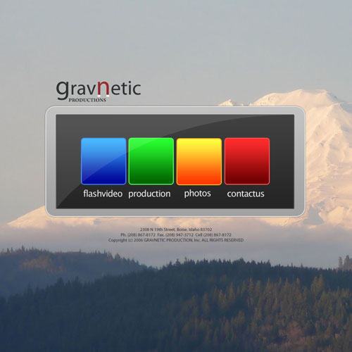
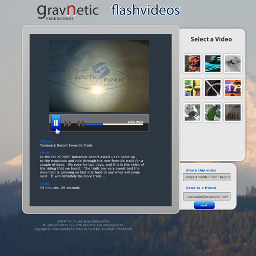
BEFORE
Client: Gravnetic Production, Inc. — www.gravnetic.com
[Jake Widman is a writer and editor who lives in San Francisco. He’s been covering the intersection of computers and graphic design for about 20 years now—since back when it was all called “desktop publishing.”]
Gravnetic provides multimedia content of all sorts, from streaming Flash videos for the Web to broadcast graphics for local TV stations to DVD material. Owner Jake Hawkes says he came up with the name by combining the words “magnetic” and “gravity”—the latter reflecting the fact that the Idaho-based company is frequently called upon to work with material involving skiing and mountain biking.
The biggest problem with the current website, says Hawkes, “is that I have two homepages—the initial one with the movie marquee, and then the Flash Video page.” The bare URL takes a visitor to the first page, even though the second page has all the navigation links on it and is even named “Home.” Not only that, the two pages don’t look anything alike; there isn’t even a consistent logo treatment tying them together. Ideally, Hawkes says, the first page would be a simple gateway that offers clear access to the other main areas of the site, although he wouldn’t mind visitors having direct access to the video player on the front page.
Overall, he’d like his site to look fun, colorful, and creative. Hawkes cites the well-known series of Sony Bravia commercials as examples of the combination of fun and creativity he admires. Another goal is for the website to encourage distribution, so that some of his videos could get viral exposure. He’d like there to be some kind of “call to action” after you look at his stuff—if people see something they like, they should be able to do something with it. “Perceive it however you will,” he says, “but then share it.” We asked three designers to take on the complicated task of providing consistency, creativity, and action in the same makeover.
AFTER
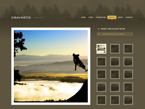
Designer: Tyler Thompson — www.workwithjob.com
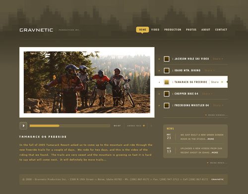
My goal for the Gravnetic website was structuring the content in a way that would come across as approachable, professional, and creative, while finding a balanced mix of structural elements and visual consistency. Lack of consistency was foremost among the many ways I thought their current website falls short.
For the homepage, I wanted to keep the video area the main focus so I decided that giving access to five videos at a time was an ideal way to keep the user interested but wanting more. I added a little News section to help give the homepage a fresh feel and provide a reason for people to come back for updated information.
For the overall look of the site, my inspiration was to mix technology with the outdoors. I chose a subtle, natural color scheme and tried to mimic a pixelated forest treeline in the header. I really resisted getting too creative with background graphics and headers—I felt that their content was the creative element and that it should have a neutral stage to perform on.
I added the ability to share any video or picture to help people spread the word for Gravnetic. I chose to tie the headlines in to the header graphic by using a pixel font (Frucade Small Extended from Semplice), while the navigation and video player font (Interstate Bold Condensed) was chosen for its bold, compact form. I cleaned up Gravnetic’s logo by setting it in a sleek, modern font that I manipulated only slightly. I wanted the logo to be simple and strong, yet plain enough that they could impose it on their other work without it taking away from what they were applying it to.
ABOUT THE DESIGNER:
 In late 2006 while working at 7-Eleven, Tyler Thompson found himself alone one night shift. While stocking the hot dogs, the layout of the packaging grabbed him, and he thought, “I can do better than this!” And so began a love story, a love story set in a world where hard drives are huge and floppy drives don’t exist.
In addition to campaigns for Safeway, Redhook, and others, Thompson has created a logo for his cousin’s softball team, a flyer for a rave, and two menus for a highly successful Mexican restaurant in town. Tyler would like to take this opportunity to thank his amazing wife, Amanda, for all of her support during his long, long nights behind the computer, and his son, Scout, for all his cool coyote sounds.
APPLICATIONS USED: Adobe Photoshop and Adobe Illustrator
AFTER
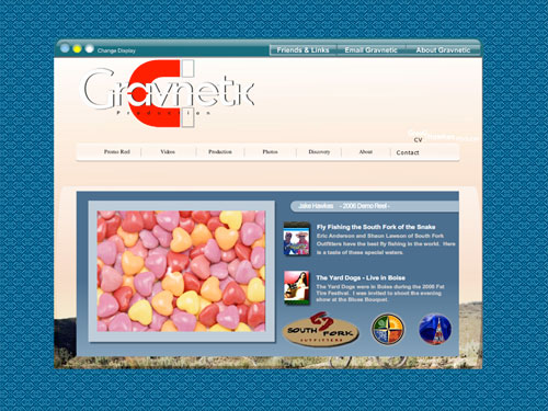
Designer: Taylor Zimmerman — www.xpdesigns.com
With the client’s personal background and preferences in mind, I opened Photoshop with a newfound vigor. I planned to keep some of the organizational and design choices; however, the lack of consistency and identity were the major items I wanted to change and enhance.
I began by using more modern design elements, adding gradients, bold colors, and glossy highlights to the first page. With the client’s wish for activity and the history of the Gravnetic name, I used a more traditional approach and gave the layout a mountainous landscape background.
I kept the magnet because it’s the client’s best representation of what his site is about. I manipulated it, however, and used it as the n of the logo to create a feeling of simplicity and boldness. I reproduced the new logo on the front page to add stronger identity and more uniformity. The selection of Lucida Sans Unicode and Myriad Pro as the fonts for the section titles and logo, respectively, adds an aura of professionalism.
Moving on to the video page, I focused on interactivity and simplicity. I converted each text-titled video to a simple glossy button organized on the right-hand side. To achieve a more distributive website, I included interactive sections to enable video exchange. I created an alternative video player with a more user-friendly interface and one that conformed to the sleek and traditional design of the layout.
ABOUT THE DESIGNER:
 A Web designer for two and a half years, the 15-year-old Taylor Zimmerman is a sophomore in high school in Tennessee. While attending high school, he has created assorted graphics for his school and its many clubs. His work has also been featured in the Tennessee Art League.
Because his father was a member of the Armed Forces for 20 years, Taylor has lived in numerous places around the world. He began Web designing in 2005 and created his website, Xpdesigns, shortly after.
Taylor enjoys hanging out with his friends, freelance PHP and MySQL programming, and jamming to his favorite alternative rock band. He plans on attending the Art Institute of Chicago to obtain a degree in Audio Production, Graphic Design, and Interactive Media.
APPLICATIONS USED: Adobe Photoshop CS3
AFTER
Designer: John McCann — www.efuturemedia.com
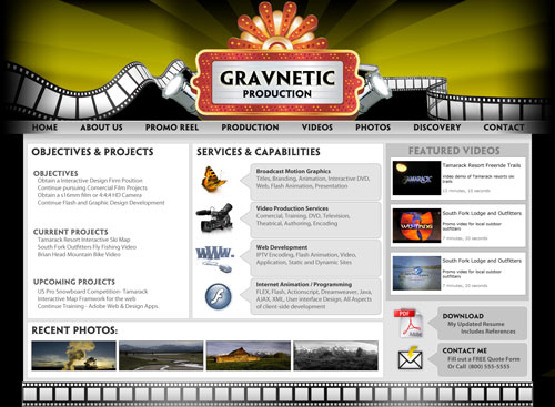
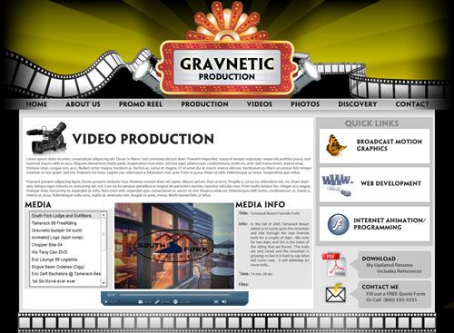
The immediate need for the Gravnetic website was quite clear from the beginning: there was no continuity. The splash page was designed as a flashy theatre marquee, but the subsequent pages made you feel as if you were leaving the site altogether. Not only do they not look like the opening page, but they contain links to pages (Promo Reel, About, Contact) that aren’t even mentioned on the splash page.
I started by tackling the splash page. Unless your site is product-focused and your homepage is introducing a product, an image-based splash page isn’t a great idea. I wanted the homepage to present basic information on all of Gravnetic’s services, as well as give an idea of what can be expected on the rest of the site. Each content area is clearly defined and has a clear heading as to what belongs to that section. I included samples of photography, direct links to videos, and a list of services, and gave each listed service an identifying icon.
On the subsequent pages, clear content areas with clear headings again give users a very clear and concise method of accessing the content. And I reinforced each service page with the icon used for that service on the front page, so it’s very clear to viewers where they are on the site. I used Penumbra HalfSerif Std for the logo and section headings and various weights of Myriad Pro for everything else.
The overall look is based on the original theater theme. In the final product, the marquee and lights around it are animated to bring the site to life, but not too much to take away from the content. It’s important to remember that the content is what’s important, not so much the design.
ABOUT THE DESIGNER:
 John McCann, 27, works at VanKomen Media (www.vankomenmedia.com), an online marketing firm based in Draper, Utah. VanKomen provides marketing services such as list management, media buying, and campaign management.
Before VanKomen, McCann worked on websites for companies doing business with HBO and the Discovery Channel. He has also worked on projects involving corporate customer relationship management and content management system design, as well as on sites designed to sell children’s toys.
McCann moved to Utah with his wife when she was in the Air Force; he says, “We absolutely love it. We used to live in Florida, so my four children, Ian, Ashton, Kyleigh, and Shealeigh, had never seen snow. They’re having the time of their lives.”
APPLICATIONS USED: Adobe Photoshop CS3 and Adobe Illustrator CS3

